Unlock a world of possibilities! Login now and discover the exclusive benefits awaiting you.
- Qlik Community
- :
- Forums
- :
- Analytics
- :
- New to Qlik Analytics
- :
- How to sort bars for each dimension in chart
- Subscribe to RSS Feed
- Mark Topic as New
- Mark Topic as Read
- Float this Topic for Current User
- Bookmark
- Subscribe
- Mute
- Printer Friendly Page
- Mark as New
- Bookmark
- Subscribe
- Mute
- Subscribe to RSS Feed
- Permalink
- Report Inappropriate Content
How to sort bars for each dimension in chart
Hello everyone, I am new to QlikSense development and already searched for the solution here in the community but no luck. Anyway here is my scenario-
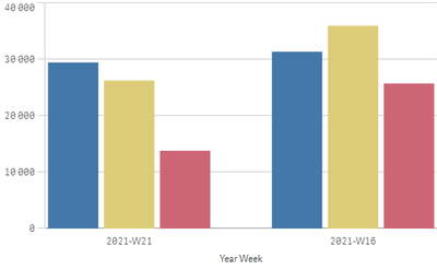
I have a bar chart with Year-Week dimension.
I have 3 measure value to show for each dimension value. For say these following three measure -
SUM(field_1) //blue bar
SUM(field_2) //yellow bar
SUM(field_3) //red bar
Here is the sample output of 2 data point from Year-Week dimension-
Now you can see, for 2021-W16 data point I have highest count for yellow then blue and then red. Now I would like to sort them for the Value. For other data point in the sample image is already in expected order by luck 🙂
Note: For each data point, that order can be different based on value/count.
Thanks in advance.
Accepted Solutions
- Mark as New
- Bookmark
- Subscribe
- Mute
- Subscribe to RSS Feed
- Permalink
- Report Inappropriate Content
With a bit of trickery it's possible. See attached example
talk is cheap, supply exceeds demand
- Mark as New
- Bookmark
- Subscribe
- Mute
- Subscribe to RSS Feed
- Permalink
- Report Inappropriate Content
With a bit of trickery it's possible. See attached example
talk is cheap, supply exceeds demand
- Mark as New
- Bookmark
- Subscribe
- Mute
- Subscribe to RSS Feed
- Permalink
- Report Inappropriate Content
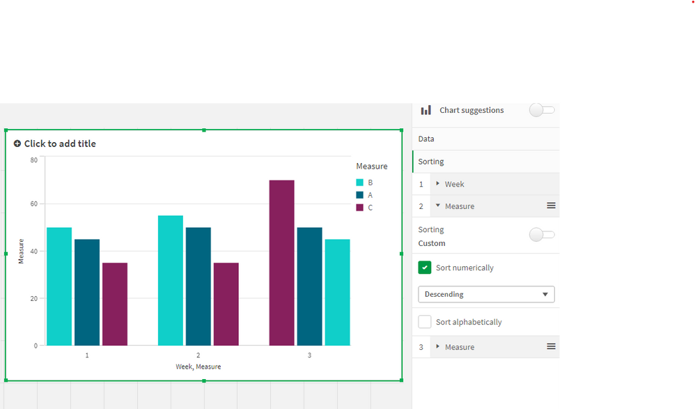
Thanks Gysbert for your answer, but unfortunately this tricks not working for me 😞
Just to avoid confusion, I am using QlikSense.
Can you please check what I am doing wrong-
- Mark as New
- Bookmark
- Subscribe
- Mute
- Subscribe to RSS Feed
- Permalink
- Report Inappropriate Content
No, you check why it doesn't work for you. That's why I attached the Qlik Sense app in the first place.
talk is cheap, supply exceeds demand
- Mark as New
- Bookmark
- Subscribe
- Mute
- Subscribe to RSS Feed
- Permalink
- Report Inappropriate Content
Thanks for your help Gysbert. It worked the way you implemented things in the app.


