Unlock a world of possibilities! Login now and discover the exclusive benefits awaiting you.
- Qlik Community
- :
- Forums
- :
- Analytics
- :
- New to Qlik Analytics
- :
- How to use custom colours in a stacked bar chart
- Subscribe to RSS Feed
- Mark Topic as New
- Mark Topic as Read
- Float this Topic for Current User
- Bookmark
- Subscribe
- Mute
- Printer Friendly Page
- Mark as New
- Bookmark
- Subscribe
- Mute
- Subscribe to RSS Feed
- Permalink
- Report Inappropriate Content
How to use custom colours in a stacked bar chart
Hi there,
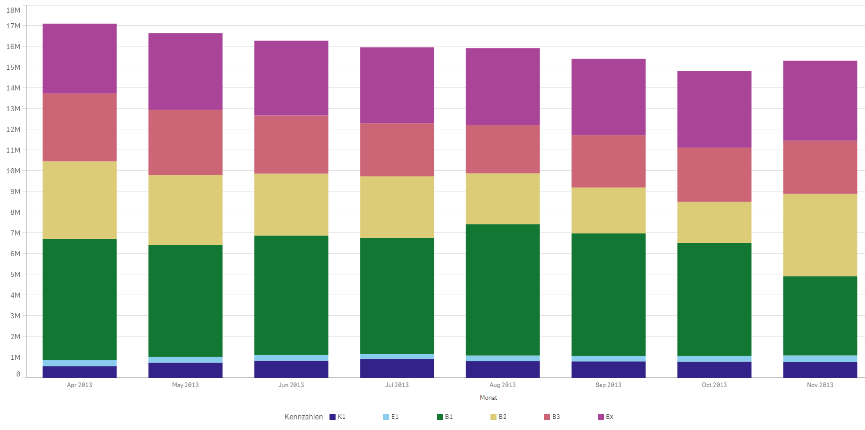
I am struggling to colour a stacked bar chart in custom colours. If you take belows chart as an example, I would like to e.g. replace the green with black, the purple with turquoise etc.
This example chart is auto-colour by QlikSense in the multicolored>12 colors mode.
I defined my custom colours as e.g. "kGreen", "kBlue" and usually use nested if-expressions to custom-colour my charts.
With the stacked bar chart, however, the issue is that my six different measures are six columns of the same facts table and the if-statements don't work.
Thank you very much for your help!
- « Previous Replies
- Next Replies »
Accepted Solutions
- Mark as New
- Bookmark
- Subscribe
- Mute
- Subscribe to RSS Feed
- Permalink
- Report Inappropriate Content
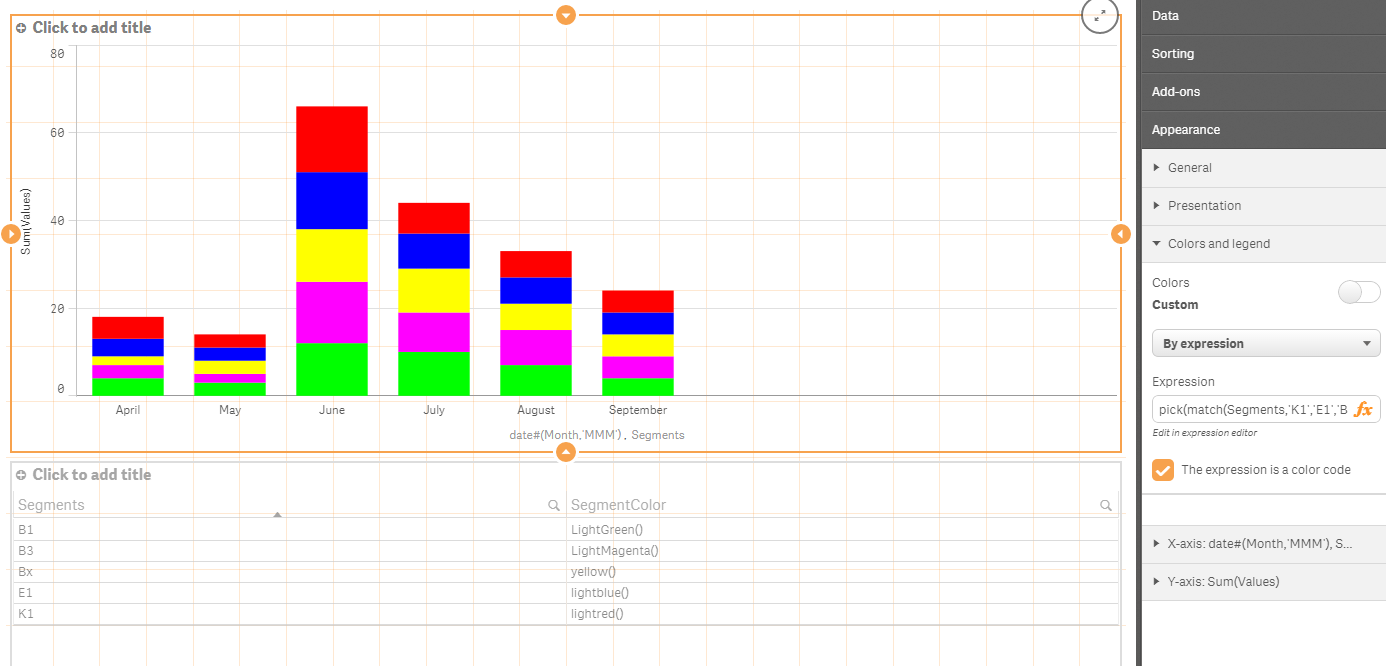
Sorry - that was the intent. For my purposes, stacks = segments.
Here is an example with this expression:
pick(match(Segments,'K1','E1','B1','B2','B3','Bx'),lightred(),lightblue(),LightGreen(),LightGray(),LightMagenta(),yellow())
Using this data load from your table above:
CrossTable(Segments, Values)
LOAD Month,
K1,
E1,
B1,
B2,
B3,
Bx
FROM
[lib://source]
(html, codepage is 1252, embedded labels, table is @1);
- Mark as New
- Bookmark
- Subscribe
- Mute
- Subscribe to RSS Feed
- Permalink
- Report Inappropriate Content
You can use your color conditions in the expression box under 'Colors and legend' > Custom colors > By Expression
- Mark as New
- Bookmark
- Subscribe
- Mute
- Subscribe to RSS Feed
- Permalink
- Report Inappropriate Content
Hi Santhosh,
thanks for your reply! Yes, I know that but I don't know how my if-expressions should look like.
Could you give me an example?
Thanks!
- Mark as New
- Bookmark
- Subscribe
- Mute
- Subscribe to RSS Feed
- Permalink
- Report Inappropriate Content
Hi David,
I think you will find this part of the video useful - Qlik Sense developer tutorial - YouTube
It starts from 49':45" and it is called "Consistent colors and good vizual design".
To make it easy for you the formula is as follows:
pick(match("OICA region",'Africa','Americas','AOME','Europe'),'springgreen','lightskyblue','violet','lightsalmon')
it allows you to match a value with a color.
Hope it's useful for you, cheers 
- Mark as New
- Bookmark
- Subscribe
- Mute
- Subscribe to RSS Feed
- Permalink
- Report Inappropriate Content
You could try something like this:
if( myExpresion > 0, red(), rgb(200,155,0))
Where my expression is the actual expression formula
- Mark as New
- Bookmark
- Subscribe
- Mute
- Subscribe to RSS Feed
- Permalink
- Report Inappropriate Content
Since your IF could get pretty big (one nested if for every unique stack) consider some alternatives:
Using 'color by expression' , the following expression assigns 5 specific colors to 5 different years (if years were the stacks)
pick( match(Year, 2009,2010,2011,2012,2013), rgb(255,0,0),rgb(0,255,0),rgb(0,0,255),rgb(255,255,0),rgb(0,255,255))
Or you can put the colors in a table in the data model with an inline table in the load editor like this. Under 'color by expression' just enter 'color'
Load * Inline [
Year,Color
2009,rgb(255,0,0)
2010,rgb(0,255,0)
2011,rgb(0,0,255)
2012,rgb(255,255,0)
2013,rgb(0,255,255)
];
- Mark as New
- Bookmark
- Subscribe
- Mute
- Subscribe to RSS Feed
- Permalink
- Report Inappropriate Content
Hi all,
thank you for your replies. I have, however, not been able to fix the problem yet.
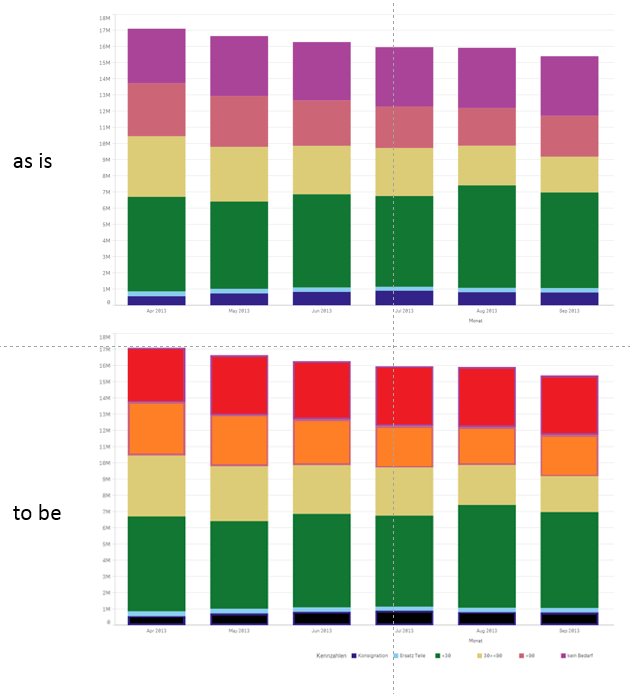
I do not want to colour each stack differently, I merely would like to "re-colour" the segments for each stacks:
The simplified underlying data model for the graph looks like the following:
| Month | K1 | E1 | B1 | B2 | B3 | Bx |
|---|---|---|---|---|---|---|
| April | 5 | 4 | 4 | 4 | 3 | 2 |
| May | 3 | 3 | 3 | 2 | 2 | 3 |
| June | 15 | 13 | 12 | 13 | 14 | 12 |
| July | 7 | 8 | 10 | 10 | 9 | 10 |
| August | 6 | 6 | 7 | 7 | 8 | 6 |
| September | 5 | 5 | 4 | 3 | 5 | 5 |
Hope this makes it clear!
- Mark as New
- Bookmark
- Subscribe
- Mute
- Subscribe to RSS Feed
- Permalink
- Report Inappropriate Content
Sorry - that was the intent. For my purposes, stacks = segments.
Here is an example with this expression:
pick(match(Segments,'K1','E1','B1','B2','B3','Bx'),lightred(),lightblue(),LightGreen(),LightGray(),LightMagenta(),yellow())
Using this data load from your table above:
CrossTable(Segments, Values)
LOAD Month,
K1,
E1,
B1,
B2,
B3,
Bx
FROM
[lib://source]
(html, codepage is 1252, embedded labels, table is @1);
- Mark as New
- Bookmark
- Subscribe
- Mute
- Subscribe to RSS Feed
- Permalink
- Report Inappropriate Content
if all the segments are always going to be present you could just change the appropriate colours in the colour tab in the chart to the ones you want.
If you want specific segments to always be displayed as specific colours then you need the if statement, which is probably best done in a variable.
Here is an example; (I used the vName to define the chart second dimension so it can be changed b the user, hence the multiple options for the colour assignment)
if(match($(vName),'Closed'),RGB(255,248,210),
if(match($(vName),'NA','Resolved'),RGB(255,247,188),
if(match($(vName),'Low','PID Requested','Tier 1','Preventative maintenance'),RGB(254,227,145),
if(match($(vName),'Medium','Open','Tier 2'),RGB(254,196,79),
if(match($(vName),'High','Waiting On A Task','Tier 3','Request For Information'),RGB(254,153,41),
if(match($(vName),'Awaiting User Feedback','Tier 4'),RGB(236,112,40),
if(match($(vName),'Onhold','Incident'),RGB(204,76,2),
if(match($(vName),'Critical','With Vendor'),RGB(153,52,4),
))))))))
- Mark as New
- Bookmark
- Subscribe
- Mute
- Subscribe to RSS Feed
- Permalink
- Report Inappropriate Content
David,
I have also been struggling with this topic.
I followed the hints that others have provided you and after some attempts I got what I think you need.
To explain what others already told you in this thread a bit further:
You create a table in the Load Script (see attached QVF file) with two columns: Segment and Values.
Then you use Month and Segment as Dimensions and Values as Measure.
[StackedBarChartTest]:
LOAD [Month],
[K1],
[E1],
[B1],
[B2],
[B3],
[Bx]
FROM [lib://Qlik/StackedBarChart.xlsx]
(ooxml, embedded labels, table is StackedBarChartTest);
CrossTable(Segments, Values)
LOAD Month,
K1,
E1,
B1,
B2,
B3,
Bx
FROM
[lib://Qlik/StackedBarChart.xlsx]
(ooxml, embedded labels, table is StackedBarChartTest);
// Chart Colours
Let K1_Colour = RGB(255,215, 15);
Let E1_Colour = RGB(255,187, 15);
Let B1_Colour = RGB(179,131, 12);
Let B2_Colour = RGB(179,106, 12);
Let B3_Colour = RGB(171,177, 11);
Let Bx_Colour = RGB(100,100,100);
To change the colours:
if(match(Segments,'K1'),K1_Colour,
if(match(Segments,'E1'),E1_Colour,
if(match(Segments,'B1'),B1_Colour,
if(match(Segments,'B2'),B2_Colour,
if(match(Segments,'B3'),B3_Colour,
if(match(Segments,'Bx'),Bx_Colour,
))))))
Hope this helps  .
.
Sadly for me,  this DOES NOT WORK for a Dimension created in the Master items section, which was what I have been looking for.
Once you add two Dimensions to a bar chart, then you can plot only ONE Measure.
If you have a Master item - Dimension, then you're stuck with whatever colours Qlik Sense gives you, no way to change them. Or at least I haven't found a solution in the Community so far and all my attempts have failed. No pick(match()...) works. Or maybe it is an advanced topic and I am not yet there  . I tried the Colour table suggested to you and it did not work... Too complicated for a newbie perhaps?
- « Previous Replies
- Next Replies »