Unlock a world of possibilities! Login now and discover the exclusive benefits awaiting you.
- Qlik Community
- :
- Forums
- :
- Analytics
- :
- New to Qlik Analytics
- :
- Re: How to use custom colours in a stacked bar cha...
- Subscribe to RSS Feed
- Mark Topic as New
- Mark Topic as Read
- Float this Topic for Current User
- Bookmark
- Subscribe
- Mute
- Printer Friendly Page
- Mark as New
- Bookmark
- Subscribe
- Mute
- Subscribe to RSS Feed
- Permalink
- Report Inappropriate Content
How to use custom colours in a stacked bar chart
Hi there,
I am struggling to colour a stacked bar chart in custom colours. If you take belows chart as an example, I would like to e.g. replace the green with black, the purple with turquoise etc.
This example chart is auto-colour by QlikSense in the multicolored>12 colors mode.
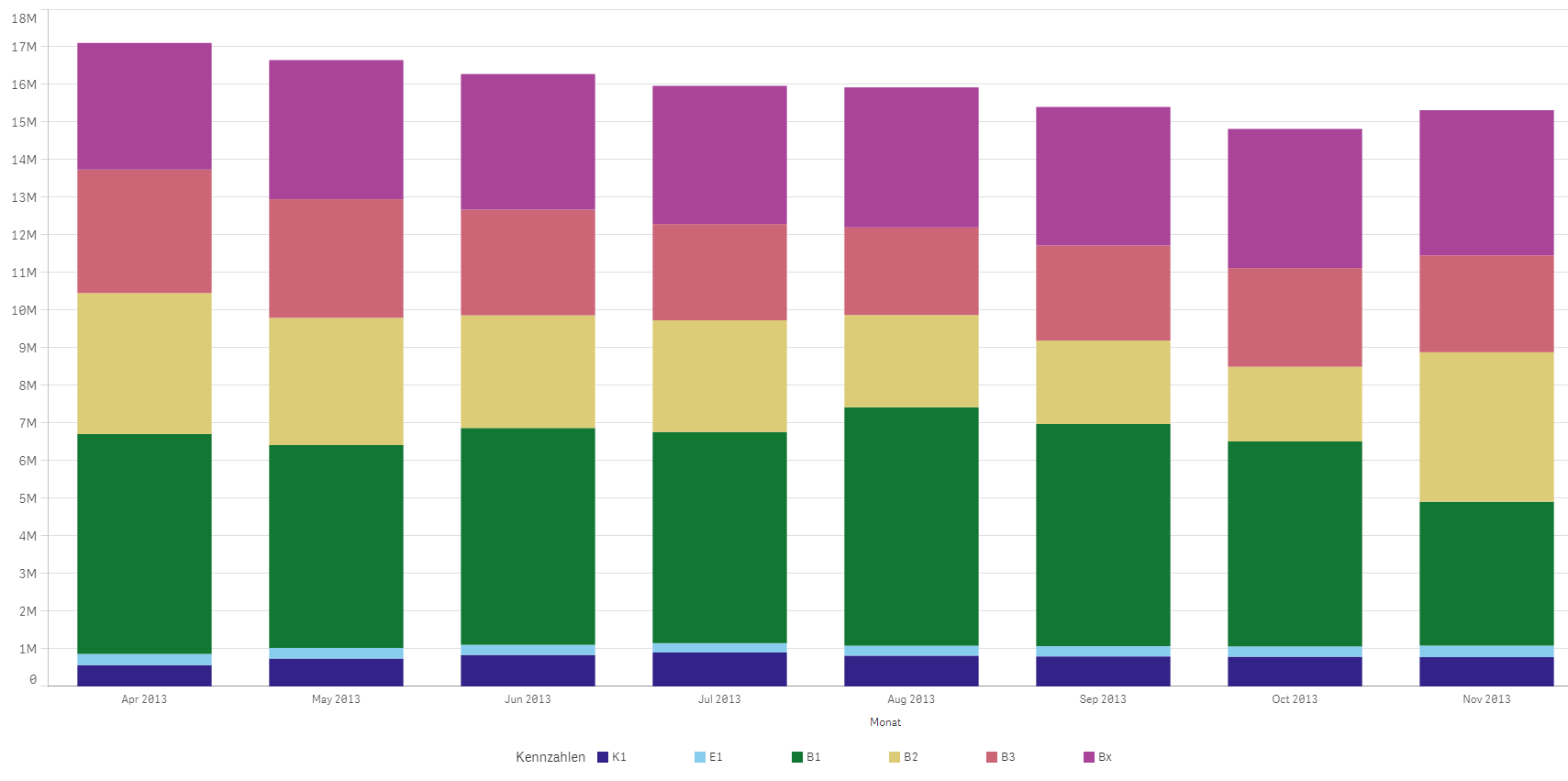
I defined my custom colours as e.g. "kGreen", "kBlue" and usually use nested if-expressions to custom-colour my charts.
With the stacked bar chart, however, the issue is that my six different measures are six columns of the same facts table and the if-statements don't work.
Thank you very much for your help!
- « Previous Replies
- Next Replies »
- Mark as New
- Bookmark
- Subscribe
- Mute
- Subscribe to RSS Feed
- Permalink
- Report Inappropriate Content
this is attached the qvw, you can notice that all segments are red.
sorry sangram, I gorgot to tell you that I have thise error message with I place the mouse over the bar chart

I give up the variable and write this formula below directly in the calculated dimension
=IF(DURATION_BENCH<=vPerfNegoTargetDurationDays,'Achieved'
,IF(DURATION_BENCH<=vPerfNegoTargetDurationDays+vPerfNegoTargetJustMissedDurationDaysZone,'Just Missed'
,'Missed'
)
)
and then the error message disappear.
And when I move the mousse over the bar first (from below), I can notice that values are corrects

You can see that the calculated dimension is "Achieved" But why this segment is RED and Not green ?
I found the solution by this formula in the color expression (note the min function). and then it works !!! thanks
=IF(min(DURATION_BENCH)<=vPerfNegoTargetDurationDays,lightgreen()
,IF(min(DURATION_BENCH)<=vPerfNegoTargetDurationDays+vPerfNegoTargetJustMissedDurationDaysZone,yellow()
,lightred()
)
)
- Mark as New
- Bookmark
- Subscribe
- Mute
- Subscribe to RSS Feed
- Permalink
- Report Inappropriate Content
hiii,
you can also use colors tab in chart properties to change the colors as you want.
Regards,
Himanshi Dubey
- Mark as New
- Bookmark
- Subscribe
- Mute
- Subscribe to RSS Feed
- Permalink
- Report Inappropriate Content
hi,
thanks but that is what is what I did first like this bellow

when a month has the 3 possible values (achieved, just missed, missed) then it works
but whenever a month has only 2 values (achieved, missed) then missed is yellow !!! and not more red !
- Mark as New
- Bookmark
- Subscribe
- Mute
- Subscribe to RSS Feed
- Permalink
- Report Inappropriate Content
hi,
its happening because a particular color represent a unique dimension for example red represents achieved yellow represents just missed and green represents missed so thats why in your second case yellow is missing.
Regards,
Himanshi Dubey
- Mark as New
- Bookmark
- Subscribe
- Mute
- Subscribe to RSS Feed
- Permalink
- Report Inappropriate Content
Hello,
I am new to the group and this is my first post/question.
I'd like to ask what is the purpose of custom colors in stacked bar charts if you are not able to display a legend of what each of those colors represent? How have you worked around this usability issue?
Thank you,
Vincent
- Mark as New
- Bookmark
- Subscribe
- Mute
- Subscribe to RSS Feed
- Permalink
- Report Inappropriate Content
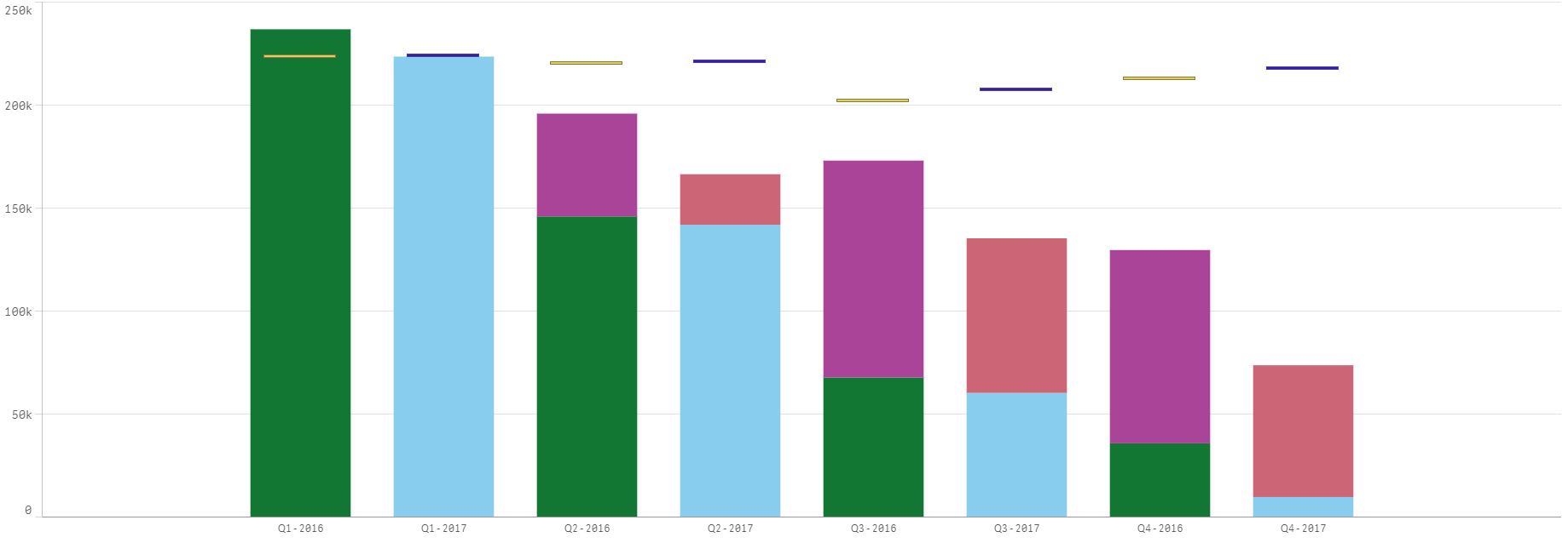
Hi. I'm trying to color Master Measures in a combo stacked bar chart. I've tried the various methods mentioned in this thread but I'm not having any luck. Either everything turns to one color or isn't colored at all.
Example of one of the measures -
***************************************
(sum( {<[Master Plan Ship Year] = {$(=MAX([Master Plan Ship Year]))}, [Plant Loading Record Type] = {'Booked'}>} [Shop Hours: Sales Total_WESESTIMATEDSHOPHOURS Code])
***************************************
The Dimension is a drill down Master Dimension with these levels:
Quarter
Month
Project
I've tried Pick(Match([Plant Loading Record Type] ,'Booked'),lightblue()) and I've tried loading in an Inline table housing the [Plant Loading Record Type] and an RGB code. Nothing seems to work. I've also used
"ColorMix2( (rank(total column(1))/(noofrows(TOTAL)/2))-1 ,$(vColorMixDark), $(vColorMixLight),$(vColorMixMiddle))".
It colors the bars but not the individual measures within the bar.
Any tips or advice?
- Mark as New
- Bookmark
- Subscribe
- Mute
- Subscribe to RSS Feed
- Permalink
- Report Inappropriate Content
But if I followed this method, the "Legend" of the bar chart would dispear.
- Mark as New
- Bookmark
- Subscribe
- Mute
- Subscribe to RSS Feed
- Permalink
- Report Inappropriate Content
But the Legend disappear
- Mark as New
- Bookmark
- Subscribe
- Mute
- Subscribe to RSS Feed
- Permalink
- Report Inappropriate Content
Hi sagram, the QVF file is not opening in qlik sense, infact it is not a file type qlik sense recognizes, how can i get it
- « Previous Replies
- Next Replies »