Unlock a world of possibilities! Login now and discover the exclusive benefits awaiting you.
- Qlik Community
- :
- Forums
- :
- Analytics
- :
- New to Qlik Analytics
- :
- Incorrect value representation in Funnel Chart
- Subscribe to RSS Feed
- Mark Topic as New
- Mark Topic as Read
- Float this Topic for Current User
- Bookmark
- Subscribe
- Mute
- Printer Friendly Page
- Mark as New
- Bookmark
- Subscribe
- Mute
- Subscribe to RSS Feed
- Permalink
- Report Inappropriate Content
Incorrect value representation in Funnel Chart
Hello All,
I have a doubt with the newly introduced funnel chart in Qliksense. I have attached two representations,
One with funnel chart and second with the Pie chart. The representation of Percent values in Pie Chart are correct but the funnel chart values are incorrect. For the Top Value of Funnel chart it always gives 100% can anyone
plz explain what is the reason of this incorrect representation of values.
Thanks & Regards, Tahreen
- Mark as New
- Bookmark
- Subscribe
- Mute
- Subscribe to RSS Feed
- Permalink
- Report Inappropriate Content
Hi Tahreen,
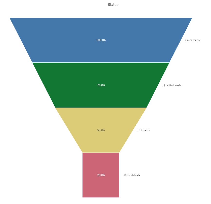
That's how a funnel chart works. Out of 100% it shows how many remains through the different stages passing through the funnel and then out at the bottom.
To quote wikipedia: https://en.wikipedia.org/wiki/Funnel_chart
"A funnel chart displays values as progressively decreasing proportions amounting to 100 percent in total. The size of the area is determined by the series value as a percentage of the total of all values.[2] Any funnel consists of the higher part called head (or base) and the lower part referred to as neck.[3]"
Since it's a process chart it often uses different data than a pie chart. Here is an example showing how many % of an initial contact makes it to the end.

Regards,
Patrik.
- Mark as New
- Bookmark
- Subscribe
- Mute
- Subscribe to RSS Feed
- Permalink
- Report Inappropriate Content
Ok got it![]() Thanks.......
Thanks.......