Unlock a world of possibilities! Login now and discover the exclusive benefits awaiting you.
- Qlik Community
- :
- Forums
- :
- Analytics
- :
- New to Qlik Analytics
- :
- Is it possible to coloring a Graphic by range of v...
- Subscribe to RSS Feed
- Mark Topic as New
- Mark Topic as Read
- Float this Topic for Current User
- Bookmark
- Subscribe
- Mute
- Printer Friendly Page
- Mark as New
- Bookmark
- Subscribe
- Mute
- Subscribe to RSS Feed
- Permalink
- Report Inappropriate Content
Is it possible to coloring a Graphic by range of values?
Hello,
I'd like to make my bars graphic to have a certain shade of color, according to pre-set values.. for instance, values ranging from 0 - 20% light blue, 21-40% slightly darker blue and so on.
Is that possible?
My biggest issue is that I've built a graphic that has several Y-axis options.. when I choose color by measure, it doesnt respond to the change of Y-axis and keeps coloring with the information of my first Y-axis option.
Tks,
Audrey
- Mark as New
- Bookmark
- Subscribe
- Mute
- Subscribe to RSS Feed
- Permalink
- Report Inappropriate Content
Can you share the sample app or data along with given expression and dim?
Thanks.
- Mark as New
- Bookmark
- Subscribe
- Mute
- Subscribe to RSS Feed
- Permalink
- Report Inappropriate Content
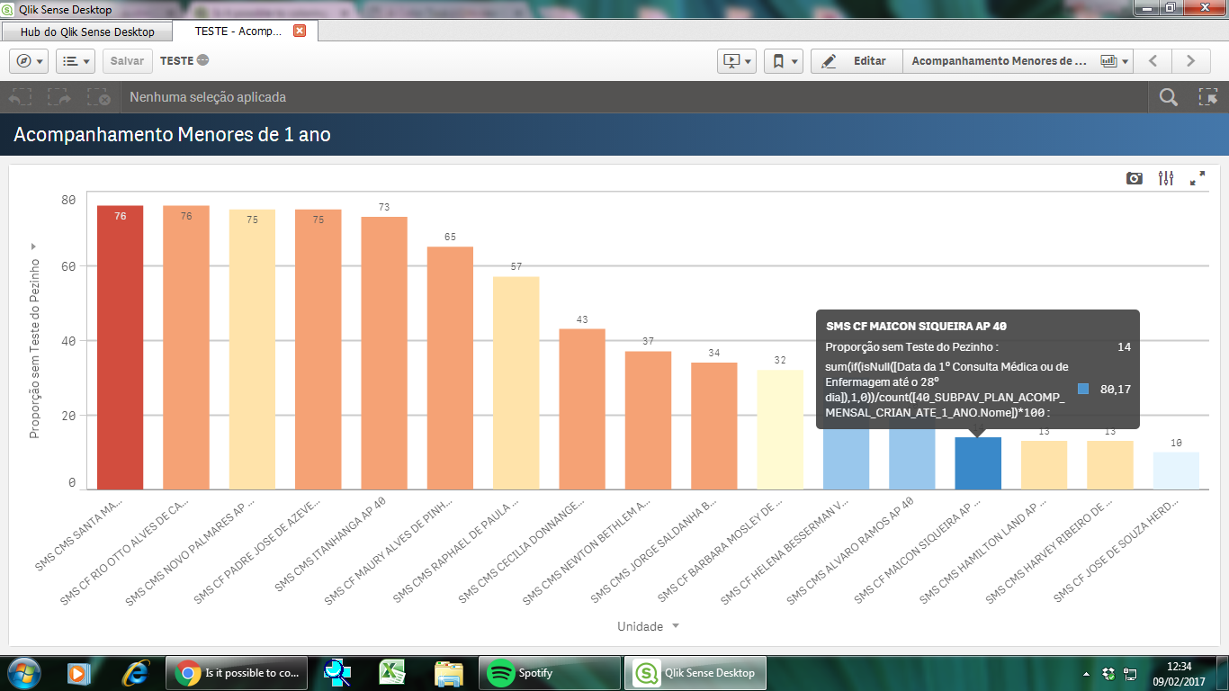
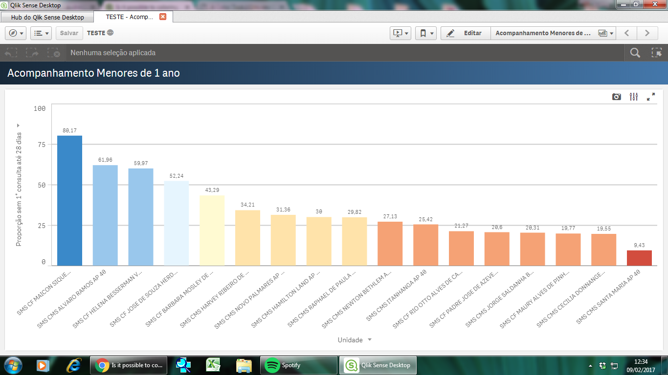
Sure. Here is one of the graphics..
What I would like is the color scale to change when I change the Y axis.. so far I managed to make that happen for one of the Y options, but the color.
But where can I attach a qvf file? It´s not showing as an option.. I'm adding images to try to explain what I mean. What I wanted was for this graphics to have the same coloring effect, left blueish and far right red. As you can see, the coloring is coming from the formula I used to create the values for the second graphic.
All my Y-axis are calculated in the same way... sum(if(Column1='',1,0))/count(ColumnWithID)*100. My X value has the units I'd like to compare..
Thank you so much for your help! ! !