Unlock a world of possibilities! Login now and discover the exclusive benefits awaiting you.
- Qlik Community
- :
- Forums
- :
- Analytics
- :
- New to Qlik Analytics
- :
- Re: Is there a way to hide the labels in a table i...
- Subscribe to RSS Feed
- Mark Topic as New
- Mark Topic as Read
- Float this Topic for Current User
- Bookmark
- Subscribe
- Mute
- Printer Friendly Page
- Mark as New
- Bookmark
- Subscribe
- Mute
- Subscribe to RSS Feed
- Permalink
- Report Inappropriate Content
Is there a way to hide the labels in a table in qliksense ?
Hi Friends,
I am trying to hide the labels with a table in qliksense. In the given screenshot, I don't want the highlighted "SiteType" and "# Of Sites" to show up. In qlikview, this was just as easy as giving a space character in the 'label' field corresponding to any dimension or expression, but qliksense doesn't behave that way.
Any clue or workaround ?

Regards,
Vishnu S
- « Previous Replies
-
- 1
- 2
- Next Replies »
- Mark as New
- Bookmark
- Subscribe
- Mute
- Subscribe to RSS Feed
- Permalink
- Report Inappropriate Content
If it's just those two measures why not display them as 2 KPIs
- Mark as New
- Bookmark
- Subscribe
- Mute
- Subscribe to RSS Feed
- Permalink
- Report Inappropriate Content
Cannot completely hid the labels but if you give any special character instead of Site Type
like =!, =@ or =# it will give label as -
But unfortunately cannot hide it.
- Mark as New
- Bookmark
- Subscribe
- Mute
- Subscribe to RSS Feed
- Permalink
- Report Inappropriate Content
If it is a dimension like your first column, I usually use "Search" as the column name as there is a search icon there.
For expressions, I will use "." (one point).
I hate this too. I want to have space as the name sometimes but so far we have to live with it...
Good luck!
Fei.
- Mark as New
- Bookmark
- Subscribe
- Mute
- Subscribe to RSS Feed
- Permalink
- Report Inappropriate Content
Putting Space ' ' at labes used to work with versions below than 3.0 .
It doesn't work in later versions.
- Mark as New
- Bookmark
- Subscribe
- Mute
- Subscribe to RSS Feed
- Permalink
- Report Inappropriate Content
Thanks for the suggetion Andy.
Well, this itself was not the requirement. I ran into this problem while I was trying to get around another limitation.
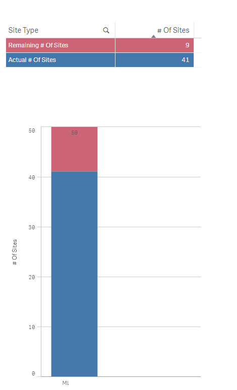
I wanted to show a stacked bar with just two values (Given a choice I would have very well used a pie/doughnut chart for this use case but sometimes the users are very specific). As you know, qliksense wouldn't show the values inside the segments of a stack which left me with an idea to show the split in a small table above the chart as shown below. That is when I found that you cannot do away with the labels 
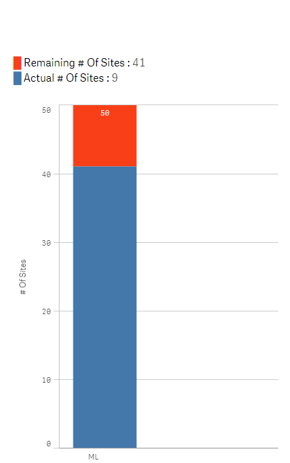
Anyway, thanks to that. I found an even cleaner way to show the split info above the chart using a text object by embedding colored special characters and expressions with in. My colleague helped me with that. The new solution is shown below.
Thanks everyone for the suggestions.
- Mark as New
- Bookmark
- Subscribe
- Mute
- Subscribe to RSS Feed
- Permalink
- Report Inappropriate Content
Looks very nice.
Could you have put the text with sub totals into the sub title of your chart, include a legend and made the title # of Sites removing the need for the axis label.
Please mark any replies as either HELPFULL/CORRECT.
Regards
Andy
- Mark as New
- Bookmark
- Subscribe
- Mute
- Subscribe to RSS Feed
- Permalink
- Report Inappropriate Content
Looking more closely it looks like your colour assignment is the wrong way round in your text box compared to your chart. I'd use the built in legend as you will never know when the palate might flip based on values being returned in your chart.
- Mark as New
- Bookmark
- Subscribe
- Mute
- Subscribe to RSS Feed
- Permalink
- Report Inappropriate Content
Hi Vishnu,
Try to give a text colour 'white' to Site type and #of Site field names .This is not exact solution but that two names won't be visible.
Regards,
M Subash Chandra.
- Mark as New
- Bookmark
- Subscribe
- Mute
- Subscribe to RSS Feed
- Permalink
- Report Inappropriate Content
You can not change color of labels in qliksense
- « Previous Replies
-
- 1
- 2
- Next Replies »