Unlock a world of possibilities! Login now and discover the exclusive benefits awaiting you.
- Qlik Community
- :
- Forums
- :
- Analytics
- :
- New to Qlik Analytics
- :
- Issue with trend line chart
Options
- Subscribe to RSS Feed
- Mark Topic as New
- Mark Topic as Read
- Float this Topic for Current User
- Bookmark
- Subscribe
- Mute
- Printer Friendly Page
Turn on suggestions
Auto-suggest helps you quickly narrow down your search results by suggesting possible matches as you type.
Showing results for
Anonymous
Not applicable
2018-01-29
11:00 AM
- Mark as New
- Bookmark
- Subscribe
- Mute
- Subscribe to RSS Feed
- Permalink
- Report Inappropriate Content
Issue with trend line chart
Hi all,
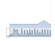
I am trying to create a trend line chart, but not sure why the chart is being split into 2 rows as below. I only have one dimension and one measure. I am trying to show a small chart (sales trend by month).
Any thoughts?
Thanks,
AK
358 Views
1 Reply
Creator
2018-01-29
11:51 AM
- Mark as New
- Bookmark
- Subscribe
- Mute
- Subscribe to RSS Feed
- Permalink
- Report Inappropriate Content
Hi aiswaryask ,
These are not 2 rows. In fact, it only displays an expression by 1 dimension. As the widht of your visualization is too small with respect to the whole x-axis range, it creates an horizontal scrolling bar beneath your trend line.
Try expanding the visualization and scroll the horizontal bar to see the whole range of values.
Hope this clarifies your misunderstanding
Community Browser