Unlock a world of possibilities! Login now and discover the exclusive benefits awaiting you.
- Qlik Community
- :
- Forums
- :
- Analytics
- :
- New to Qlik Analytics
- :
- Re: KPI for the percent of names appearing in a co...
- Subscribe to RSS Feed
- Mark Topic as New
- Mark Topic as Read
- Float this Topic for Current User
- Bookmark
- Subscribe
- Mute
- Printer Friendly Page
- Mark as New
- Bookmark
- Subscribe
- Mute
- Subscribe to RSS Feed
- Permalink
- Report Inappropriate Content
KPI for the percent of names appearing in a column 2 or more times
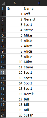
I am trying to write a script or chart function that would display a percentage in a KPI for the percent of people on the below list appearing 2 or more times. I attempted to write a function for it, but could only get it to return yes or no when satisfying the criteria.
- Mark as New
- Bookmark
- Subscribe
- Mute
- Subscribe to RSS Feed
- Permalink
- Report Inappropriate Content
if the challenge is to report only those that have counts >=2, you can use this in your set analysis
{<Name={"=count(Name)>=2"}>}
the following picture shows individual counts and their %, and similar table but only for counts > 2
- Mark as New
- Bookmark
- Subscribe
- Mute
- Subscribe to RSS Feed
- Permalink
- Report Inappropriate Content
Thank you for your assistance! This was extremely helpful. We needed the percentage of distinct names that met the criteria and your set expression lead us to that, so thank you!
Do you know how would we modify the set expression to show us the percentage on a monthly basis with a line chart?
- Mark as New
- Bookmark
- Subscribe
- Mute
- Subscribe to RSS Feed
- Permalink
- Report Inappropriate Content
if your data has the month field, you dont need to modify the expression. add the month as your dimension in your line chart, add the expression as your measure. it will make the calculation per month.
but this means it will do the count only for those with names showing up 2 or more times PER month
- Mark as New
- Bookmark
- Subscribe
- Mute
- Subscribe to RSS Feed
- Permalink
- Report Inappropriate Content
thank you very much Edwin and Worker_Bee! This is really useful as a beginner. Suppose I wanted my set expression to calculate whether the condition of the name appearing more than two times was satisfied, and this condition used the full calendar year - I don't want the count to calculate this condition being satisfied per month, but on a yearly basis. How would the expression be modified to accomplish this? Really appreciate your expertise, Edwin!
- Mark as New
- Bookmark
- Subscribe
- Mute
- Subscribe to RSS Feed
- Permalink
- Report Inappropriate Content
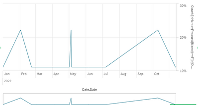
Still having difficulties here for some reason. I have added the date to the line chart visualization as dimension with the measure as name with the chart expression:
Count({<Name={"=count(Name)>=2"}>}Distinct Name)/Count(total Distinct Name)
It produces:
I am looking for the y-axis to be the percentage of people who have satisfied the >=2 criteria as the year goes on, with months being the x-axis.
- Mark as New
- Bookmark
- Subscribe
- Mute
- Subscribe to RSS Feed
- Permalink
- Report Inappropriate Content
since you apparently have sparce data, a line chart may not be the best visual, try using a bar chart.
is the calculation incorrect?


