Unlock a world of possibilities! Login now and discover the exclusive benefits awaiting you.
- Qlik Community
- :
- Forums
- :
- Analytics
- :
- New to Qlik Analytics
- :
- Limiting a Pie Chart - And Filtering a Pie Chart
- Subscribe to RSS Feed
- Mark Topic as New
- Mark Topic as Read
- Float this Topic for Current User
- Bookmark
- Subscribe
- Mute
- Printer Friendly Page
- Mark as New
- Bookmark
- Subscribe
- Mute
- Subscribe to RSS Feed
- Permalink
- Report Inappropriate Content
Limiting a Pie Chart - And Filtering a Pie Chart
Hi -
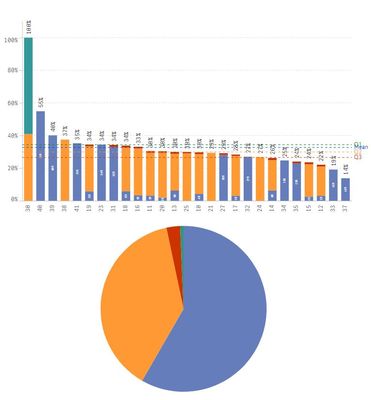
I'm trying to convert a bar graph to a pie chart. My bar graph is a stacked bar and I want each color from the bar graph to become a slice in my pie chart. I'm having a hard time figuring out what restrictions to put on my expressions for the pie chart. I have multiple years of data. Each piece in my bar chart has an equation like this:
(this is for the blue piece in the bar chart, to change to the other pieces I change the color in the first sum equ)
=(Avg({1<Year = {$(=Max(num#(Year ,'####')))}>} Aggr(
Sum({1<QPermID={"Stack_Blue*"}>}Response)/
Sum({1<QPermID={"Stack*"}>}Response)
,CompanyID,Year)))
That way I can specify which year of data I want to look at and it sorts it by CompanyID (the two digit codes at the bottom of my bar graph). I'm looking to make two pie charts. One will show the average for a specified year for all companies. The next will show the data specific to one CompanyID (so, if I selected CompanyID 30, I would get a pie that showed 41% yellow, 59% teal). I cannot figure out what I need to do in my dimensions, measures for my pie chart to create either of these. The current pie is for all years, I think. It's close, but I need to just show one year of data. And I cannot figure out where to put the limitation of just one CompanyID for the second pie.
Right now my pie dimension is:
=ColorName (which is the color specification)
My pie measure is:
=Sum({1<QPermID={"Stack_Blue*","Stack_Yellow*","Stack_Red*","Stack_Teal*"}>}Response)
Any suggestions would be appreciated! THANK YOU!
