Unlock a world of possibilities! Login now and discover the exclusive benefits awaiting you.
- Qlik Community
- :
- Forums
- :
- Analytics
- :
- New to Qlik Analytics
- :
- Re: Limiting the values on a line chart
- Subscribe to RSS Feed
- Mark Topic as New
- Mark Topic as Read
- Float this Topic for Current User
- Bookmark
- Subscribe
- Mute
- Printer Friendly Page
- Mark as New
- Bookmark
- Subscribe
- Mute
- Subscribe to RSS Feed
- Permalink
- Report Inappropriate Content
Limiting the values on a line chart
Hi All,
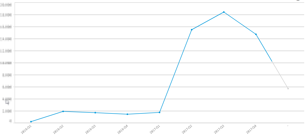
I have the following problem with line chart created in QlikSense (see the picture and the description below).
The graph represents count of customer requests for each quarter and the expression on the X-axis is an IF function: if(quarterend(Date<Today(),YearQuarter). Therefore, I would expect the values on the X-axis to display data until 2017 Q4 as this is the last full quarter that has been completed. However, there is a grey line after that point that shows the count of requests for the first month of 2018 which should not be there.
Can anyone advise how to fix it? I tried different options but could not eliminate the problem. I think this is a QlikSense-specific problem as the same graph works perfectly fine in QV.
Thanks a lot in advance!
Accepted Solutions
- Mark as New
- Bookmark
- Subscribe
- Mute
- Subscribe to RSS Feed
- Permalink
- Report Inappropriate Content
Under your dimension: uncheck show null values
- Mark as New
- Bookmark
- Subscribe
- Mute
- Subscribe to RSS Feed
- Permalink
- Report Inappropriate Content
looks like you are using if function on the measure
try to put Null in Else space.
- Mark as New
- Bookmark
- Subscribe
- Mute
- Subscribe to RSS Feed
- Permalink
- Report Inappropriate Content
Under your dimension: uncheck show null values
- Mark as New
- Bookmark
- Subscribe
- Mute
- Subscribe to RSS Feed
- Permalink
- Report Inappropriate Content
Hi Omar,
that indeed made the trick  I used this option before and the graph didn't update for some reason, I gave it another shot yesterday though and now the grey line is gone. Thank you for your time and advice
- Mark as New
- Bookmark
- Subscribe
- Mute
- Subscribe to RSS Feed
- Permalink
- Report Inappropriate Content
good to know !
Then, if ur question has been asnwered, please make sure to close the thread by marking the correct answer as correct