Unlock a world of possibilities! Login now and discover the exclusive benefits awaiting you.
- Qlik Community
- :
- Forums
- :
- Analytics
- :
- New to Qlik Analytics
- :
- Re: Line Chart Navigators A Nuisance
- Subscribe to RSS Feed
- Mark Topic as New
- Mark Topic as Read
- Float this Topic for Current User
- Bookmark
- Subscribe
- Mute
- Printer Friendly Page
- Mark as New
- Bookmark
- Subscribe
- Mute
- Subscribe to RSS Feed
- Permalink
- Report Inappropriate Content
Line Chart Navigators A Nuisance
Hi,
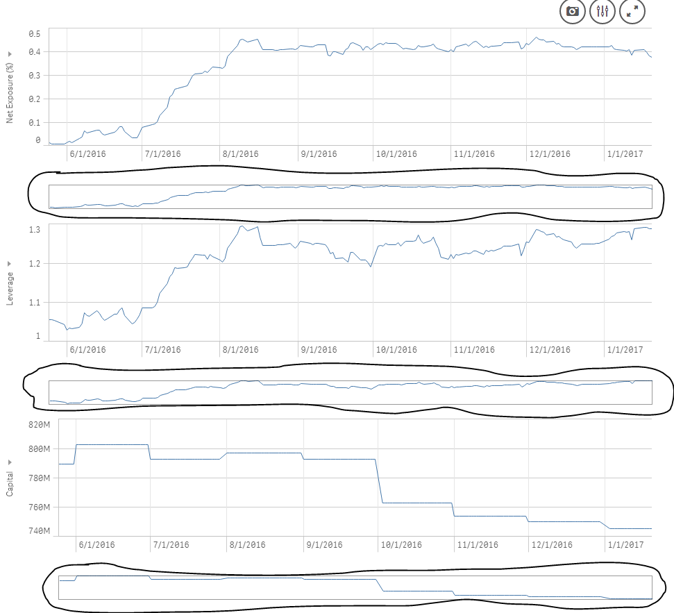
I read through different forums from several years ago and it seems like this has been a pain point for other QlikSense users with no apparent solution. I just want someone to correct me if this is not still the case that I have no choice but to busy-up my application with these navigator bars, despite the range of the data being covered in the X-Axis in the graph. I was spinning my wheels with both a line graph and a combo graph as a line graph trying to get rid of these things with no success. I know I have the option of de-selecting "Continuous" and having every data point labeled on the axis and having the graph rescale so that it is only partially displayed. I like the graphs the way they are, but just want to suppress those unwanted mini-me graphs that show up.
- Mark as New
- Bookmark
- Subscribe
- Mute
- Subscribe to RSS Feed
- Permalink
- Report Inappropriate Content
In my current Sense version (3.1.4), the navigator disappears when the entire range is visible. What version are you on?
-Rob
- Mark as New
- Bookmark
- Subscribe
- Mute
- Subscribe to RSS Feed
- Permalink
- Report Inappropriate Content
Hi,
In the Presentation tab, just try to un-check the "Use Continuous Scale" option.
- Mark as New
- Bookmark
- Subscribe
- Mute
- Subscribe to RSS Feed
- Permalink
- Report Inappropriate Content
Thanks for the reply.
Version is Qlik Sense Desktop 3.1 SR4; qliksensedesktop 10.7.3
I restricted the data to a shorter time series and it does not matter, the little navigator graph shows up
- Mark as New
- Bookmark
- Subscribe
- Mute
- Subscribe to RSS Feed
- Permalink
- Report Inappropriate Content
Hi Yasmeen,
Thanks for the reply. I did notice that clicking continuous and the navigator chart disappears. However, the graph rescales and lables every X-axis point. I would like to be able to pdf the graphs covering the entire series and I honestly do not need labels for every X-axis point. I like the graph with continuous checked, I just do not want the navigator charts given that all of the data points on the X-axis are in the chart. Any other idea?
Thanks!
