Unlock a world of possibilities! Login now and discover the exclusive benefits awaiting you.
- Qlik Community
- :
- Forums
- :
- Analytics
- :
- New to Qlik Analytics
- :
- Re: Line chart measure dependent on dimension
- Subscribe to RSS Feed
- Mark Topic as New
- Mark Topic as Read
- Float this Topic for Current User
- Bookmark
- Subscribe
- Mute
- Printer Friendly Page
- Mark as New
- Bookmark
- Subscribe
- Mute
- Subscribe to RSS Feed
- Permalink
- Report Inappropriate Content
Line chart measure dependent on dimension
Hi Qlik Community,
I have created a line chart, with dates on the x-axis and a rangesum for a stock level on the y-axis. The stock is the sum of the stock since "the beginning of time" (2007 ish in my case), however I only want to show on my chart 2015 onwards. When I filter to show only 2015 onwards, the measure recalculates the sum since the new beginning of time (my 2015 filter) and the values change.
Does any one know how to de-couple the measure from the dimension, in a way that will preserve a range sum since the beginning of the data set, when filtering my dimension?
- Tags:
- line chart
- rangesum
- Subscribe by Topic:
-
above
-
de couple
-
Deall
-
dimension
-
help
-
LineChartExpression
-
Stock turnover
- « Previous Replies
-
- 1
- 2
- Next Replies »
- Mark as New
- Bookmark
- Subscribe
- Mute
- Subscribe to RSS Feed
- Permalink
- Report Inappropriate Content
try multiplying the EXPRESION WITH
avg({<Year={2015,2016,2017,2018}>}1) // you can changes your field accordingly
Edit: Please don't make the year static and use some expression to make this dynamic.
- Mark as New
- Bookmark
- Subscribe
- Mute
- Subscribe to RSS Feed
- Permalink
- Report Inappropriate Content
change ur Measure from:
Rangesum(Above(
sum(In-Out)
,0,rowno()))
to :
Aggr( {<YourDateDimension>}
Rangesum(Above(
sum(In-Out)
,0,rowno()))
,YourDateDimension)
Result per analogy:
With no selection:
Now I select from week 35 (128.88M)
If u want to ONLY SELECT WEEK 35 and get all the data since 35:
sum({<YourDateDimension={">=$(=min(YourDateDimension))"}>}aggr({<YourDateDimension>}
RangeSum(above(
Sum({<YourDateDimension>}In-Out)
,0,RowNo()))
,YourDateDimension))
- Mark as New
- Bookmark
- Subscribe
- Mute
- Subscribe to RSS Feed
- Permalink
- Report Inappropriate Content
It's never a good idea to build static expressions Pradosh
- Mark as New
- Bookmark
- Subscribe
- Mute
- Subscribe to RSS Feed
- Permalink
- Report Inappropriate Content
I guess the OP wants the number to not start from zero from the year he wanted hence the solution.
- Mark as New
- Bookmark
- Subscribe
- Mute
- Subscribe to RSS Feed
- Permalink
- Report Inappropriate Content
Please see my reply, I think that's what he wants to achieve.
- Mark as New
- Bookmark
- Subscribe
- Mute
- Subscribe to RSS Feed
- Permalink
- Report Inappropriate Content
Hi OmarBenSalem,
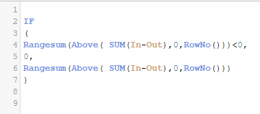
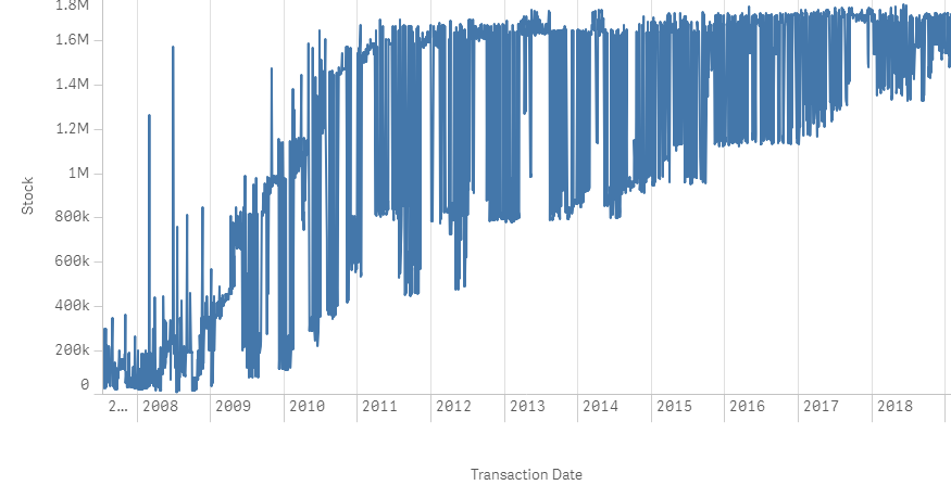
Thank you for your contribution. I applied your solution as follows and experienced a strange effect on my graph. Do you know how to resolve this? I have a feeling it may be something to do with the Aggr function?
- Mark as New
- Bookmark
- Subscribe
- Mute
- Subscribe to RSS Feed
- Permalink
- Report Inappropriate Content
Can u please uncheck continous axis under the x-axis tab and select only the last month u have so that we could see what had happened?
- Mark as New
- Bookmark
- Subscribe
- Mute
- Subscribe to RSS Feed
- Permalink
- Report Inappropriate Content
I have a day by day axis so I am looking to show the continuous aspect in my chart, however I have filtered to just one month, January 2017, to check it out. It seems this aggregation is increasing the raw data values markedly (see screenshot) as no data points in this month reach 1.7m, so I think perhaps I'm basing it incorrectly
- Mark as New
- Bookmark
- Subscribe
- Mute
- Subscribe to RSS Feed
- Permalink
- Report Inappropriate Content
Reattach the same image with data points checked with the values (under presentation tab)
and add a new line chart with ur basic measure:
sum(In-Out)
I want to compare the 2 to see what the rangesum does
- « Previous Replies
-
- 1
- 2
- Next Replies »


