Unlock a world of possibilities! Login now and discover the exclusive benefits awaiting you.
- Qlik Community
- :
- Forums
- :
- Analytics
- :
- New to Qlik Analytics
- :
- Make an evolutionary graph of my sales, compared t...
- Subscribe to RSS Feed
- Mark Topic as New
- Mark Topic as Read
- Float this Topic for Current User
- Bookmark
- Subscribe
- Mute
- Printer Friendly Page
- Mark as New
- Bookmark
- Subscribe
- Mute
- Subscribe to RSS Feed
- Permalink
- Report Inappropriate Content
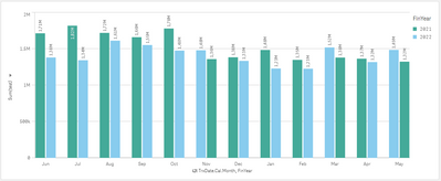
Make an evolutionary graph of my sales, compared to the previous year.
I need to make a graph or table where an evolutionary graph of sales is observed and that I can compare with the same month of the previous year.
Attached example image.
- Subscribe by Topic:
-
Chart
-
Developers
-
dimension
-
expression
-
filter
-
General Question
-
Script
-
Set Analysis
-
Variables
-
Visualization
Accepted Solutions
- Mark as New
- Bookmark
- Subscribe
- Mute
- Subscribe to RSS Feed
- Permalink
- Report Inappropriate Content
Create a "yearmonth" field for your date, I would go with "Date(MonthStart(trxdate),'MMMM yyyy')".
You can then add this yearmonth field to your chart as the dimension and you can then add 2 measures.
- Mark as New
- Bookmark
- Subscribe
- Mute
- Subscribe to RSS Feed
- Permalink
- Report Inappropriate Content
Hi @Richard3
I tend to do timeline based charts on line charts, but you can do the same on a bar chart as required.
Create dimensions for month and year, add both to your chart and your measure.
- Mark as New
- Bookmark
- Subscribe
- Mute
- Subscribe to RSS Feed
- Permalink
- Report Inappropriate Content
I need to have a timeline for example of two years with months and years where the production is seen and another line that shows me the comparison of the production against the previous year, as well as the one I place in the image, is this possible?
- Mark as New
- Bookmark
- Subscribe
- Mute
- Subscribe to RSS Feed
- Permalink
- Report Inappropriate Content
Create a "yearmonth" field for your date, I would go with "Date(MonthStart(trxdate),'MMMM yyyy')".
You can then add this yearmonth field to your chart as the dimension and you can then add 2 measures.
