Unlock a world of possibilities! Login now and discover the exclusive benefits awaiting you.
- Qlik Community
- :
- Forums
- :
- Analytics
- :
- New to Qlik Analytics
- :
- Re: Missing data points in scatter plot
- Subscribe to RSS Feed
- Mark Topic as New
- Mark Topic as Read
- Float this Topic for Current User
- Bookmark
- Subscribe
- Mute
- Printer Friendly Page
- Mark as New
- Bookmark
- Subscribe
- Mute
- Subscribe to RSS Feed
- Permalink
- Report Inappropriate Content
Missing data points in scatter plot
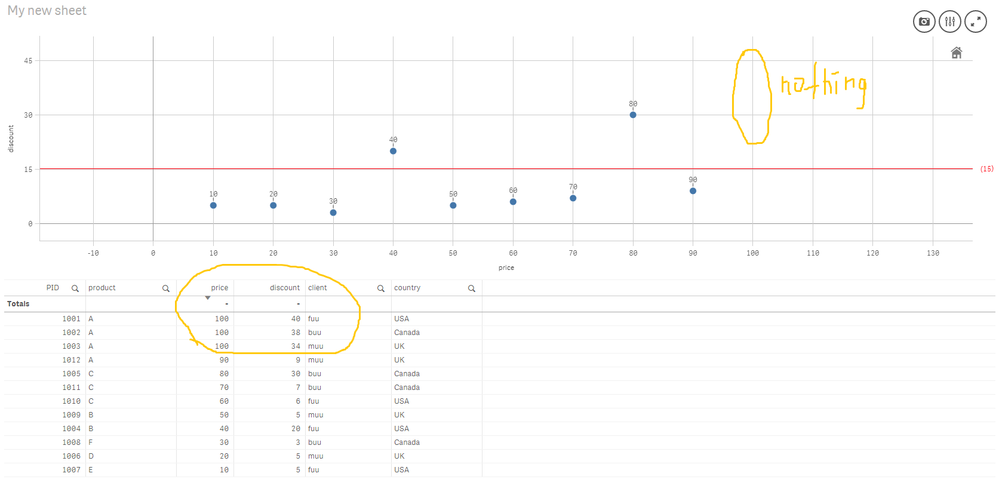
Hello, i am creating an app to visualize the distribution of product prices and discounts they got using scatter plot. The problem is that when there are overlapping values, the points doesn't show up at all. On the picture are three products with price of 100$ as showed in the table (dummy dataset), but they do not appear in the scatter plot. Why? Am i missing sth?
This is Qlik Sense 2019 april version. I would appreciate some input from the community!
Accepted Solutions
- Mark as New
- Bookmark
- Subscribe
- Mute
- Subscribe to RSS Feed
- Permalink
- Report Inappropriate Content
Check the attached app.
- Mark as New
- Bookmark
- Subscribe
- Mute
- Subscribe to RSS Feed
- Permalink
- Report Inappropriate Content
Hi
I think you may be using Price as a dimension, in which case your data point for 100 would actually lie on 300 assuming you are using Sum as your aggregation function for measure.
Regards,
Chirag
- Mark as New
- Bookmark
- Subscribe
- Mute
- Subscribe to RSS Feed
- Permalink
- Report Inappropriate Content
Yeah, price is my dimension and measure for the x-axis as well, without any aggregation though. Discount is my y-axis measure.
- Mark as New
- Bookmark
- Subscribe
- Mute
- Subscribe to RSS Feed
- Permalink
- Report Inappropriate Content
That is your problem. Since you are not using an aggregation function, where there are multiple values for a dimension value, it is returned as an array of values and treated as null by the chart. Essentially it equates to using the only function.
Where there is only one value per dimension value, it will show on the chart.
Always use aggregation functions in your expressions !
Regards,
Chirag
- Mark as New
- Bookmark
- Subscribe
- Mute
- Subscribe to RSS Feed
- Permalink
- Report Inappropriate Content
Thx for understanding the situation and providing insights about how it works behind the scenes.
However, what i want to achieve is to plot the multiple values anyway, so that the client can see and select them on the scatter plot. Other corresponding diagrams (e.g. the table below) should update accordingly. Is there a way to achieve that, maybe an appropriate aggregation?
Regards
Irving
- Mark as New
- Bookmark
- Subscribe
- Mute
- Subscribe to RSS Feed
- Permalink
- Report Inappropriate Content
Check the attached app.
- Mark as New
- Bookmark
- Subscribe
- Mute
- Subscribe to RSS Feed
- Permalink
- Report Inappropriate Content
- Mark as New
- Bookmark
- Subscribe
- Mute
- Subscribe to RSS Feed
- Permalink
- Report Inappropriate Content
Hi Irving, that's correct. The rowno caters for situations where the price and discount are same for a client or country. You could also use the PID but as a principle it's better to use numeric fields when aggregating.
Please mark it as resolved, if it is what you are looking for.
Ta
