Unlock a world of possibilities! Login now and discover the exclusive benefits awaiting you.
- Qlik Community
- :
- Forums
- :
- Analytics
- :
- New to Qlik Analytics
- :
- Re: Most current salary
- Subscribe to RSS Feed
- Mark Topic as New
- Mark Topic as Read
- Float this Topic for Current User
- Bookmark
- Subscribe
- Mute
- Printer Friendly Page
- Mark as New
- Bookmark
- Subscribe
- Mute
- Subscribe to RSS Feed
- Permalink
- Report Inappropriate Content
Most current salary
I have a table with Salary history. I am trying to show a line chart with salary change over time. What should be the measure if my dimension is year>Month>? If there is no salary entry for a particular month I would like to show the last applicable salary. For instance, for E2, the salary for 2015 should be zzz as it was in 2014.
| Employee | Date | Salary |
|---|---|---|
| E1 | June 2015 | xxx |
| E1 | Mar 2016 | xxy |
| E2 | Jan 2014 | zzz |
| E2 | Jan 2016 | zcx |
- Mark as New
- Bookmark
- Subscribe
- Mute
- Subscribe to RSS Feed
- Permalink
- Report Inappropriate Content
I would fill in the missing records in the script:
- Mark as New
- Bookmark
- Subscribe
- Mute
- Subscribe to RSS Feed
- Permalink
- Report Inappropriate Content
- Mark as New
- Bookmark
- Subscribe
- Mute
- Subscribe to RSS Feed
- Permalink
- Report Inappropriate Content
Thank you Stefan, I did create a master calendar table and interval for date but I am having a hard time visualizing in graphically. How does one show interval data in a graph? If I use max(salary) as a measure with master calendar dimension (because there are other measures too) then it shows a straight line.
- Mark as New
- Bookmark
- Subscribe
- Mute
- Subscribe to RSS Feed
- Permalink
- Report Inappropriate Content
Are your master calendar table and your fact table linked? If so, what are the key fields?
If you have created intervals, you need to create reference dates to link the intervals to your master calendar, either manually using the approach described in the referenced blog post or using INTERVALMATCH LOAD prefix.
If possible, upload a small sample QVW, this makes it easier to understand your issue and help you.
- Mark as New
- Bookmark
- Subscribe
- Mute
- Subscribe to RSS Feed
- Permalink
- Report Inappropriate Content
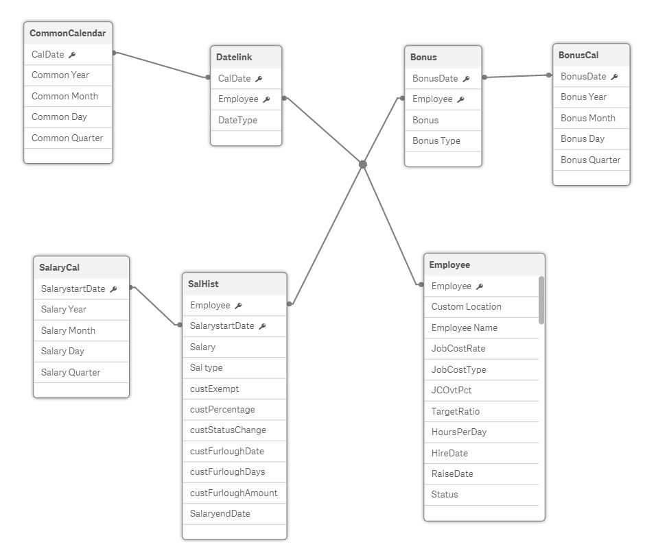
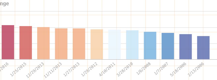
Attaching the current data model. My final requirement is to show Salary, Bonus in the same line graph. Below are separate graphs one for Bonus and other for Salary over time. I wish to combine them.

- Mark as New
- Bookmark
- Subscribe
- Mute
- Subscribe to RSS Feed
- Permalink
- Report Inappropriate Content
Hard to say without knowing how for example the Datelink table was built and how the data sources look like.
It seems you already created a canonical date.
Have you tried to use the common calendar as dimension and filter the facts like
=Sum({<Datetype = {Salary}>} Salary)
=Sum({<Datetype = {Bonus}>} Bonus)
Not sure if you want to sum the facts. Again, would be easier if we can look at the data.