Unlock a world of possibilities! Login now and discover the exclusive benefits awaiting you.
- Qlik Community
- :
- Forums
- :
- Analytics
- :
- New to Qlik Analytics
- :
- Percentage on Y axis for a bar chart using Set Ana...
- Subscribe to RSS Feed
- Mark Topic as New
- Mark Topic as Read
- Float this Topic for Current User
- Bookmark
- Subscribe
- Mute
- Printer Friendly Page
- Mark as New
- Bookmark
- Subscribe
- Mute
- Subscribe to RSS Feed
- Permalink
- Report Inappropriate Content
Percentage on Y axis for a bar chart using Set Analysis and Total function
load * Inline [
Responsible Person, Phases, Value
Tom, Phase 1, 30
Tom, Phase 2, 20
Tom, Phase 3, 50
Jack, Phase 1, 10
Jack, Phase 2, 20
Jack, Phase 3, 10
Jack, Phase 4, 25
Kate, Phase 1, 10
Kate, Phase 2, 10
Kate, Phase 3, 50
]
Hi guys,
Here's a sample data that I have.
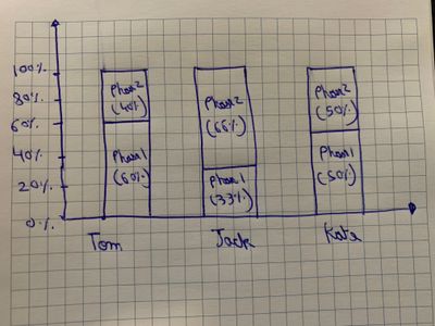
I just want to consider sum(Phase 1 and Phase 2) and present the numbers in percentage (Y- Axis)
I want to create a bar chart like this.
I believe we have to use Total function and Set Analysis.
Also, in the real data set, I have around 100 phases and I just have to display 5 out of it.
Thank you so much,
N
- Tags:
- total
- Subscribe by Topic:
-
Bar chart with values
-
Percentagevalues
-
Set Analysis
-
Set Analysis As A Dimension
- « Previous Replies
-
- 1
- 2
- Next Replies »
- Mark as New
- Bookmark
- Subscribe
- Mute
- Subscribe to RSS Feed
- Permalink
- Report Inappropriate Content
Hi Kush,
By numbers, I meant the values.
Like for Tom, it should display 30 & 20 on the bars (it's okay if we can't display the percentage with it, just the values will be fine too.)
For Kate, it should display 10 and 10
And for Jack, it should display 10 and 20.
(same as the last picture that I shared with you)
-N
- Mark as New
- Bookmark
- Subscribe
- Mute
- Subscribe to RSS Feed
- Permalink
- Report Inappropriate Content
@SkitzN27 see the attched
- Mark as New
- Bookmark
- Subscribe
- Mute
- Subscribe to RSS Feed
- Permalink
- Report Inappropriate Content
You're great, thanks so much. @Kushal_Chawda
- Mark as New
- Bookmark
- Subscribe
- Mute
- Subscribe to RSS Feed
- Permalink
- Report Inappropriate Content
Can you also tell me, how I can display the same kind of bar chart in Qlik sense?
Single bar that represents two measures.
@Kushal_Chawda
Thanks,
N
- Mark as New
- Bookmark
- Subscribe
- Mute
- Subscribe to RSS Feed
- Permalink
- Report Inappropriate Content
@SkitzN27 You can add same dimension and expression in qlik sense
- « Previous Replies
-
- 1
- 2
- Next Replies »