Unlock a world of possibilities! Login now and discover the exclusive benefits awaiting you.
- Qlik Community
- :
- Forums
- :
- Analytics
- :
- New to Qlik Analytics
- :
- Re: Pie Chart Displays Incorrect Legend When Calcu...
- Subscribe to RSS Feed
- Mark Topic as New
- Mark Topic as Read
- Float this Topic for Current User
- Bookmark
- Subscribe
- Mute
- Printer Friendly Page
- Mark as New
- Bookmark
- Subscribe
- Mute
- Subscribe to RSS Feed
- Permalink
- Report Inappropriate Content
Pie Chart Displays Incorrect Legend When Calculated Using Set Analysis
I have created Tables and Pie Charts using the set analysis formulae for the measures e.g.
Dimension: [TaskName]
Measure: sum({$<[ActivityName] = {'Administration'}>}[TotalPeriods])
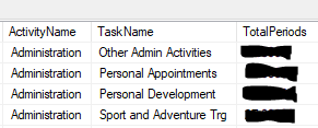
The data is coming in from a database where there are multiple Tasks for each Activity, in this form:
(These are the only 4 tasks that come under Administration)
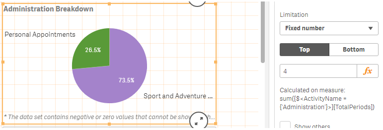
For some reason the Pie Chart legend takes random Tasks from other Activities and presents it on the legend.
On the picture attached, I have highlighted 2 tasks that are presented in the legend that do not come under Administration. This is happening on many of my pie charts.
Any idea why this is happening and how to stop it from occurring?
- Mark as New
- Bookmark
- Subscribe
- Mute
- Subscribe to RSS Feed
- Permalink
- Report Inappropriate Content
That is strange, never seen something like this before. Would you be able to replicate this issue in a sample file to check?
- Mark as New
- Bookmark
- Subscribe
- Mute
- Subscribe to RSS Feed
- Permalink
- Report Inappropriate Content
I am not sure I know how replicate the problem on a sample.
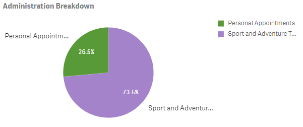
HOWEVER, I have found a way of getting round the problem. If I change the dimension limitation from Fixed Number = 4 to Exact Value > 0 It only displays positive values.


