Unlock a world of possibilities! Login now and discover the exclusive benefits awaiting you.
- Qlik Community
- :
- Forums
- :
- Analytics
- :
- New to Qlik Analytics
- :
- Re: Pie chart problems
- Subscribe to RSS Feed
- Mark Topic as New
- Mark Topic as Read
- Float this Topic for Current User
- Bookmark
- Subscribe
- Mute
- Printer Friendly Page
- Mark as New
- Bookmark
- Subscribe
- Mute
- Subscribe to RSS Feed
- Permalink
- Report Inappropriate Content
Pie chart problems
Hello good people,
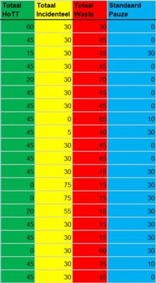
I just started working with Qlik-sens, and i cant seem to manage to create a decent Pie chart. The problem im struggeling with is finding the right inputs to use for the measure and dimensions. I want to make a Pie chart displaying the average of the 4 data colums shown in the attechment.
Any help would be highly appreciated :).
- Mark as New
- Bookmark
- Subscribe
- Mute
- Subscribe to RSS Feed
- Permalink
- Report Inappropriate Content
Create a pie chart with Dimension and below measure
=RangeAvg (ExpressionForTotaal HoTT, ExpressionForTotaal Incidentaal,....)
- Mark as New
- Bookmark
- Subscribe
- Mute
- Subscribe to RSS Feed
- Permalink
- Report Inappropriate Content
I'm not quite sure what you mean by this? Is the ''=RangeAvg (ExpressionForTotaal HoTT, ExpressionForTotaal Incidentaal,....)'' statement supposed to be put for Fx in the expression for the measures? and What kind of Dimension should i choose then?
- Mark as New
- Bookmark
- Subscribe
- Mute
- Subscribe to RSS Feed
- Permalink
- Report Inappropriate Content
Yes, for the first part of your question. You can choose any dimension based on your requirement. If you can share sample data with expected output, it will be helpful
- Mark as New
- Bookmark
- Subscribe
- Mute
- Subscribe to RSS Feed
- Permalink
- Report Inappropriate Content
I would like to see a pie chart showing the average values of these for coloms, so;
29,2%
27,5%
31,25%
12,1%.
But im not sure wich dimension to choose to get these values.
- Mark as New
- Bookmark
- Subscribe
- Mute
- Subscribe to RSS Feed
- Permalink
- Report Inappropriate Content
these four columns*
