Unlock a world of possibilities! Login now and discover the exclusive benefits awaiting you.
- Qlik Community
- :
- Forums
- :
- Analytics
- :
- New to Qlik Analytics
- :
- Qlik Sense Bar Chart - how to use color by express...
- Subscribe to RSS Feed
- Mark Topic as New
- Mark Topic as Read
- Float this Topic for Current User
- Bookmark
- Subscribe
- Mute
- Printer Friendly Page
- Mark as New
- Bookmark
- Subscribe
- Mute
- Subscribe to RSS Feed
- Permalink
- Report Inappropriate Content
Qlik Sense Bar Chart - how to use color by expression?
Hi guys,
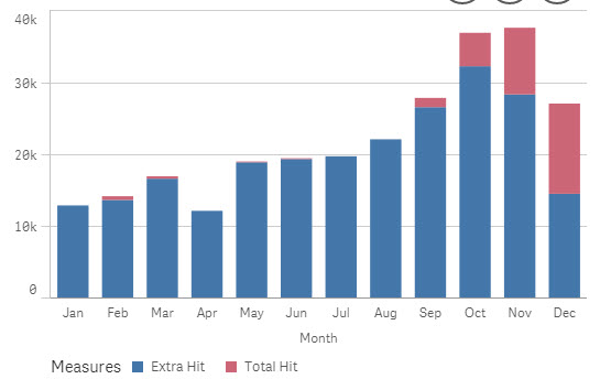
I have created a bar chart, with 2 measurements. i want to use different color on these 2 measurements instead of the default color.
1 dimension - Month
this is my measurement 1
count({<Type = {'B'}>}REC_ID)
this is my measurement 2
count({<Type = {'C'}>}REC_ID)
So, add the color - by expression, i want the measurement 1 in green() and measurement 2 in red().
i have failed to do so. please help guys!
Rgds
Jim
Accepted Solutions
- Mark as New
- Bookmark
- Subscribe
- Mute
- Subscribe to RSS Feed
- Permalink
- Report Inappropriate Content
Hi Jim
Please see attached.
Here are 3 ways of doing it. - The left bottom is the one i guess you will use.
Please let me know.
Kind Regards
- Mark as New
- Bookmark
- Subscribe
- Mute
- Subscribe to RSS Feed
- Permalink
- Report Inappropriate Content
hi
currently in Qlik sense , when you use color by expression it is evaluated per dimension and not per expression
you can try this approach
create a new field in the script the has the values meas1,meas2
then in the chart use two dimensions (Month,newfield)
and one expression : if(newfield = 'meas1',count({<Type = {'B'}>}REC_ID),count({<Type = {'C'}>}REC_ID))
now in color bye expression you can use : if(newfield = 'meas1',green(),red())
- Mark as New
- Bookmark
- Subscribe
- Mute
- Subscribe to RSS Feed
- Permalink
- Report Inappropriate Content
Hi Jim
Please see attached.
Here are 3 ways of doing it. - The left bottom is the one i guess you will use.
Please let me know.
Kind Regards
- Mark as New
- Bookmark
- Subscribe
- Mute
- Subscribe to RSS Feed
- Permalink
- Report Inappropriate Content
in qlik sense 3.1.4 - the bar chart object only allows you to add in 1 dimension ONLY. another dimension will be categorized as Alternate Dimension. - more like to use it as Cyclic function.
So. when u r saying creating new field and add in into the bar chart, you will be able to see Month and NewField dimension at the X- Axis.
- Mark as New
- Bookmark
- Subscribe
- Mute
- Subscribe to RSS Feed
- Permalink
- Report Inappropriate Content
thanks bro. downloading....
- Mark as New
- Bookmark
- Subscribe
- Mute
- Subscribe to RSS Feed
- Permalink
- Report Inappropriate Content
hi
the bar chart allows two dimensions
i think you are using combo chart
- Mark as New
- Bookmark
- Subscribe
- Mute
- Subscribe to RSS Feed
- Permalink
- Report Inappropriate Content
Hi Jim
You may have either 2 expressions and 1 dimension - or 2 dimensions and 1 expression.
You will see if you remove the second expression and you will be able to add another dimension.
Regards
- Mark as New
- Bookmark
- Subscribe
- Mute
- Subscribe to RSS Feed
- Permalink
- Report Inappropriate Content
Hi,
Yes u r correct. i am using the bottom one.
as for the expression.
Count({<Type = {'A', 'B'}>} RecID) , how to put a description for A and B. Because in the chart when i hover it, looks weird when A = 10 , for example. hwo to make it somethign like, instead of showing A, APPLE = 10 ?
Rgds
Jim
- Mark as New
- Bookmark
- Subscribe
- Mute
- Subscribe to RSS Feed
- Permalink
- Report Inappropriate Content
Hi Jim
Please mark my answer as correct.
As for your second question - Please see attached.
Using a mapping load.
Kind Regards
- Mark as New
- Bookmark
- Subscribe
- Mute
- Subscribe to RSS Feed
- Permalink
- Report Inappropriate Content
applymap... i seee... Thanks bro!!!!