Unlock a world of possibilities! Login now and discover the exclusive benefits awaiting you.
- Qlik Community
- :
- Forums
- :
- Analytics
- :
- New to Qlik Analytics
- :
- Qlik Sense Heatmap Chart with individual mean
- Subscribe to RSS Feed
- Mark Topic as New
- Mark Topic as Read
- Float this Topic for Current User
- Bookmark
- Subscribe
- Mute
- Printer Friendly Page
- Mark as New
- Bookmark
- Subscribe
- Mute
- Subscribe to RSS Feed
- Permalink
- Report Inappropriate Content
Qlik Sense Heatmap Chart with individual mean
Hi,
I am trying to create a heatmap chart with 2 dimensions, customer name and date, and 1 measure: Sum of Amount.
There is a default "Mean in Scale" function used to configure the scale of colours that would change according to the magnitude of Amount.
However, I have multiple customers and some customers may have much larger amounts, and when both companies are displayed the scale is skewed towards the larger amounts.
Is there a way to configure the chart such that each customer dimension, will have its own colour scale, almost like an AGGR function and grouping by customer?
- Mark as New
- Bookmark
- Subscribe
- Mute
- Subscribe to RSS Feed
- Permalink
- Report Inappropriate Content
Hi,
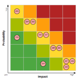
we are offering a Heatmap, that is usually used for Risk Management. The function can fit to you needs and it is available in the Garden Branch for testing. Please have a look at:
https://developer.qlik.com/garden/5fd6531adae7960011eb30ec
