Unlock a world of possibilities! Login now and discover the exclusive benefits awaiting you.
- Qlik Community
- :
- Forums
- :
- Analytics
- :
- New to Qlik Analytics
- :
- Qlik Sense Map Issue
- Subscribe to RSS Feed
- Mark Topic as New
- Mark Topic as Read
- Float this Topic for Current User
- Bookmark
- Subscribe
- Mute
- Printer Friendly Page
- Mark as New
- Bookmark
- Subscribe
- Mute
- Subscribe to RSS Feed
- Permalink
- Report Inappropriate Content
Qlik Sense Map Issue
Hi ,
can someone assist me with the below please?
I am using the point layer map in qliksense but i am getting wrong data shown on my maps.
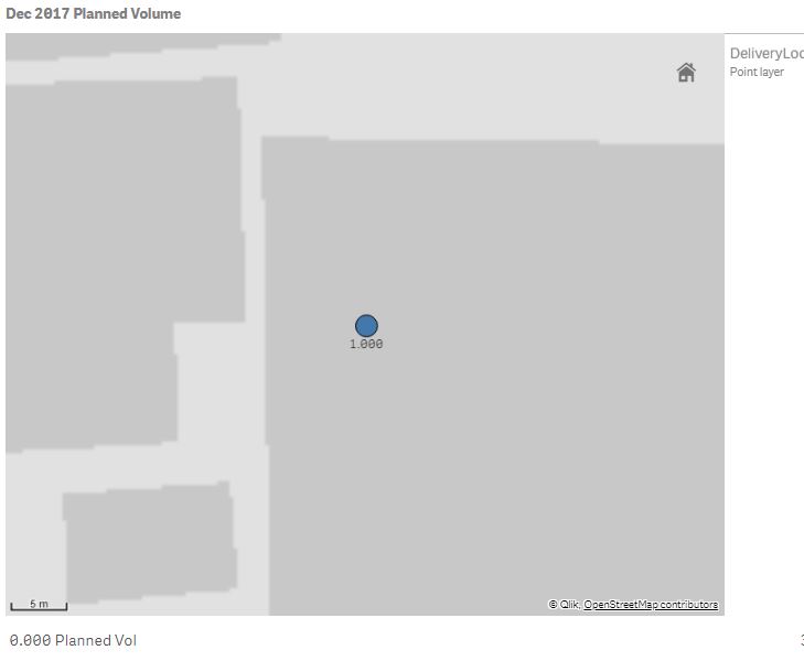
So the purpose of this map is to show where in the country the most Planned volume is - The Dimension i am using is Delivery Location and the size & Shape is by Sum of Planned Volumes same with the Colours -
The strange thing is some of the bigger planned areas is showing correct data but others are showing incorrect data all together - i have compared the data with the source and for some reason my maps is showing incorrect but my other graphs and KPI's is correct.
The only thing i can think of is i'm missing the trick with the Map charts in Qlik Sense. The below screenshot shows there are 11 Planned Qty when I hover over the bubble but when I add labels it says 1? I've added a text box with the calculation at the bottom showing there are actually 0 planned.
- Mark as New
- Bookmark
- Subscribe
- Mute
- Subscribe to RSS Feed
- Permalink
- Report Inappropriate Content
Check Color by Dimension or Measure option...
Maybe that should work...
Pick Color by Dimension same as your existing dimension 'Delivery Location'