Unlock a world of possibilities! Login now and discover the exclusive benefits awaiting you.
- Qlik Community
- :
- Forums
- :
- Analytics
- :
- New to Qlik Analytics
- :
- Qlik Sense line chart Issue
- Subscribe to RSS Feed
- Mark Topic as New
- Mark Topic as Read
- Float this Topic for Current User
- Bookmark
- Subscribe
- Mute
- Printer Friendly Page
- Mark as New
- Bookmark
- Subscribe
- Mute
- Subscribe to RSS Feed
- Permalink
- Report Inappropriate Content
Qlik Sense line chart Issue
Hi,
REQUIREMENT
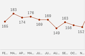
I am working on qlik sense line chart and facing some UI issues. I want the line chart to show only static start and end point pop up as shown in the attachment.

Current Status
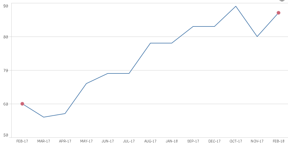
Currently as shown below qlik sense allow all the Mockup/Data points for all the months, but I don't want in that way. Can any body help me on this. Do we need to download any extension to work on this or this can be handled in qlik sense desktop itself.
- Mark as New
- Bookmark
- Subscribe
- Mute
- Subscribe to RSS Feed
- Permalink
- Report Inappropriate Content
This question was already asked by someone else and I've already answered it:
Require datapoints only at start and end in Line chart
Create a combined chart:
Expression 1 : as line :
YourExpression
Expression2:as Points:
if(YourExpressionforMinandMax=0,null(),YourExpressionforMinandMax)
Per Analogy:
Original Line chart:
dim : Num
Expression : sum(Expression1):

New chart: combined chart:
dim:
Num
Expression1: Sum(Expression1)

Expression 2:
if(Sum({<Num={'26','1'}>}Expression1)=0,Null(),Sum({<Num={'26','1'}>}Expression1))

Result:

So, please close the thread.
- Mark as New
- Bookmark
- Subscribe
- Mute
- Subscribe to RSS Feed
- Permalink
- Report Inappropriate Content
Thank you Omar that helped to get outline of my line chart and now I am able to have two spark points at start and end point. But when I implemented this I ran into some other issues.
1) Can we fix the label hover as shown in below image and disable rest of the hover from march 17 to jan 18.
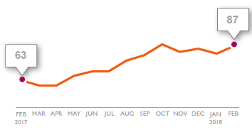
If i am pointing my mouse on feb 17 then I am getting two hover values of risk. One for Red dot and other for blue line.(63 & 63). I want only red dot hover value and rest of them I want to disable. Any option to do that in qlik sense.
- Mark as New
- Bookmark
- Subscribe
- Mute
- Subscribe to RSS Feed
- Permalink
- Report Inappropriate Content