Unlock a world of possibilities! Login now and discover the exclusive benefits awaiting you.
Announcements
Live today at 11 AM ET. Get your questions about Qlik Connect answered, or just listen in.
SIGN UP NOW
- Qlik Community
- :
- Forums
- :
- Analytics
- :
- New to Qlik Analytics
- :
- QlikSense Line Chart X/Y Axis Scales based on expr...
Options
- Subscribe to RSS Feed
- Mark Topic as New
- Mark Topic as Read
- Float this Topic for Current User
- Bookmark
- Subscribe
- Mute
- Printer Friendly Page
Turn on suggestions
Auto-suggest helps you quickly narrow down your search results by suggesting possible matches as you type.
Showing results for
Contributor
2020-03-02
08:32 AM
- Mark as New
- Bookmark
- Subscribe
- Mute
- Subscribe to RSS Feed
- Permalink
- Report Inappropriate Content
QlikSense Line Chart X/Y Axis Scales based on expression
Hi
I have an issue with a line graph in QlikSense.
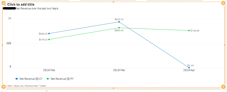
I have a line graph which shows the previous year measure and current year measure by month and year.
There is a measure toggle where the user can select 3 measures.
The Y Axis on the line chart shows the incorrect scale.
Find the image.
If you take your focus to the one for '2019-Apr' which shows the measure for the current year to be 1.1 million, the line is misrepresented.
How do I fix this in the Appearance settings for this graph?
- Tags:
- expression
483 Views
0 Replies
Community Browser
