Unlock a world of possibilities! Login now and discover the exclusive benefits awaiting you.
- Qlik Community
- :
- Forums
- :
- Analytics
- :
- New to Qlik Analytics
- :
- Re: QlikSense Line Chart Y-axis for multiple measu...
- Subscribe to RSS Feed
- Mark Topic as New
- Mark Topic as Read
- Float this Topic for Current User
- Bookmark
- Subscribe
- Mute
- Printer Friendly Page
- Mark as New
- Bookmark
- Subscribe
- Mute
- Subscribe to RSS Feed
- Permalink
- Report Inappropriate Content
QlikSense Line Chart Y-axis for multiple measures
Hi,
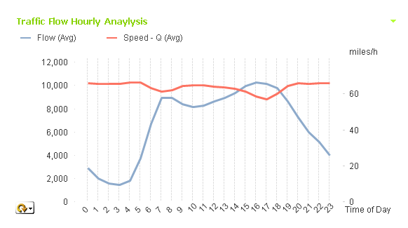
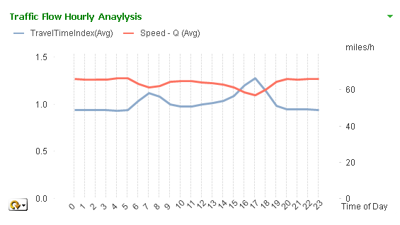
I have the following graph need to migrate to QlikSense.
One dimension and three expressions.
Need to group the first two expressions (so user can toggle) and display the third expression label in right.
Can anyone advise how to do this in QlikSense?
Appreciate any help!
Regards
I-Cheng
- Mark as New
- Bookmark
- Subscribe
- Mute
- Subscribe to RSS Feed
- Permalink
- Report Inappropriate Content
If you want the user to toogle dimension or measures in a single chart try using this technique in sense.
- Mark as New
- Bookmark
- Subscribe
- Mute
- Subscribe to RSS Feed
- Permalink
- Report Inappropriate Content
Thanks a lot. I install the extension and review the .qvf file. The result is not exactly what I need. Each expression has different labels. Need the third expression label stay in the right side while the left side label display whatever user choose from the grouped two expressions. Is this possible?
Thanks
Regards
I-Cheng