Unlock a world of possibilities! Login now and discover the exclusive benefits awaiting you.
- Qlik Community
- :
- Forums
- :
- Analytics
- :
- New to Qlik Analytics
- :
- Qliksense - Scatter Chart Advice
- Subscribe to RSS Feed
- Mark Topic as New
- Mark Topic as Read
- Float this Topic for Current User
- Bookmark
- Subscribe
- Mute
- Printer Friendly Page
- Mark as New
- Bookmark
- Subscribe
- Mute
- Subscribe to RSS Feed
- Permalink
- Report Inappropriate Content
Qliksense - Scatter Chart Advice
Hi,
Im having some issues trying to correctly represent a chart. I need to recreate the following chart :
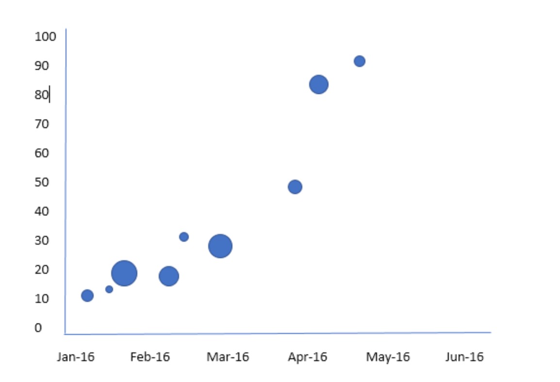
My data values are :
y axis : median price
x axis : month of sale
plots represent a 'sales consultant'
size of plots represent the qauntity of sales.
I'm completely stumped. Is this possible? Ideally - it would be great to achieve this in Sense, but would be equalply happy to get this working in View.
Any help is greatly appreciated!
Regards,
phil
Accepted Solutions
- Mark as New
- Bookmark
- Subscribe
- Mute
- Subscribe to RSS Feed
- Permalink
- Report Inappropriate Content
- Mark as New
- Bookmark
- Subscribe
- Mute
- Subscribe to RSS Feed
- Permalink
- Report Inappropriate Content
Hi Phil,
May be as at attached file (for QlikView)?
Regards,
Andrey
- Mark as New
- Bookmark
- Subscribe
- Mute
- Subscribe to RSS Feed
- Permalink
- Report Inappropriate Content
Hello! Both X-axis and Y-axis should be expressions in a scatter plot. The date field is a dimension. Therefore, your requirement is not available by default in Qlik Sense, but there might be an extension for this in the Qlik Branch.
- Mark as New
- Bookmark
- Subscribe
- Mute
- Subscribe to RSS Feed
- Permalink
- Report Inappropriate Content
Hi Andrey,
Many thanks ! This is 99.9% perfect for my requirements. One thing I haven't taken into consideration is that I need to show the Minimum Price on the y-axis. So when I use Min(Price) as a dimension it is throwing an error. Is there any way I can get around this??
Regards,
Phil