Unlock a world of possibilities! Login now and discover the exclusive benefits awaiting you.
- Qlik Community
- :
- Forums
- :
- Analytics
- :
- New to Qlik Analytics
- :
- Re: Qn on Setting Color in Master Dimensions and M...
- Subscribe to RSS Feed
- Mark Topic as New
- Mark Topic as Read
- Float this Topic for Current User
- Bookmark
- Subscribe
- Mute
- Printer Friendly Page
- Mark as New
- Bookmark
- Subscribe
- Mute
- Subscribe to RSS Feed
- Permalink
- Report Inappropriate Content
Qn on Setting Color in Master Dimensions and Measures
In relation to this new feature of Qliksense, I tried to create a Master dimension to use separate value colors. The issue I am facing is if I have the dimension as a direct field from the table this feature works. But if I have a calculated dimension as a Master dimension this feature does not seem to work. Any one can help?
Accepted Solutions
- Mark as New
- Bookmark
- Subscribe
- Mute
- Subscribe to RSS Feed
- Permalink
- Report Inappropriate Content
Hi,
Just tested it out on September patch, and you can create calculated master dimensions and put a color to it.
See the below image:
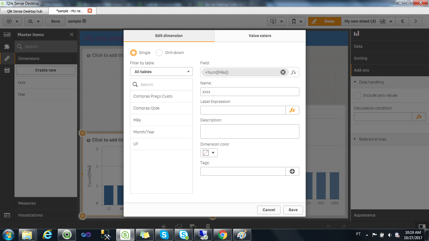
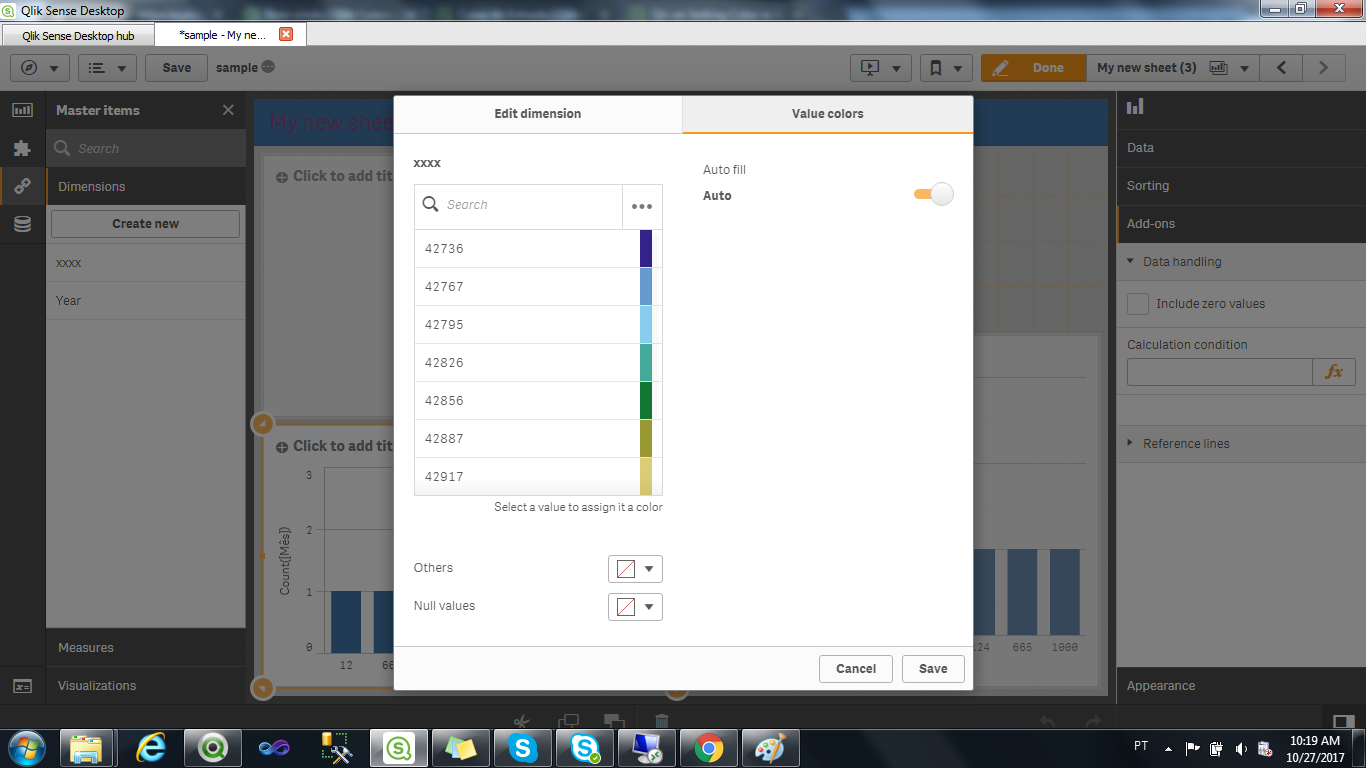
And even though i changed the color scheme for the calculated, its following the color from the field used in the calculation, so both graphs are the same (just dummy data).
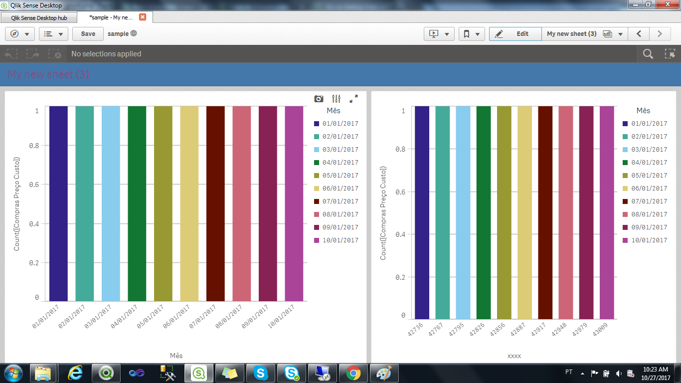
YOur way out would be creating another field.
Felipe.
- Mark as New
- Bookmark
- Subscribe
- Mute
- Subscribe to RSS Feed
- Permalink
- Report Inappropriate Content
Hi,
When you need the calculated dimension, do it in load part (script) so that you can use the same feature for the master dimension you want.
Lets say you have
Date:
Load
Date
From [Whatever];
and you need weeknames
So do the following:
Date:
Load
Date,
Weekname(Date) as WKNAME
From [Whatever];
And use the WKNAME as dimension for creating the master dimension and use the colors you want.
Felipe.
- Mark as New
- Bookmark
- Subscribe
- Mute
- Subscribe to RSS Feed
- Permalink
- Report Inappropriate Content
Thanks for the response!
I understand thats an option but I would like to know if this new color feature does not work with calculated dimension or if I need to do some setting to make this work?
Thanks!
- Mark as New
- Bookmark
- Subscribe
- Mute
- Subscribe to RSS Feed
- Permalink
- Report Inappropriate Content
Hi,
Just tested it out on September patch, and you can create calculated master dimensions and put a color to it.
See the below image:
And even though i changed the color scheme for the calculated, its following the color from the field used in the calculation, so both graphs are the same (just dummy data).
YOur way out would be creating another field.
Felipe.