Unlock a world of possibilities! Login now and discover the exclusive benefits awaiting you.
- Qlik Community
- :
- Forums
- :
- Analytics
- :
- New to Qlik Analytics
- :
- Re: Reference Line moves above visible area in gra...
- Subscribe to RSS Feed
- Mark Topic as New
- Mark Topic as Read
- Float this Topic for Current User
- Bookmark
- Subscribe
- Mute
- Printer Friendly Page
- Mark as New
- Bookmark
- Subscribe
- Mute
- Subscribe to RSS Feed
- Permalink
- Report Inappropriate Content
Reference Line moves above visible area in graph
Hello,
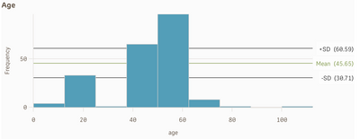
I have a simple age histogram. Added a few reference lines, mean, mean+ SD and mean-SD.
This is for all the data.
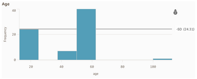
Now I make selections / filter based on what the user is looking for.
The graph changes (as expected) but the refernce lines go above the graph (and also seem wrong ?!)
Isn't the mean supposed to be of only the values left after selection ? Or am I supposed to make that evident in the formula for the histogram ? Meaning, the formula currently is
Reference line : Mean=Avg(age)
Is it supposed to be something else, which reflects the age of only selected values ?
And how do I view them ? I can see a small 2 and an up arrow, but cannot click or scroll to see them.
Thank you !
- Subscribe by Topic:
-
Histogram
-
Reference line
-
Reference Line Average
-
Reference Lines
Accepted Solutions
- Mark as New
- Bookmark
- Subscribe
- Mute
- Subscribe to RSS Feed
- Permalink
- Report Inappropriate Content
- Mark as New
- Bookmark
- Subscribe
- Mute
- Subscribe to RSS Feed
- Permalink
- Report Inappropriate Content
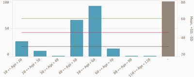
This case use Combo chart and use second axis
- Mark as New
- Bookmark
- Subscribe
- Mute
- Subscribe to RSS Feed
- Permalink
- Report Inappropriate Content
@Channa Thank you !
I ended up using class(age ,10,'Age') for dimension to make it look like bins in a histogram,
and avg(total age) for the mean reference line and that works just as intended.
Thank you !
- Mark as New
- Bookmark
- Subscribe
- Mute
- Subscribe to RSS Feed
- Permalink
- Report Inappropriate Content
@Channa
If you see the graph above, it is missing the [70,80] group. possibly because no data exists.
I would still like to see an empty/blank column there.
Any way to do this ?
Thank you


