Unlock a world of possibilities! Login now and discover the exclusive benefits awaiting you.
- Qlik Community
- :
- Forums
- :
- Analytics
- :
- New to Qlik Analytics
- :
- Rotate Table to shift columns to rows
- Subscribe to RSS Feed
- Mark Topic as New
- Mark Topic as Read
- Float this Topic for Current User
- Bookmark
- Subscribe
- Mute
- Printer Friendly Page
- Mark as New
- Bookmark
- Subscribe
- Mute
- Subscribe to RSS Feed
- Permalink
- Report Inappropriate Content
Rotate Table to shift columns to rows
Is there a way to rotate a table on Qlik sense? When you add data it provides it in columns, I am able to present my dimension followed by different measures but this all appears vertically.
Am I able to translate the table so that the dimension appears on the top row and I can list my measures it the following rows?
I've tried with pivot tables which give me the desired layout but I'm limited to 1 measure as to not overcrowd the table with information, rather than being able to list measure by measure against a Job.
Accepted Solutions
- Mark as New
- Bookmark
- Subscribe
- Mute
- Subscribe to RSS Feed
- Permalink
- Report Inappropriate Content
Just use a pivot chart
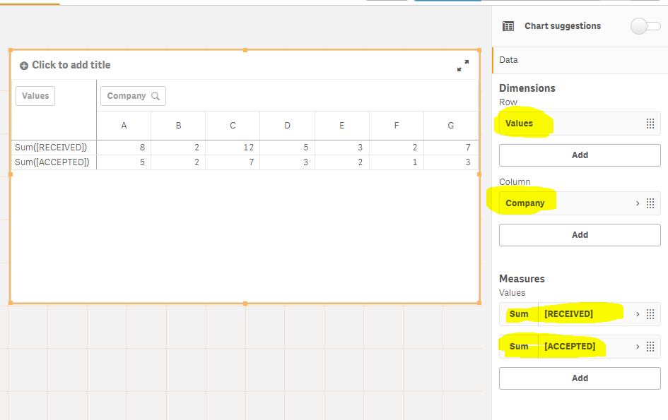
1) Add Measures
= sum(ACCEPTED)
= sum(RECEIVED)
2) Under Column Add Dimension = Company
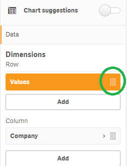
3) Drag Values from Column to Row , this is the part I think you missed
press and hold with the cursor on the circled part to drag and move the item, from Column to Rows section
If a post helps to resolve your issue, please accept it as a Solution.
- Mark as New
- Bookmark
- Subscribe
- Mute
- Subscribe to RSS Feed
- Permalink
- Report Inappropriate Content
Please post some sample data and a snapshot / mockup of the expected output
If a post helps to resolve your issue, please accept it as a Solution.
- Mark as New
- Bookmark
- Subscribe
- Mute
- Subscribe to RSS Feed
- Permalink
- Report Inappropriate Content
as mentioned above, you may want to add in sample data and sample outcome you want so it is easier for someone to help you and the solution more tailored to what you need.
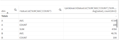
the straight table was designed to present the measures as separate columns, if you want the results in just one column - it can be done but more like a hack as you will include all your different calculations in one measure column. one possible solution is:
assume you have a single dim and you want to show sum, avg, and count under one column:
2nd dimension for your metrics:
=ValueList('SUM','AVG','COUNT')
your measure:
=pick(match(ValueList('SUM','AVG','COUNT'),'SUM','AVG','COUNT'),sum(value), Avg(value), count(dim))
you can then tweak this to your specific requirement
hope that helps
- Mark as New
- Bookmark
- Subscribe
- Mute
- Subscribe to RSS Feed
- Permalink
- Report Inappropriate Content
I've attached an excel spreadsheet with some data in it, all I am after is the below
Qlik organises everything into columns is there a way to transpose and put it in rows instead?
- Mark as New
- Bookmark
- Subscribe
- Mute
- Subscribe to RSS Feed
- Permalink
- Report Inappropriate Content
Just use a pivot chart
1) Add Measures
= sum(ACCEPTED)
= sum(RECEIVED)
2) Under Column Add Dimension = Company
3) Drag Values from Column to Row , this is the part I think you missed
press and hold with the cursor on the circled part to drag and move the item, from Column to Rows section
If a post helps to resolve your issue, please accept it as a Solution.


