Unlock a world of possibilities! Login now and discover the exclusive benefits awaiting you.
- Qlik Community
- :
- Forums
- :
- Analytics
- :
- New to Qlik Analytics
- :
- Scatat plot symbols
- Subscribe to RSS Feed
- Mark Topic as New
- Mark Topic as Read
- Float this Topic for Current User
- Bookmark
- Subscribe
- Mute
- Printer Friendly Page
- Mark as New
- Bookmark
- Subscribe
- Mute
- Subscribe to RSS Feed
- Permalink
- Report Inappropriate Content
Scatat plot symbols
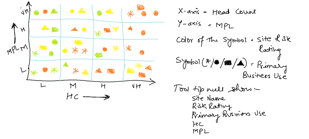
Hi Everyone,
Is it possible to do in qliksense.Below is the requiement.
L= Low
M=Medium
H= High
VH= Very high
Is it possible in qliksense
- Mark as New
- Bookmark
- Subscribe
- Mute
- Subscribe to RSS Feed
- Permalink
- Report Inappropriate Content
Not that I know of, or have ever seen.
- Mark as New
- Bookmark
- Subscribe
- Mute
- Subscribe to RSS Feed
- Permalink
- Report Inappropriate Content
Thanks for the reply.
Any other insights or any alternate way to showcase in a different view.
Challange😀
Thanks..
- Mark as New
- Bookmark
- Subscribe
- Mute
- Subscribe to RSS Feed
- Permalink
- Report Inappropriate Content
Color by risk, size by primary business use?
Could have distinct sizes for different business uses?
- Mark as New
- Bookmark
- Subscribe
- Mute
- Subscribe to RSS Feed
- Permalink
- Report Inappropriate Content
Can you attach your data here?
- Mark as New
- Bookmark
- Subscribe
- Mute
- Subscribe to RSS Feed
- Permalink
- Report Inappropriate Content
How to Create the Magic Quadrant
Use the basic map chart in the included charts. This will also use point layers for the symbols and area layers for the grid.
- Add the map chart.
- In Map Settings set the Base map to NONE.
- Set Projection to User Defined Degrees.
- Turn Off Legend in Legend Setting.
- Turn off Scale Bar in Presentation Settings.
- Add area layers for box.
- Add a layer titled box.
- Dimension equals 1.
- Location equals: ='[[[0,0],[100,0],[100,100],[0,100]]]'
- Add area layers for Grid.
- If using a 4 quadrant plane use the following:
- Add a layer titled Grid.
- Dimension equals 1.
- If using a 4 quadrant plane use the following:
- Location equals: ='['& '[[0,0],[50,0],[50,50],[0,50]],' & '[[50,50],[100,50],[100,100],[50,100]]' & ']'
- If using a 16 quadrant plane use the following:
- You need to add 4 grid layers.
- Each dimension is equal to 1.
- Locations are as follows:
Grid1: ='['&'[[0,0],[25,0],[25,25],[0,25]],' &'[[25,25],[50,25],[50,50],[25,50]]'& ']'
Grid2: ='['&'[[50,0],[50,25],[75,25],[75,0]],' &'[[75,25],[100,25],[100,50],[75,50]]'& ']'
Grid3: ='['&'[[0,50],[25,50],[25,75],[0,75]],' &'[[25,75],[25,100],[50,100],[50,75]]'& ']'
Grid4: ='['&'[[50,50],[75,50],[75,75],[50,75]],'&'[[75,75],[100,75],[100,100],[75,100]]'& ']'
- Set Grid and Box Colors to desired colors.
- Add a point layer
- Use a dimension.
- If you need separate type shapes, limit your dimension and set shape in settings.
- As location you need to have two separate fields with values 0-100
- Set the “Y” value as the Latitude.
- Set the “X” value as the Longitude.
- If desired color by a method.
- Use a dimension.
Quadrant Labels
For Labels you will need to add another point layer.
- Add point layer.
- Dimension is Label.
- Location is as follows:
- LabelY as Latitude.
- LabelX as Longitude.
- Make bubble size 0 and opacity far left.
- Under general options set show labels to ON and Centered.
- Inline load with coordinates is as follows:
4 Quadrant
QuadrantLabels:
load * Inline [
Label, LabelX, LabelY
UpperRight, 75, 98
UpperLeft, 25, 98
LowerRight, 75, 2
LowerLeft, 25, 2
];
16 Quadrant
load * Inline [
Label, LabelX, LabelY
X4, 87.5, 2
X3, 62.5, 2
X2, 37.5, 2
X1, 12.5, 2
Y1, 2,12.5
Y2, 2,37.5
Y3, 2,62.5
Y4, 2,87.5
];
- Mark as New
- Bookmark
- Subscribe
- Mute
- Subscribe to RSS Feed
- Permalink
- Report Inappropriate Content
This is possible. I have created a document with the steps to follow located here:
- Mark as New
- Bookmark
- Subscribe
- Mute
- Subscribe to RSS Feed
- Permalink
- Report Inappropriate Content
Hi Steven,
It's a good tecnique.
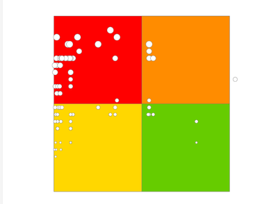
But still i'ts not full fill my requirement.I need to cateogize risk state in each block.
I got the below.
Small bubble should come under green box,medium under yellow box...
Thanks..
- Mark as New
- Bookmark
- Subscribe
- Mute
- Subscribe to RSS Feed
- Permalink
- Report Inappropriate Content
A sample of your data would help in this case I think.

