Unlock a world of possibilities! Login now and discover the exclusive benefits awaiting you.
- Qlik Community
- :
- Forums
- :
- Analytics
- :
- New to Qlik Analytics
- :
- Re: Scatter plot expression help
- Subscribe to RSS Feed
- Mark Topic as New
- Mark Topic as Read
- Float this Topic for Current User
- Bookmark
- Subscribe
- Mute
- Printer Friendly Page
- Mark as New
- Bookmark
- Subscribe
- Mute
- Subscribe to RSS Feed
- Permalink
- Report Inappropriate Content
Scatter plot expression help
Hi,
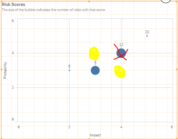
I have some 'Risk' data that i am trying to plot on a scatter plot chart. The risk generates a 'Risk Score' which is a multiplication of 'Probability' and 'Impact' figures. the data looks like the following.
| RefNo | Impact | Probability | Score |
| 1 | 3 | 4 | 12 |
| 2 | 2 | 3 | 6 |
| 3 | 4 | 3 | 12 |
| 4 | 3 | 4 | 12 |
The scatter plot has the probability on the Y axis and impact is on the x, then the score is the bubble.
It all works apart from when 2 different combinations = the same score (4x3 or 3x4 etc). What this does is show a bubble on the 4 impact and 4 probability.
I know why it is doing this, it is because i am using max() in the 2 expressions, what i dont know is how to fix it so i see the bubble split into 2 bubbles, 1 on 4 impact,3 probability and the other on 3 impact,4 probability.
Can anyone help?
I have attached an example.
Thanks very much.
Accepted Solutions
- Mark as New
- Bookmark
- Subscribe
- Mute
- Subscribe to RSS Feed
- Permalink
- Report Inappropriate Content
- Mark as New
- Bookmark
- Subscribe
- Mute
- Subscribe to RSS Feed
- Permalink
- Report Inappropriate Content
bump..
- Mark as New
- Bookmark
- Subscribe
- Mute
- Subscribe to RSS Feed
- Permalink
- Report Inappropriate Content
I don't see max(), but count() in your expression. Also there are 32 records at the back-end. Could not really get the requirement also.
- Mark as New
- Bookmark
- Subscribe
- Mute
- Subscribe to RSS Feed
- Permalink
- Report Inappropriate Content
Hi, Thanks for replying.
The example in my description is just an example, the app contains the real data hence why there are more records.
The count is the expression for the bubble size, its the X and Y axis expressions that use max().
The requirement is to plot the actual 'Probability' and 'Impact' scores on the scatter plot and not just the max.
i.e.
If you look at the table at the top of the sheet in the app, you will see that for refs 9,11,15 the impact is 4 and probability is 3 and for ref 12 the impact is 3 and probability is 4. all of these refs give a total score of 12 and by using MAX() it plots the 4 refs at 4 probability and 4 impact = 12 but i want it to plot the first 3 refs at impact 4 and probability 3 and the last one at impact 3 and probability 4 (what they actually are in the table.
Does that make more sense?
- Mark as New
- Bookmark
- Subscribe
- Mute
- Subscribe to RSS Feed
- Permalink
- Report Inappropriate Content
Does anyone have any ideas on this please?
- Mark as New
- Bookmark
- Subscribe
- Mute
- Subscribe to RSS Feed
- Permalink
- Report Inappropriate Content
Hello CNH_1978,
Try the attached, it looks correct to me.
- Mark as New
- Bookmark
- Subscribe
- Mute
- Subscribe to RSS Feed
- Permalink
- Report Inappropriate Content
Fantastic, thtat is what i wanted!
Thank you very very much.
