Unlock a world of possibilities! Login now and discover the exclusive benefits awaiting you.
- Qlik Community
- :
- Forums
- :
- Analytics
- :
- New to Qlik Analytics
- :
- Selection in Filter causes uniform sections in the...
- Subscribe to RSS Feed
- Mark Topic as New
- Mark Topic as Read
- Float this Topic for Current User
- Bookmark
- Subscribe
- Mute
- Printer Friendly Page
- Mark as New
- Bookmark
- Subscribe
- Mute
- Subscribe to RSS Feed
- Permalink
- Report Inappropriate Content
Selection in Filter causes uniform sections in the pie chart instead of correct values
I have a pie chart that is supposed to show how many tests were done on a test type. For the angle I have this formula: Count (distinct AuftrNr)
So it counts the order numbers and sorts according to the type of test that is in the same line. Distinct, because in this table order numbers occur several times, but each should only be counted once.
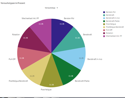
Without further selections it seems to work. If you select for example the component in a filter it shows equal sections instead of the correct percentages. If there are e.g. 4 types of tests to choose from for the type of component selected, it is 4 parts with 25 percent. Or here, for example with 9 fields:

I'm confused because I created the diagram some time ago and I think at that time it worked. Maybe the problem arises in the database?
Thanks and regards
Hannah
- « Previous Replies
-
- 1
- 2
- Next Replies »
Accepted Solutions
- Mark as New
- Bookmark
- Subscribe
- Mute
- Subscribe to RSS Feed
- Permalink
- Report Inappropriate Content
It was actually links that the data manager had made. I also had two Loops that I had not taken seriously, but have now solved.
The diagram itself or the diagram script were correct.
This also explains why the diagrams used to work earlier and had not anymore - even though I did not change them myself.
The new incorrect links seem to have generated errors in some charts, because now some small bugs that I could not explain were eliminated. So I should probably pay close attention to what the data manager does when synchronizing and loading tables.
- Mark as New
- Bookmark
- Subscribe
- Mute
- Subscribe to RSS Feed
- Permalink
- Report Inappropriate Content
Hi Hannah,
To begin with your definition, 'to show how many tests were done on a test type'. This shows you the number of unique tests, not how many tests on a test type, right?
But what is the real problem, could you show an image with the wrong calculated values? Or could you maybe make a table containing the data? This makes helping you a bit easier.
Jordy
Climber
- Mark as New
- Bookmark
- Subscribe
- Mute
- Subscribe to RSS Feed
- Permalink
- Report Inappropriate Content
Hey,
I just noticed that I have similar Problems in other counting diagrams. It seems liked Qlik Sense isn't able to get the complete data or just isn'T able to count right.
Here is a example. because I can't share the real data:
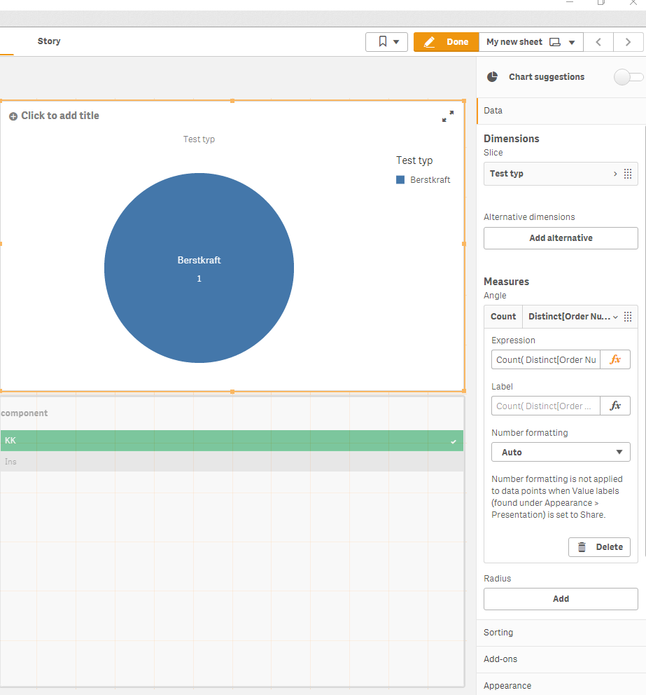
Order Number Test typ result component
1 Berstkraft 5 KK
1 Berstkraft 12 KK
2 Rotation 7 Ins
2 Rotation 6 Ins
2 Rotation 10 Ins
3 Berstkraft 2 Ins
3 Berstkraft 4 Ins
In this case 66% (or 2 orders) of Berstkraft and 33% (or 1 order) of Rotation would have to be displayed. Since one row per result is stored in the table, I use distinct.
In my example, with the component selection 'KK' 100 percent Berstkraft would have to be displayed. Instead, 50% Berstkraft and 50% Rotation are displayed. He also shows only one order per trial type. Even if it is much more orders than here in the example.
Thanks
Hannah
- Mark as New
- Bookmark
- Subscribe
- Mute
- Subscribe to RSS Feed
- Permalink
- Report Inappropriate Content
In an older version of my app there is the same diagram with the same diagram script. Seems like it doesn't count right but it doesn't show equal parts. So probably it never worked right but something changed. Something that isn't in the diagram script. It has old data as well. Data loaded in May. So maybe there is bad data in the database now?
- Mark as New
- Bookmark
- Subscribe
- Mute
- Subscribe to RSS Feed
- Permalink
- Report Inappropriate Content
Hi Hannah,
You need to use the following formula:
Count(Distinct [Order Number])This will result in, with test typ as dimension, in a 66,6% to a 33,3% mix.
The other one it not doing that because it is counting the unique test types and you only have two in your test set.
Jordy
Climber
- Mark as New
- Bookmark
- Subscribe
- Mute
- Subscribe to RSS Feed
- Permalink
- Report Inappropriate Content
Thanks,
but beside the bracktets it's the same like Count (distinct AuftrNr). AuftrNr is Order Number.
When I take a old Version of the app with the same diagram script but load new data in it it doesn't show the equal parts. So when it's not because of the data and noch because of the diagram script it's because of the script in the script Editor or bad Connections between tables?
- Mark as New
- Bookmark
- Subscribe
- Mute
- Subscribe to RSS Feed
- Permalink
- Report Inappropriate Content
Maybe the data is not correct? Instead of using pie charts, use tables to investigate problems like this. This makes it easier. Do you know for certain that the tables are linked? Are there no combinations like you describe for the 50/50 pie chart after making a selection?
I'm getting this, just as you describe and the way is should work right?
Jordy
Climber
- Mark as New
- Bookmark
- Subscribe
- Mute
- Subscribe to RSS Feed
- Permalink
- Report Inappropriate Content
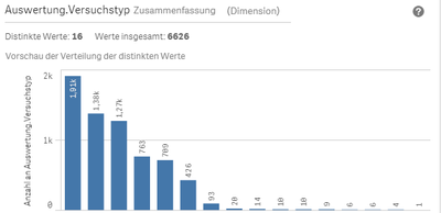
Using tables is a good idea. It's a lot of data so I cant count by myself. So I checked the table in the Datamanager. There is a Diagramm that counts the test typs.
I cut the test typs because I don't know what I'm allowed to share. Here you see there are 6626 entries in the whole table. But in the next table the sum of the right coloumn isn't 6626. I think i should be? Because Count(AuftrNr) should Count how much cows there are.
 This is what my Diagram counts. I just noticed that the 263 could be true for the unique occurrences of Order Numbers.
That would mean that Count(distinct AuftrNr) - 'AuftrID' and 'AuftrNr' is pretty much the same. Counts the the unique occurrences of test typs. And Count(AuftrNr) Counts the unique occurrences of the order numbers.
But: When I use Count(AuftrNr) because it (maybe?) shows what I want I still have the equal parts Problem. When I select for example KK I have 4 equal part.
And yes, your photo seems to Show what I want to see. Besides that I have a lot more data of cause.
Thanks
Hannah
- Mark as New
- Bookmark
- Subscribe
- Mute
- Subscribe to RSS Feed
- Permalink
- Report Inappropriate Content
I can't edit my replies.
Acutally I have no idea what Count(distinct AuftrNr) Counts. If it was the amount of different test types it would be 16 in every row.
Edit:
...I'm confused. For one test typ it calculates 93 entries in the datamanager. That's correct. It's the same like in the database. But in the diagram count(AuftrNr) is 250 and that's not possible. There can't be more Order Numbers than Entries in total.
Sorry, that this is such a mess. I can't even discribe my Problem because I can't find regularities in it. It just doesn't make sense.
- Mark as New
- Bookmark
- Subscribe
- Mute
- Subscribe to RSS Feed
- Permalink
- Report Inappropriate Content
Here is a secon example, where it doesn't work:
The datamanager counts the components right:

But when I use Count(AuftrNr) in the diagram the values are wrong:
- « Previous Replies
-
- 1
- 2
- Next Replies »

