Unlock a world of possibilities! Login now and discover the exclusive benefits awaiting you.
- Qlik Community
- :
- Forums
- :
- Analytics
- :
- New to Qlik Analytics
- :
- Simple Qlik Chart
Options
- Subscribe to RSS Feed
- Mark Topic as New
- Mark Topic as Read
- Float this Topic for Current User
- Bookmark
- Subscribe
- Mute
- Printer Friendly Page
Turn on suggestions
Auto-suggest helps you quickly narrow down your search results by suggesting possible matches as you type.
Showing results for
Anonymous
Not applicable
2018-11-30
02:06 AM
- Mark as New
- Bookmark
- Subscribe
- Mute
- Subscribe to RSS Feed
- Permalink
- Report Inappropriate Content
Simple Qlik Chart
Hi all,
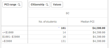
Attached is the chart i have tried in Qlik Sense.
What i want to be able to do is to be able to customize the PCI ranges at the left side without hard coding the ranges. This means when i filter , for example PCI from $200 to $1,500. The first row might show something like >= $200 to <=$1,500. Basically to be able to define my own ranges and to display it in the table. Please help if you have any idea.
(An idea i had was to create columns with no values and then put them as dimensions and then use the PCI range to toggle around. I am unsure if it is possible)
Thank you for your time.
334 Views
2 Replies
Creator II
2018-11-30
02:27 AM
- Mark as New
- Bookmark
- Subscribe
- Mute
- Subscribe to RSS Feed
- Permalink
- Report Inappropriate Content
You can use a class() function for the PCI dimension but the interval has to be fix for both intervals (0-100, 100-200, ...). If you need to user different ranges (0-200, 200-1500, ...) you have to do it in the script. Using an intervalmatch you can get it.
Ag+
327 Views
2018-11-30
03:38 AM
- Mark as New
- Bookmark
- Subscribe
- Mute
- Subscribe to RSS Feed
- Permalink
- Report Inappropriate Content
Please post sample file
Best Anil, When applicable please mark the correct/appropriate replies as "solution" (you can mark up to 3 "solutions". Please LIKE threads if the provided solution is helpful
320 Views
Related Topics
Community Browser
