Unlock a world of possibilities! Login now and discover the exclusive benefits awaiting you.
- Qlik Community
- :
- Forums
- :
- Analytics
- :
- New to Qlik Analytics
- :
- Re: Simple line chart visualization similar to Exc...
Options
- Subscribe to RSS Feed
- Mark Topic as New
- Mark Topic as Read
- Float this Topic for Current User
- Bookmark
- Subscribe
- Mute
- Printer Friendly Page
Turn on suggestions
Auto-suggest helps you quickly narrow down your search results by suggesting possible matches as you type.
Showing results for
Anonymous
Not applicable
2017-12-16
03:39 AM
- Mark as New
- Bookmark
- Subscribe
- Mute
- Subscribe to RSS Feed
- Permalink
- Report Inappropriate Content
Simple line chart visualization similar to Excel
Hello,
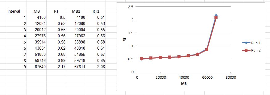
I'm very new to Qlik sense so pardon for the basic question, I'm trying to recreate this chart from excel, the data represents measures taken every 30 seconds intervals, I can create the curve with line chart but also need to mark each interval as excel does with the little squares. Is there a way to accomplish that? Any help will be greatly appreciated.
Thanks in advance
-Patricia
718 Views
1 Solution
Accepted Solutions
MVP
2017-12-17
10:02 AM
- Mark as New
- Bookmark
- Subscribe
- Mute
- Subscribe to RSS Feed
- Permalink
- Report Inappropriate Content
529 Views
5 Replies
Partner - Master III
2017-12-17
04:40 AM
- Mark as New
- Bookmark
- Subscribe
- Mute
- Subscribe to RSS Feed
- Permalink
- Report Inappropriate Content
hi
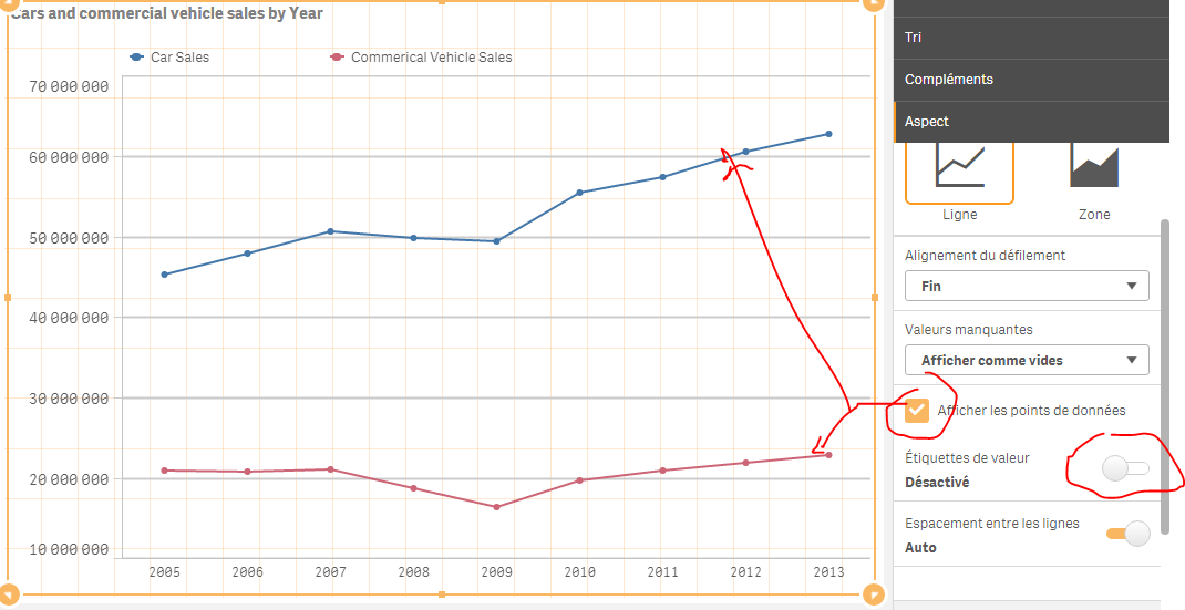
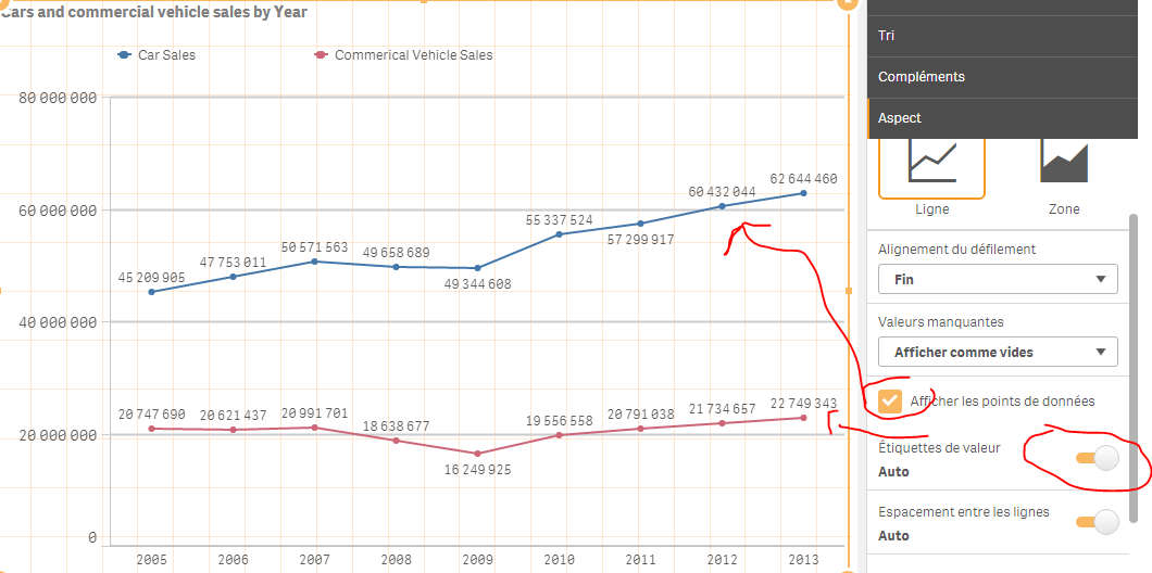
in the chart properties panel ,
under presentation section
check the box show data points
Anonymous
Not applicable
2017-12-17
07:31 AM
Author
- Mark as New
- Bookmark
- Subscribe
- Mute
- Subscribe to RSS Feed
- Permalink
- Report Inappropriate Content
Select line chart and choose show data point
529 Views
MVP
2017-12-17
10:02 AM
- Mark as New
- Bookmark
- Subscribe
- Mute
- Subscribe to RSS Feed
- Permalink
- Report Inappropriate Content
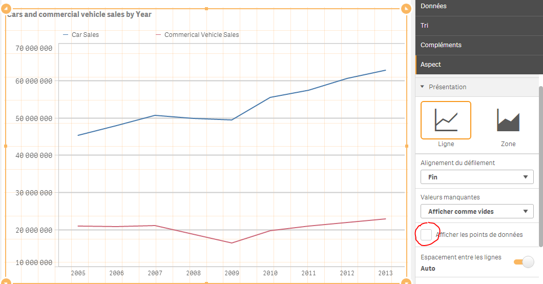
Under aspect, presentation : check show data points:
530 Views
Anonymous
Not applicable
2017-12-17
06:28 PM
Author
- Mark as New
- Bookmark
- Subscribe
- Mute
- Subscribe to RSS Feed
- Permalink
- Report Inappropriate Content
Thank you Liron!
529 Views
Anonymous
Not applicable
2017-12-17
06:30 PM
Author
- Mark as New
- Bookmark
- Subscribe
- Mute
- Subscribe to RSS Feed
- Permalink
- Report Inappropriate Content
Thank you Omar, appreciate the extra tips too.
529 Views
Community Browser