Unlock a world of possibilities! Login now and discover the exclusive benefits awaiting you.
- Qlik Community
- :
- Forums
- :
- Analytics
- :
- New to Qlik Analytics
- :
- Trellis container and gauge chart compatibility
- Subscribe to RSS Feed
- Mark Topic as New
- Mark Topic as Read
- Float this Topic for Current User
- Bookmark
- Subscribe
- Mute
- Printer Friendly Page
- Mark as New
- Bookmark
- Subscribe
- Mute
- Subscribe to RSS Feed
- Permalink
- Report Inappropriate Content
Trellis container and gauge chart compatibility
Hi all,
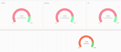
I was trying to create a gauge chart using trellis container. But currently the values are not showing as per expectation.
here as can be seen the achievement total is way more than each of the component. To cross check I added bar graphs to check for the same.
Here the correct value of achievement is shown for the bar charts.
I was thus wondering what I could be doing wrong with the gauge chart as I have followed the same process for both. Here achievement is just a ratio of total sales/total target
EDIT 1 : So I found that the Gauge chart has been averaging the achievement across all the categories. That's why I have been getting such low values. Can anyone help on how to get rid of this ?
Shouldn't a single row be shown instead of 3 in the table ? Also I tried the same example with other sub products and rather than showing a single aggregated row, multiple rows based on product categories were shown.


