Unlock a world of possibilities! Login now and discover the exclusive benefits awaiting you.
- Qlik Community
- :
- Forums
- :
- Analytics
- :
- New to Qlik Analytics
- :
- Two similar graphs/formula's. One is working...one...
- Subscribe to RSS Feed
- Mark Topic as New
- Mark Topic as Read
- Float this Topic for Current User
- Bookmark
- Subscribe
- Mute
- Printer Friendly Page
- Mark as New
- Bookmark
- Subscribe
- Mute
- Subscribe to RSS Feed
- Permalink
- Report Inappropriate Content
Two similar graphs/formula's. One is working...one not. Help?
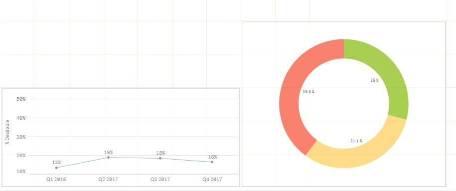
Hello All...I have a line graph and a pie chart here. The pie Chart is giving me the correct score. The Green Section in the Pie chart has a percentage of 29%. These are the "good" scores, and they are just for Quarter 1 2018. A good score is 4 or over. On the left with the line chart I have the "good" scores charted out by quarter. The Q1 2018 score on here is giving me 13%?! I am baffled. It seems like the line chart is counting the null values in the percentage where the pie chart isn't for some reason?
I am using this formula for the line chart: Num(Count({<test_measure = {">=4"}>} test_measure) /Count(test_measure),'0%')
- Mark as New
- Bookmark
- Subscribe
- Mute
- Subscribe to RSS Feed
- Permalink
- Report Inappropriate Content
Hi,
Maybe something like
Num(Count({<test_measure = {">=4"}>} test_measure) /Count({<test_measure = {'*'}>}test_measure),'0%')
- Mark as New
- Bookmark
- Subscribe
- Mute
- Subscribe to RSS Feed
- Permalink
- Report Inappropriate Content
Hello,
Thank you for the response. I am still getting the same result with that formula.
- Mark as New
- Bookmark
- Subscribe
- Mute
- Subscribe to RSS Feed
- Permalink
- Report Inappropriate Content
Hi,
Can you share sample App or Data.
- Mark as New
- Bookmark
- Subscribe
- Mute
- Subscribe to RSS Feed
- Permalink
- Report Inappropriate Content
May be this -
Num(Count({<test_measure = {">=4"}>} test_measure) /Count(total test_measure),'0%')
- Mark as New
- Bookmark
- Subscribe
- Mute
- Subscribe to RSS Feed
- Permalink
- Report Inappropriate Content
Jordan,
which version of Qlik are you using? I can't reproduce your issue in February 2018 release.
As Mohammed said, it would help if you could share a sample app.
Alex
- Mark as New
- Bookmark
- Subscribe
- Mute
- Subscribe to RSS Feed
- Permalink
- Report Inappropriate Content
Qlik Sense 3.2 SR3
How can I share a sample app?
- Mark as New
- Bookmark
- Subscribe
- Mute
- Subscribe to RSS Feed
- Permalink
- Report Inappropriate Content
You may want to create a copy of your app first, removing sensitive and/or irrelevant data to make it lighter.
If you are using Qlik Sense desktop, then you can just take the appropriate file from C:\Users\{your username}\Documents\Qlik\Sense\Apps (or something like that).
if you are on Qlik Sense server, you have to go to QMC and export the app - it will produce a QVF file.