Unlock a world of possibilities! Login now and discover the exclusive benefits awaiting you.
- Qlik Community
- :
- Forums
- :
- Analytics
- :
- New to Qlik Analytics
- :
- Re: Use continuous scale greyed out
- Subscribe to RSS Feed
- Mark Topic as New
- Mark Topic as Read
- Float this Topic for Current User
- Bookmark
- Subscribe
- Mute
- Printer Friendly Page
- Mark as New
- Bookmark
- Subscribe
- Mute
- Subscribe to RSS Feed
- Permalink
- Report Inappropriate Content
Use continuous scale greyed out
Hi
Using QS Feb 2018.
had to create a line chart with multiple lines (almost 100 days) to compare the last day data with the reference of the other 99, so it made sense to have 99 grey lines and just the last one say in red.
Basically the new line chart had two dimensions (day and time_period, where time_period is just a 5 mins period division of the day). Have only one measure and is a numeric value.
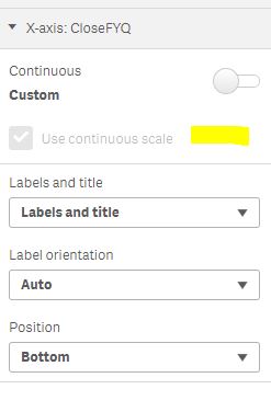
Point is that no matter what I do I'm just able to show not more than 17 lines despite all data are effectively there...Thought it was because the "Use continuous scale" in the X-axis section was checked, but unfortunately it can't be unchecked, it's just greyed out. What is the reason? and how could I solve the issue?
Thanks in advance.
- Mark as New
- Bookmark
- Subscribe
- Mute
- Subscribe to RSS Feed
- Permalink
- Report Inappropriate Content
Hey Stefano,
I'm having the same issue. Did you got it working now?
Thanks,
Christian
- Mark as New
- Bookmark
- Subscribe
- Mute
- Subscribe to RSS Feed
- Permalink
- Report Inappropriate Content
Still no solution? I have the same problem.
I seems that I have that option only with a date field. Not when I use other dimension, even if they're numeric.
- Mark as New
- Bookmark
- Subscribe
- Mute
- Subscribe to RSS Feed
- Permalink
- Report Inappropriate Content
Hey,
This is just a workaround I used to remove the greyed continuous scale.
I commented my dimension/formula and put Today() instead. and then I disabled continuous scale and uncommented my dimension/formula.
Cheers