Unlock a world of possibilities! Login now and discover the exclusive benefits awaiting you.
- Qlik Community
- :
- Forums
- :
- Analytics
- :
- New to Qlik Analytics
- :
- Visualization similar to this
- Subscribe to RSS Feed
- Mark Topic as New
- Mark Topic as Read
- Float this Topic for Current User
- Bookmark
- Subscribe
- Mute
- Printer Friendly Page
- Mark as New
- Bookmark
- Subscribe
- Mute
- Subscribe to RSS Feed
- Permalink
- Report Inappropriate Content
Visualization similar to this
Visualization similar to below graph/bar.
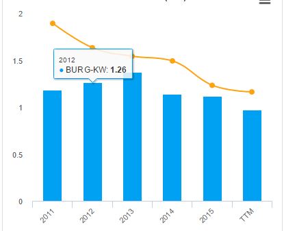
Here actually two dimensions and one measure is there. Dimension1 is year and Dimension2 represents two entities(one represented by blue bar and another by Yellow line). Is any visualization available in branch.qlik.com to acheive the same ??
Accepted Solutions
- Mark as New
- Bookmark
- Subscribe
- Mute
- Subscribe to RSS Feed
- Permalink
- Report Inappropriate Content
I got the answer for this.
I created a combi chart, with two measures.
Each with Measure 1 expression: avg({<[BANK]={'Bank1','Bank2','Bank3','Bank4'}>}Amount)
Measure 2 expression sum({<[BANK]={'Bank5'}>}Amount)
More over, made view of Measure1 to Bar in properties and Measure2 to line.
Its working perfect for me
- Mark as New
- Bookmark
- Subscribe
- Mute
- Subscribe to RSS Feed
- Permalink
- Report Inappropriate Content
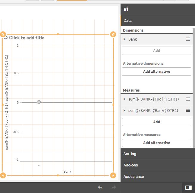
No. You'll have to use a combi chart with two expressions; one for the bars and one for the line.
line: sum({<Dim2={'Foo'}>} Amount)
bars: sum({<Dim2={'Bar'}>} Amount)
talk is cheap, supply exceeds demand
- Mark as New
- Bookmark
- Subscribe
- Mute
- Subscribe to RSS Feed
- Permalink
- Report Inappropriate Content
It is not working. Attaching how i tried with the same.
- Mark as New
- Bookmark
- Subscribe
- Mute
- Subscribe to RSS Feed
- Permalink
- Report Inappropriate Content
I think you should google for the origin of Foo and Bar.
talk is cheap, supply exceeds demand
- Mark as New
- Bookmark
- Subscribe
- Mute
- Subscribe to RSS Feed
- Permalink
- Report Inappropriate Content
I got the answer for this.
I created a combi chart, with two measures.
Each with Measure 1 expression: avg({<[BANK]={'Bank1','Bank2','Bank3','Bank4'}>}Amount)
Measure 2 expression sum({<[BANK]={'Bank5'}>}Amount)
More over, made view of Measure1 to Bar in properties and Measure2 to line.
Its working perfect for me
- Mark as New
- Bookmark
- Subscribe
- Mute
- Subscribe to RSS Feed
- Permalink
- Report Inappropriate Content
Great. Well done. Can you mark this question as answered so other users with the same question can find it more easily?
talk is cheap, supply exceeds demand