Unlock a world of possibilities! Login now and discover the exclusive benefits awaiting you.
- Qlik Community
- :
- Forums
- :
- Analytics
- :
- New to Qlik Analytics
- :
- What does configuring a box plot with multiple dim...
- Subscribe to RSS Feed
- Mark Topic as New
- Mark Topic as Read
- Float this Topic for Current User
- Bookmark
- Subscribe
- Mute
- Printer Friendly Page
- Mark as New
- Bookmark
- Subscribe
- Mute
- Subscribe to RSS Feed
- Permalink
- Report Inappropriate Content
What does configuring a box plot with multiple dimensions do?
Hi,
I don't understand the configuration of box plots in Qlik Sense. The documentation says "In a box plot you need to use one or two dimensions", and this video uploaded by the Youtube channel Qlik Help shows usage of both dimensions, and what happens if you change their relative order.
However, neither of these sources describe what this actually does. In the video, the order just changes the grouping of the box plots from month to countries, but it doesn't really explain how the two, when encoded into the settings of a box plot, actually change visualisation.
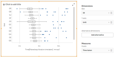
Further, I just created a box plot with essentially one dimension to differentiate them, referred to as "Unit", which I wanted to group to compare their 'time taken' values. It didn't work, however, until I added a second dimension "ID", which is each record's unique number. This seems strange and arbitrary that it should only work when ID is included. Below is a picture capturing the scenario where it works:
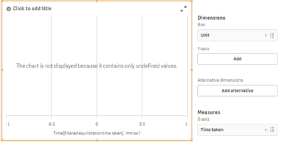
and now when removing ID:
Why does this happen? This doesn't make any intuitive sense to me.
Thanks in advance for any help!
Accepted Solutions
- Mark as New
- Bookmark
- Subscribe
- Mute
- Subscribe to RSS Feed
- Permalink
- Report Inappropriate Content
IT may have something to do with the relationships in your data.
Another way to understand the data is to copy the box plot and convert it to a distribution plot where you see all values.
The first dimension should show one box and the distribution of raw values per the first dimension, the second dimension shows a box per dimension value.
- Mark as New
- Bookmark
- Subscribe
- Mute
- Subscribe to RSS Feed
- Permalink
- Report Inappropriate Content
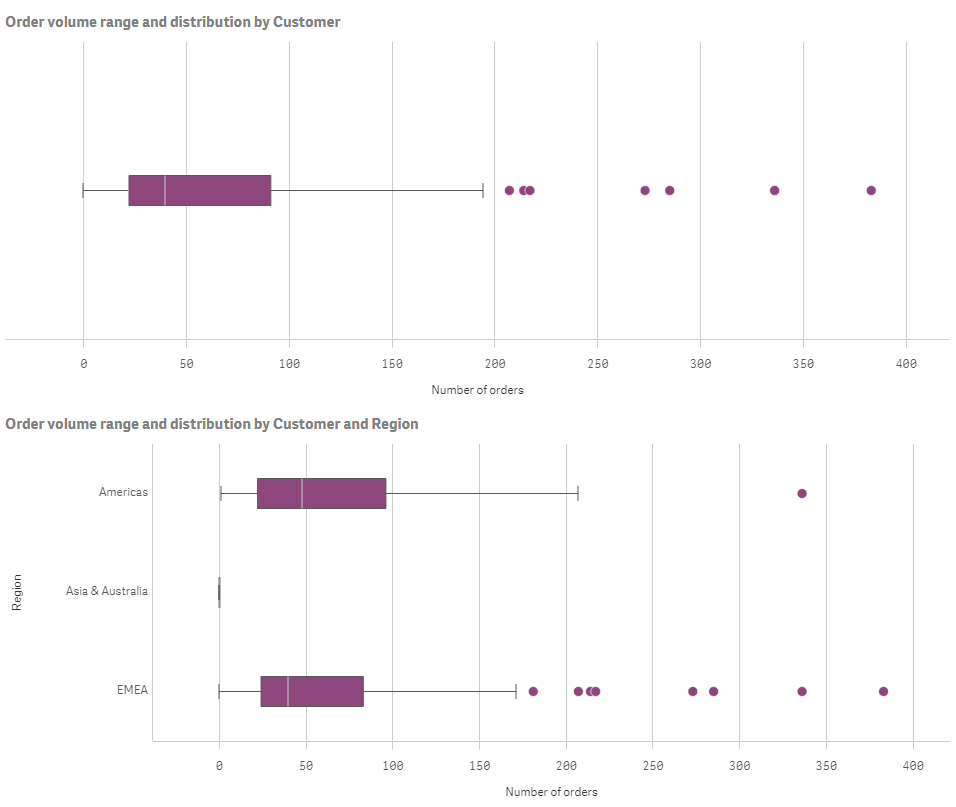
I can get a box plot to do what you want with my own data, the bit I don't know is your data. Here is an example of a box plot with one dimension and then a box plot with two dimensions.
- Mark as New
- Bookmark
- Subscribe
- Mute
- Subscribe to RSS Feed
- Permalink
- Report Inappropriate Content
This is possible by using the Purchase cost as the first dimension as well as the measure and Customer as second dimension.
- Mark as New
- Bookmark
- Subscribe
- Mute
- Subscribe to RSS Feed
- Permalink
- Report Inappropriate Content
IT may have something to do with the relationships in your data.
Another way to understand the data is to copy the box plot and convert it to a distribution plot where you see all values.
The first dimension should show one box and the distribution of raw values per the first dimension, the second dimension shows a box per dimension value.
- Mark as New
- Bookmark
- Subscribe
- Mute
- Subscribe to RSS Feed
- Permalink
- Report Inappropriate Content
Hi!
The first dimension should show one box and the distribution of raw values per the first dimension, the second dimension shows a box per dimension value.
I'm not sure what you mean by this. If I'm measuring just the distribution of the values on the x-axis (as in my example), then there is no dimension, because we are simply taking the values of, for example, the time-taken measure, and then graphing their median/min/max and distribution.
I'll rephrase to try to be clear: in order to get all the information to make a single box plot with one box describing the distribution of some measure, I can calculate what all the values of this should be from just these values themselves. For example, I can get the median of a measure by just sorting it and counting to it, and I can find the min/max/q1/q3 in similar ways.
In this way, doesn't the first dimension do nothing? Where am I going wrong here with my understanding?
Cheers!
- Mark as New
- Bookmark
- Subscribe
- Mute
- Subscribe to RSS Feed
- Permalink
- Report Inappropriate Content
I can get a box plot to do what you want with my own data, the bit I don't know is your data. Here is an example of a box plot with one dimension and then a box plot with two dimensions.
- Mark as New
- Bookmark
- Subscribe
- Mute
- Subscribe to RSS Feed
- Permalink
- Report Inappropriate Content
Perhaps I didn't explain myself well. I don't understand why a first dimension is necessary, as it doesn't appear to add any information to the plot. I say this because like I said before, I could calculate the box plot in your first image by hand (manually on a piece of paper) if I just had the field Number of Orders.
It's actually starting to make sense, now. But I still have some uncertainties:
I think I understand your example. In your case the first dimension is needed because it may be necessary to group the data by customer to get the count of orders per customer, each of which will be treated as a part of the box plot in one dimension.
But suppose that we wanted all customers on the y-axis, and a boxplot for individual customers (i.e. each customer would have their own box and whisker set). How would you do that?
- Mark as New
- Bookmark
- Subscribe
- Mute
- Subscribe to RSS Feed
- Permalink
- Report Inappropriate Content
What do you want to show distribution of ? If you show a box per customer, how do you want the box to be broken down ? By Product as an example would then show the range and distribution of orders by Product by customer. Product would be first dimension, Customer would be second dimension
- Mark as New
- Bookmark
- Subscribe
- Mute
- Subscribe to RSS Feed
- Permalink
- Report Inappropriate Content
@Lisa_P wrote:What do you want to show distribution of ? If you show a box per customer, how do you want the box to be broken down ? By Product as an example would then show the range and distribution of orders by Product by customer. Product would be first dimension, Customer would be second dimension
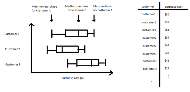
My interest is actually even more simple than that. Below I made an example of what I mean. Suppose we have the table on the right which is just a big list of all the purchases of various customers. We want to just see how their purchase cost is distributed, per customer: like so
In this case, do you see how the only grouping that exists is the customer itself? Can we use the box plot like this?
- Mark as New
- Bookmark
- Subscribe
- Mute
- Subscribe to RSS Feed
- Permalink
- Report Inappropriate Content
This is possible by using the Purchase cost as the first dimension as well as the measure and Customer as second dimension.
- Mark as New
- Bookmark
- Subscribe
- Mute
- Subscribe to RSS Feed
- Permalink
- Report Inappropriate Content
Right, okay!
That's all my questions!
Thanks so much for sticking it out and making sure I understood! You're a legend.


