Unlock a world of possibilities! Login now and discover the exclusive benefits awaiting you.
- Qlik Community
- :
- Forums
- :
- Analytics
- :
- New to Qlik Analytics
- :
- Why do legends disappear when I color a chart by e...
- Subscribe to RSS Feed
- Mark Topic as New
- Mark Topic as Read
- Float this Topic for Current User
- Bookmark
- Subscribe
- Mute
- Printer Friendly Page
- Mark as New
- Bookmark
- Subscribe
- Mute
- Subscribe to RSS Feed
- Permalink
- Report Inappropriate Content
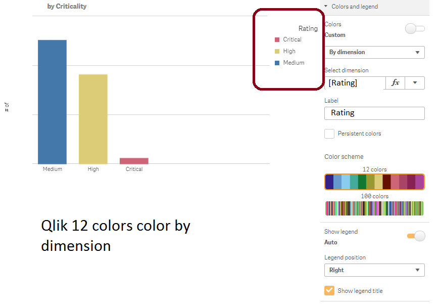
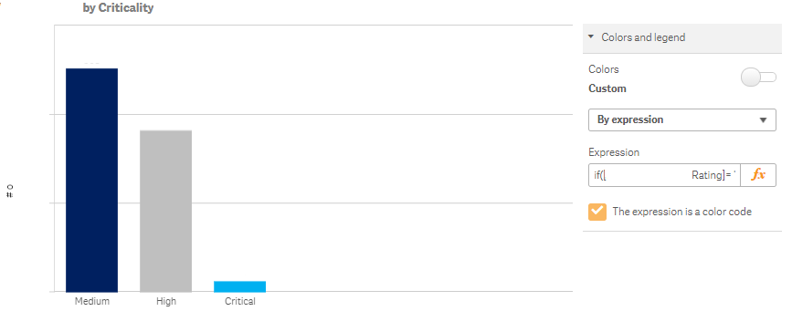
Why do legends disappear when I color a chart by expression (two scenarios)?
I need to color bar charts, pie charts, point maps, table fills, etc. consistently by a custom color set by:
- a single dimension, or
- two different dimensions on different tables that repeat common values High, Medium, and Critical.
but when specifying colors the legend disappears.
For one dimension (#1), I built a color by expression for each of the three measures,
if([Security Category Rating]= 'Medium', rgb(191, 191, 191),
if([Security Category Rating]= 'High', rgb(0, 32, 96),
if([Security Category Rating]= 'Critical', rgb(0, 176, 240),
'purple')))
When I use the expression instead of Qlik's built-in color, the legend disappears from the chart.
For two similar dimensions in different contexts (#2), I have columns that have the same implicit meaning and I want to filter by the same unique 'overall' category High, Medium, and Critical across different tables of things rated separately. Normally in SSRS I define a bridge lookup table and a unique dimension table then connect the data as follows.
Location Summary Table
| Location | Overall Equipment Criticality |
|---|---|
| A | High |
| B | Medium |
| C | Critical |
| D | Critical |
| E | Medium |
| F | Critical |
Storage Table
| Location | Storage Criticalities |
|---|---|
| A | High; Medium |
| B | Medium; Low |
| C | Critical; High |
| D | High; Critical |
| E | Medium; Low |
| F | Critical; Medium |
Bridge Table
| Overall Criticality | Criticality Variant |
|---|---|
| High | High; Medium |
| Medium | Medium; Low |
| Critical | Critical; High |
| Critical | High; Critical |
| Medium | Medium; Low |
| Critical | Critical; Medium |
| High | High |
| Medium | Medium |
| Critical | Critical |
Dim_Criticality
| Overall Criticality |
|---|
| High |
| Medium |
| Critical |
Relationships in SSRS like data modeling software:
- Bridge Table.[Overall Equipment Criticality] (>>many to one>) Dim_Criticality.[Overall Criticality]
- Storage Table.[Storage Criticalities] (>>many to one>) Bridge Table.[Criticality Variant]
- Bridge Table.[Criticality Variant] (>>many to one>) Dim_Criticality.[Overall Criticality]
- Location Summary Table.[Overall Equipment Criticality] (>>many to one>) Dim_Criticality.[Overall Criticality]
Then within my charts I would like to use the dimension with a common meaning in the two different tables as Dim_Criticality.[Overall Criticality]. In Qlik Sense's data manager, when creating associations listed above it said there is a circular reference. I think this is because I cannot appear to tell Qlik the directionality of any association relationship as being many to one. Is that correct?
To get around this must I merge the Bridge, Storage, and Location Summary tables?
I found another approach unique to Qlik that involves setting variables within the load script then referencing the variables in the color by expression. This will not get around the first issue, granted, but is that method documented or useful to consider?
I need this to work in Qlik Sense Cloud, Qlik Sense Desktop, and Qlik Sense Enterprise server.
Accepted Solutions
- Mark as New
- Bookmark
- Subscribe
- Mute
- Subscribe to RSS Feed
- Permalink
- Report Inappropriate Content
When you custom color the dimension....you could insert a table with just the dimension and choose background color using expression. Here you can write the expression or use color code from script via data modeling.
- Mark as New
- Bookmark
- Subscribe
- Mute
- Subscribe to RSS Feed
- Permalink
- Report Inappropriate Content
Once again, QlikView is still superior to Qlik Sense on these development tasks.
- Mark as New
- Bookmark
- Subscribe
- Mute
- Subscribe to RSS Feed
- Permalink
- Report Inappropriate Content
I wish it would be possible to use a custom color, while still showing the dimension legend. This would save the need of duplicate work, by creating a new chart due to the lack of this functionality!
- Mark as New
- Bookmark
- Subscribe
- Mute
- Subscribe to RSS Feed
- Permalink
- Report Inappropriate Content
Please read this and it should solve the problem:
Thanks,
Padma Priya
Qlik Support
- Mark as New
- Bookmark
- Subscribe
- Mute
- Subscribe to RSS Feed
- Permalink
- Report Inappropriate Content
I would like to use color by measure but legend based on dimension in stacked bar chart. Could anyone please suggest a way to do it. I can not define the dimension color because it keeps on changing with the filter.