Unlock a world of possibilities! Login now and discover the exclusive benefits awaiting you.
- Qlik Community
- :
- Forums
- :
- Analytics
- :
- New to Qlik Analytics
- :
- change starting values on X-axis
- Subscribe to RSS Feed
- Mark Topic as New
- Mark Topic as Read
- Float this Topic for Current User
- Bookmark
- Subscribe
- Mute
- Printer Friendly Page
- Mark as New
- Bookmark
- Subscribe
- Mute
- Subscribe to RSS Feed
- Permalink
- Report Inappropriate Content
change starting values on X-axis
Hi everyone,
I'm new to qliksense but have progressed somewhere and benefitted greatly from this community board. I have a question for bar charts axis below. My data starts from 29 - 57, and I have arranged it to be grouped in classes of 5. I would like for the data to start at 29, i.e. the first bar should say 29-34 instead of 25-30, as it could mislead that 25 is acceptable (as it is not). Could anyone help me with this? thank you!
Accepted Solutions
- Mark as New
- Bookmark
- Subscribe
- Mute
- Subscribe to RSS Feed
- Permalink
- Report Inappropriate Content
Hi @sharonq, sorry my bad, I think I've missed a part of your post 😅 In this case (giving that you have an example field "Age" and an example field "YearsOfExp") setting the Dimension and the Measure this way in the Bar Chart should help you:
- Set the Dimension as Class(Age,5,'x', 4) (where the number 4 represents the offset) to create the correct intervals.
- Set the Measure as follows: Avg({$<Age={">28"}>}YearsOfExp). This expression uses Set Analysis to select values only above 28 of the field 'Age'.
You can check also the attached screenshot. Let me know if this solved your issue 😊

- Mark as New
- Bookmark
- Subscribe
- Mute
- Subscribe to RSS Feed
- Permalink
- Report Inappropriate Content
Hi @sharonq! If I got your request right, you could solve your issue by setting the "offset" field to "4" and the "Width" to "5".
Let me know if this helped you! 🙂
Cheers!

- Mark as New
- Bookmark
- Subscribe
- Mute
- Subscribe to RSS Feed
- Permalink
- Report Inappropriate Content
Thank you for your comment! I am looking at creating a graph/chart that shows average work experience in the age groups of 29-34, 35-40, 41-46, 47-51, 52 and beyond. Not sure if Histogram is the right way..
- Mark as New
- Bookmark
- Subscribe
- Mute
- Subscribe to RSS Feed
- Permalink
- Report Inappropriate Content
Hi @sharonq, sorry my bad, I think I've missed a part of your post 😅 In this case (giving that you have an example field "Age" and an example field "YearsOfExp") setting the Dimension and the Measure this way in the Bar Chart should help you:
- Set the Dimension as Class(Age,5,'x', 4) (where the number 4 represents the offset) to create the correct intervals.
- Set the Measure as follows: Avg({$<Age={">28"}>}YearsOfExp). This expression uses Set Analysis to select values only above 28 of the field 'Age'.
You can check also the attached screenshot. Let me know if this solved your issue 😊

- Mark as New
- Bookmark
- Subscribe
- Mute
- Subscribe to RSS Feed
- Permalink
- Report Inappropriate Content
Hello there,
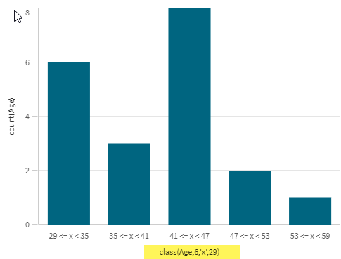
The age groups you listed are not even; some have 6 values (29-34, 35-40) and some 5 (41-46, 47-51)... anyhow I think the key for you is to set the 4th argument to 29
Assuming the class size is 6 use: class(Age,6,'x',29)
- Mark as New
- Bookmark
- Subscribe
- Mute
- Subscribe to RSS Feed
- Permalink
- Report Inappropriate Content
Thank you! this worked well!!!

