Unlock a world of possibilities! Login now and discover the exclusive benefits awaiting you.
- Qlik Community
- :
- Forums
- :
- Analytics
- :
- New to Qlik Analytics
- :
- color by expression - QlikSense
- Subscribe to RSS Feed
- Mark Topic as New
- Mark Topic as Read
- Float this Topic for Current User
- Bookmark
- Subscribe
- Mute
- Printer Friendly Page
- Mark as New
- Bookmark
- Subscribe
- Mute
- Subscribe to RSS Feed
- Permalink
- Report Inappropriate Content
color by expression - QlikSense
Hi all,
i am struggeling with a simple line chart. It shows revenue over month - so "Month" would be one dimension. It has two expressions. The one calculates revenue for the current year. The other calculates revenue for the previous year. All no problem.
What i want - and until now couldnt get to: I want the line representing the current year to have a specific color (lets say, red) and the line representing the previous year to have another specific color (lets say, gray).
Can anyone help and explain how this can be done in SENSE ?
Thanks!
K
- Mark as New
- Bookmark
- Subscribe
- Mute
- Subscribe to RSS Feed
- Permalink
- Report Inappropriate Content
Hi Naresh,
It will depend on the definition of your variable. Test it with just one measure first (e.g. $(Sales2011)) since the expansion of the variable has nothing to do with ValueList. I expect you're missing an '=' somewhere - perhaps $(=Sales2011) will work?
- Mark as New
- Bookmark
- Subscribe
- Mute
- Subscribe to RSS Feed
- Permalink
- Report Inappropriate Content
Hi Steve,
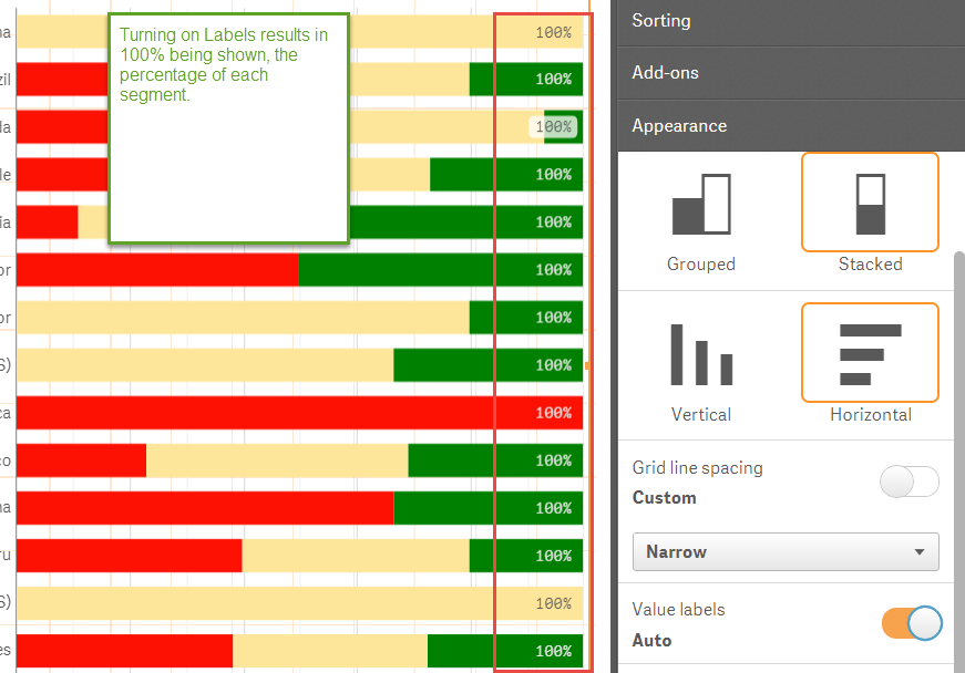
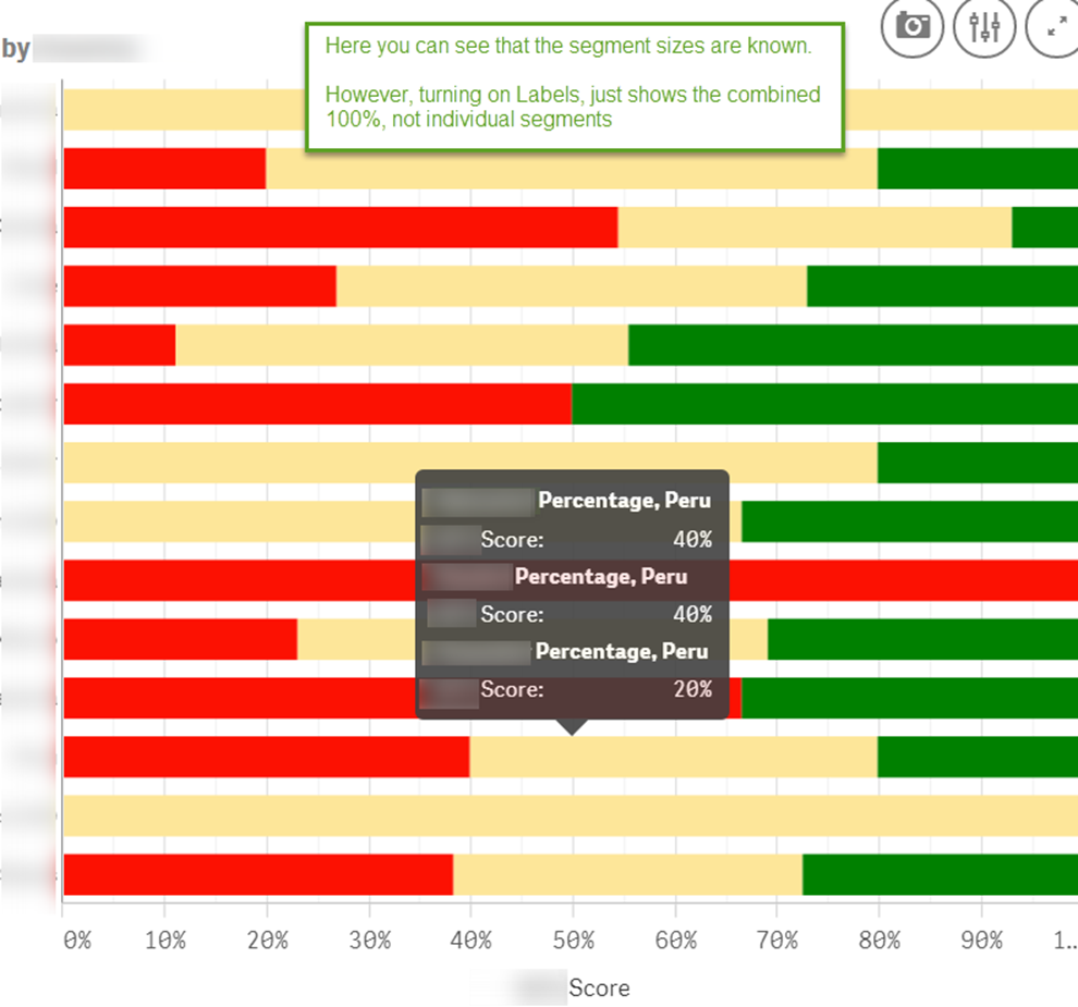
Thanks for such a rapid response. To remind, I am using the method found here (color by expression - QlikSense<https://community.qlik.com/message/594463#594463>) for specifying the colors required for a stacked bar chart.
The problem I have with showing the labels is easier to show than articulate. Here is the chart I am using, by hovering over one of the bars, you can see that each of the segment sizes is know –
However, if I turn on Labels in Presentation, I only see the combined 100% total, not the value of each of the stacked bars (semgents).
Pat
- Mark as New
- Bookmark
- Subscribe
- Mute
- Subscribe to RSS Feed
- Permalink
- Report Inappropriate Content
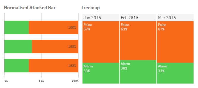
Value Labels on Stacked Bar give the total value. This doesn't make sense if you're using a normalised stacked bar where the total value is always 100%. Perhaps you can consider another visualisation (such as Treemap) for this if it's imperative the exact values are shown. Or use the stacked bar in conjunction with a table listing.
- Mark as New
- Bookmark
- Subscribe
- Mute
- Subscribe to RSS Feed
- Permalink
- Report Inappropriate Content
Hi.
I have one question related with this:
You have LightGray for the years that are not selected in the graphic.
How can i do to fix the colours independently of the year i select?
Thank you!
- Mark as New
- Bookmark
- Subscribe
- Mute
- Subscribe to RSS Feed
- Permalink
- Report Inappropriate Content
Hi Carla. I'm not sure which chart you're referring to but let's assume its this one.
 In this chart I've used a technique called 'brushing' which still shows you all dimensions but applies specific colouring only to the selected value (in this case Feb 2015). This is useful to highlight a selection but see it in context with your other data. It works by using set analysis on your measure to include the entire dataset (the '1' in the following statement) - Count({1<Alarm=,Month=>}Date)
If you replace the '1' with '$' it will show the current selections so the chart is reduced to only the month and year that was selected. If you want the same colours applied irrespective of what selections are made you can use the technique mentioned above by pieterkup.

I hope this answers your query
- Mark as New
- Bookmark
- Subscribe
- Mute
- Subscribe to RSS Feed
- Permalink
- Report Inappropriate Content
Hi Sean,
I also have a similar problem about color by expression with QlikSense.
I use the following expression to assign different color to each REGION (REGION column contains ‘West’, ‘East’, ‘North’, ‘South’)on the map, but my problem is how to also show a legend with REGION type and the corresponding color.
By the way, I can not use REGION as my map dimension, because I have to use another column (State, State column contains different states name) as my map dimension.
Could you please give any suggestion?
Thanks so much for your help!
If ( REGION = 'West', red(),
If ( REGION = 'East', green(),
(
if ( REGION = 'North', blue(), Yellow() )
)
)
)
- Mark as New
- Bookmark
- Subscribe
- Mute
- Subscribe to RSS Feed
- Permalink
- Report Inappropriate Content
Hi Janani,
I also have a similar problem about color by expression with QlikSense.
I use the following expression to assign different color to each REGION (REGION column contains ‘West’, ‘East’, ‘North’, ‘South’) on the map, but my problem is how to also show a legend with REGION type and the corresponding color.
By the way, I can not use REGION as my map dimension, because I have to use another column (State, State column contains different states name) as my map dimension.
Could you please share how you use a table to get color legend?
Thanks so much for your help!
If ( REGION = 'West', red(),
If ( REGION = 'East', green(),
(
if ( REGION = 'North', blue(), Yellow() )
)
)
)
- Mark as New
- Bookmark
- Subscribe
- Mute
- Subscribe to RSS Feed
- Permalink
- Report Inappropriate Content
Hi Steve,
Can you help me for getting a solution for this discussion.
Color by expression for two different measures in a Combo Chart
Is there any possibility to customize 'Multicolored' option in Combo chart where we can set out default colors ??Currently Multicolored option provide Blue and Magenta as its first two color options.
- Mark as New
- Bookmark
- Subscribe
- Mute
- Subscribe to RSS Feed
- Permalink
- Report Inappropriate Content
Hi Steve,
Is there any possibility where we can customize the colors in the "Multicolored' option in Combo Chart, Colors and legend property??
- Mark as New
- Bookmark
- Subscribe
- Mute
- Subscribe to RSS Feed
- Permalink
- Report Inappropriate Content
Hi Steve,
I'm trying your magic method with a cumulative sum :
if( ValueList('Dim1', 'Dim2')='Dim1', rangesum(Above( (Sum ({<Annee={2017}>} rea_eco)),0,RowNo())),
if( ValueList('Dim1', 'Dim2')='Dim2', rangesum(Above( (Sum ({<Annee={2017}>} obj_eco)),0,RowNo()))))
however, the results in the graph are false 
any suggestion ?
Thank you.