Unlock a world of possibilities! Login now and discover the exclusive benefits awaiting you.
- Qlik Community
- :
- Forums
- :
- Analytics
- :
- New to Qlik Analytics
- :
- Re: colors fomating
- Subscribe to RSS Feed
- Mark Topic as New
- Mark Topic as Read
- Float this Topic for Current User
- Bookmark
- Subscribe
- Mute
- Printer Friendly Page
- Mark as New
- Bookmark
- Subscribe
- Mute
- Subscribe to RSS Feed
- Permalink
- Report Inappropriate Content
colors fomating
Hi Guys
I need your help I have two field One is dimension(State) and measure(Sales) I want to set gradient color my chart bit not able to find any option for this can you please help me how to do this.
Note* I am working on Qlik sense cloud
- « Previous Replies
-
- 1
- 2
- Next Replies »
Accepted Solutions
- Mark as New
- Bookmark
- Subscribe
- Mute
- Subscribe to RSS Feed
- Permalink
- Report Inappropriate Content
Actually, it is possible but we have to enter two colours instead, the 0% and 100% colours, it works by
- Selecting Sequential Gradient,
- Then deleting all the brackets, just keeping the 50% point and
- Define the 0% and 100% colour.
- Then assign as Custom Color by Measure using this Measure Master Item. Qlik resolves the gradient.
Interesting, we can achieve the same result with different approaches, each one affecting the legend; there is also an option by implementing the following expressing for colouring (with ColorMix1(); Rank() and Argb()):
=ColorMix1(Rank(TOTAL Sum([Total Cases]),4)/(NoOfRows(TOTAL)), argb(255, 255, 0, 0), argb(128,255, 230,255))
A journey of a thousand miles begins with a single step.
- Mark as New
- Bookmark
- Subscribe
- Mute
- Subscribe to RSS Feed
- Permalink
- Report Inappropriate Content
Hello @MeeraAgrawal
What type of graphic are you implementing, Bars or Lines? Have you explore the colouring feature in Master Items? both Dimensions and Measures extending the colouring options!
Hope this helps,
A journey of a thousand miles begins with a single step.
- Mark as New
- Bookmark
- Subscribe
- Mute
- Subscribe to RSS Feed
- Permalink
- Report Inappropriate Content
After reading your answer I learned about master measure and more or less its working fine. but as I want not able to find how to set segment limit according to my output I have attached both the scenario.
1.What happening.
2.What I want.
Can we make single color as gradient instead of applying different color using limit.
- Mark as New
- Bookmark
- Subscribe
- Mute
- Subscribe to RSS Feed
- Permalink
- Report Inappropriate Content
I am preparing my data to populate India, with its states!!! I will be able to get back to you in 24 hours, as I am preparing some data as well.
Regards
A journey of a thousand miles begins with a single step.
- Mark as New
- Bookmark
- Subscribe
- Mute
- Subscribe to RSS Feed
- Permalink
- Report Inappropriate Content
I have attached test sheet. you can directly import it.
- Mark as New
- Bookmark
- Subscribe
- Mute
- Subscribe to RSS Feed
- Permalink
- Report Inappropriate Content
Thanks for the data it will help, I suspect that you are trying to apply shadows of red over the map, probably driven by a rate or proportion, if my guess is on target, perhaps you will find these replies helpful, the topic is about applying gradients of colours to a pivot table, but the procedure to do it, could also help your challenge.
I will be busy in the next 18 hours, so it will be difficult for me to look at your question, but I can't wait to give it a try, in the meantime, this Topic may give you more ideas, that solution implements and combine ColorMix1() and ARGB()
Regards,
A journey of a thousand miles begins with a single step.
- Mark as New
- Bookmark
- Subscribe
- Mute
- Subscribe to RSS Feed
- Permalink
- Report Inappropriate Content
I think I cracked the Qlik's colour palette! the attached qvf illustrates it, but let me explain, I introduced a Total Case Palette # dimensions, e.g. TC_P1, TC_P2, TC_P3 ... and so on while trying to understand how the palette works; I referenced this HTML Colour Picker to pick up the colours to render, let's start with the procedure.
- With your Master Item Dimensions, edit the one defining the Total_Cases
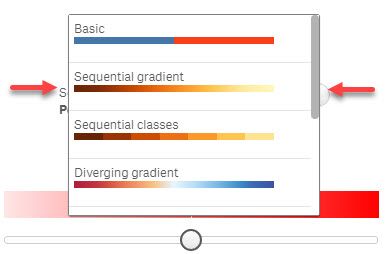
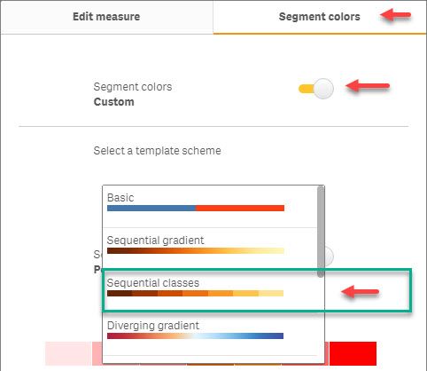
- Click on the Segment Color tab > Turn On Custom Segment Color > Select Sequential Classes
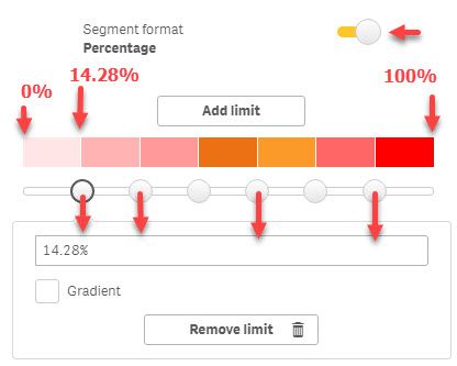
- Then you assign the color you want to each percentage bracket, you get six 7 brackets, but you can add or remove them to suit your needs; the first bracket is defined between 0% - 14.28% (Internally Qlik is calculating the measure % with an unknown expression); the second bracket is defined between 14.28% and 28.57%
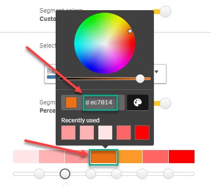
- Click on the Bracket's color to open the palette, and select or enter the color HEX value (this is where the Colour Picker link become handy)
- Once you are happy with the color palette associated with your measure, edit your map, select Custom Colors > By Measure and you will get a more representative colouring schema in your map, and the legend is adjusted accordingly.
Now, some screenshots supporting this procedure, note, you will see the measure TC_P3 in some screenshot, I expect your to be Total Cases.
Accessing the Segment Colors Palette.
Explaining the Palette:
Selecting colors per bracket:
Applying colours to the map selecting colouring By Measure (Note the screenshot show the TC_P3 measure, you should user yours); with the Map rendering and its legend.
I hope this procedure help you to assign appropriated colour to the map!
A journey of a thousand miles begins with a single step.
- Mark as New
- Bookmark
- Subscribe
- Mute
- Subscribe to RSS Feed
- Permalink
- Report Inappropriate Content
Yes it's working fine but my question is that for every limit we need to assign specific HAX code here. is it not possible once I will select color for 100 % limit then color for rest of the limit distribute automatically.
- Mark as New
- Bookmark
- Subscribe
- Mute
- Subscribe to RSS Feed
- Permalink
- Report Inappropriate Content
Actually, it is possible but we have to enter two colours instead, the 0% and 100% colours, it works by
- Selecting Sequential Gradient,
- Then deleting all the brackets, just keeping the 50% point and
- Define the 0% and 100% colour.
- Then assign as Custom Color by Measure using this Measure Master Item. Qlik resolves the gradient.
Interesting, we can achieve the same result with different approaches, each one affecting the legend; there is also an option by implementing the following expressing for colouring (with ColorMix1(); Rank() and Argb()):
=ColorMix1(Rank(TOTAL Sum([Total Cases]),4)/(NoOfRows(TOTAL)), argb(255, 255, 0, 0), argb(128,255, 230,255))
A journey of a thousand miles begins with a single step.
- Mark as New
- Bookmark
- Subscribe
- Mute
- Subscribe to RSS Feed
- Permalink
- Report Inappropriate Content
My answer is different from yours why it's happening.
ColorMix1(Rank(Total Sum([Covid-19 District wise data.Total Cases]),4)/NoOfRows(TOTAL),ARGB(255, 255, 0, 0), argb(128,255, 230,255))
and can you please elaborate this function.
- « Previous Replies
-
- 1
- 2
- Next Replies »


