Unlock a world of possibilities! Login now and discover the exclusive benefits awaiting you.
- Qlik Community
- :
- Forums
- :
- Analytics
- :
- New to Qlik Analytics
- :
- Re: comparison between months in my sales
- Subscribe to RSS Feed
- Mark Topic as New
- Mark Topic as Read
- Float this Topic for Current User
- Bookmark
- Subscribe
- Mute
- Printer Friendly Page
- Mark as New
- Bookmark
- Subscribe
- Mute
- Subscribe to RSS Feed
- Permalink
- Report Inappropriate Content
comparison between months in my sales
Hi! I would like to make a comparison between months in my sales, can anyone help me with the formula? There is attached a sample of the data that I am handling .
Thank you!
Accepted Solutions
- Mark as New
- Bookmark
- Subscribe
- Mute
- Subscribe to RSS Feed
- Permalink
- Report Inappropriate Content
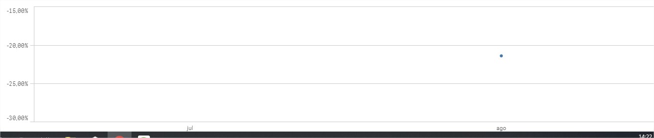
Olá Arthur,
Aqui está a solução que pediu, agora só precisa lapidar o gráfico da forma como quiser, como só temos apenas 2 meses nessa base, apenas de Agosto está aparecendo no gráfico de linha.
Adicione a dimensão:
=Month([Sales date])
Adicione a Medida:
(Sum(Value*Qtd) / (RangeSum( Above( Sum(Value*Qtd),0, 2 ) )-Sum(Value*Qtd)))-1
Explicação:
A função RangeSum permite que eu faça a soma de um determinado alcance/intervalo e Above eu defini a soma e o intervalo das dimensões que quero somar, portanto caso seja necessário mudar o intervalo altere esta parte Above( Sum(Value*Qtd),0, 2 ), intervalo entre 0 e 2.
Resultados:
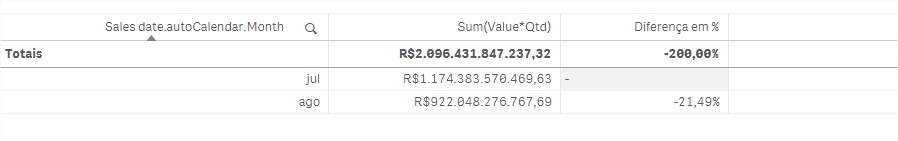
Caso seja a resposta correta marque como CORRETA, isso me ajuda muito, se lhe foi útil marque como ÚTIL.
Abrss
- Mark as New
- Bookmark
- Subscribe
- Mute
- Subscribe to RSS Feed
- Permalink
- Report Inappropriate Content
Hi !
May you be more precise about what you need ? chart, graph, do you need only months in dimension of your analysis ? Do you want to show sales, % of increase...?
Do you have a sample app ?
Regards,
Marina
- Mark as New
- Bookmark
- Subscribe
- Mute
- Subscribe to RSS Feed
- Permalink
- Report Inappropriate Content
Hi! I want to show the increase os sales between months in a chart, but i do not have any sample about it.
- Mark as New
- Bookmark
- Subscribe
- Mute
- Subscribe to RSS Feed
- Permalink
- Report Inappropriate Content
Hello Arthur,
If you need simple chart, I will give for you:
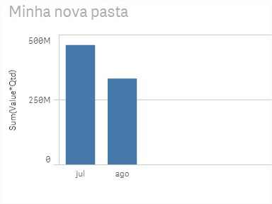
You just need add in dimensions:
=Month([Sales date])
and measures:
Sum(Value*Qtd)
I help you? Please mark correct answer
- Mark as New
- Bookmark
- Subscribe
- Mute
- Subscribe to RSS Feed
- Permalink
- Report Inappropriate Content
Try Insights Advisor feature and select the appropriate chart.
Using the insight advisor to create visualizations from your data - Qlik Sense - YouTube
- Mark as New
- Bookmark
- Subscribe
- Mute
- Subscribe to RSS Feed
- Permalink
- Report Inappropriate Content
Oi Breno! O que eu quero fazer é uma linha entre esses dois gráficos mostrando a variação entre as dois meses
Ex: Novembro Vendeu 10k, e Dezembro 11K ou seja houve uma variação de 10%.
Obrigado pela atenção!
- Mark as New
- Bookmark
- Subscribe
- Mute
- Subscribe to RSS Feed
- Permalink
- Report Inappropriate Content
Olá Arthur,
Aqui está a solução que pediu, agora só precisa lapidar o gráfico da forma como quiser, como só temos apenas 2 meses nessa base, apenas de Agosto está aparecendo no gráfico de linha.
Adicione a dimensão:
=Month([Sales date])
Adicione a Medida:
(Sum(Value*Qtd) / (RangeSum( Above( Sum(Value*Qtd),0, 2 ) )-Sum(Value*Qtd)))-1
Explicação:
A função RangeSum permite que eu faça a soma de um determinado alcance/intervalo e Above eu defini a soma e o intervalo das dimensões que quero somar, portanto caso seja necessário mudar o intervalo altere esta parte Above( Sum(Value*Qtd),0, 2 ), intervalo entre 0 e 2.
Resultados:
Caso seja a resposta correta marque como CORRETA, isso me ajuda muito, se lhe foi útil marque como ÚTIL.
Abrss
- Mark as New
- Bookmark
- Subscribe
- Mute
- Subscribe to RSS Feed
- Permalink
- Report Inappropriate Content
Hi Arthur,
Before making any charts in your app. Your going to want to create a date table for your sales. In your data sales load make sure to Floor your primary date field, like Sale Date.
Load
blah,
blah,
Date(FLOOR([Sale_Date])) AS Sale_Date,
FROM
Then in a separate Section I would pass in the Sale_Date to your Date Table. This will create new formatted fields for you to use in charts, set analysis, etc, all using your sale date.
Let vStartDate=Floor(MakeDate(2016,1,1));
Let vEndDate=Floor(Today());
Let vDiff=vEndDate-vStartDate+1;
Sale_Date:
Qualify*;
Unqualify Sale_Date;
Load *,
Date(MonthStart(Sale_Date), 'YYYY-MM') As YearMonth,
Year & '-' & Quarter As YearQuarter,
WeekYear & '-' & Num(Week, '00') As YearWeek;
Load
Sale_Date,
Year(Sale_Date) As Year,
Month(Sale_Date) As Month,
Date(Sale_Date) As Date,
Day(Sale_Date) As Day,
Week(Sale_Date) As Week,
'Q' & Ceil(Month(Sale_Date)/3) As Quarter,
WeekYear(Sale_Date) As WeekYear,
-Year2Date(Sale_Date) As YTD_Flag,
-Year2Date(Sale_Date, -1) As LYTD_Flag,
If( DayNumberOfQuarter(Sale_Date) <= DayNumberOfQuarter(Today()), 1, 0) as IsInQTD,
If( Day(Sale_Date) <= Day(Today()), 1, 0) as IsInMTD,
If( Month(Sale_Date) = Month(Today()), 1, 0) as IsCurrentMonth,
If( Month(AddMonths(Sale_Date,1)) = Month(Today()), 1, 0) as IsLastMonth,
If( DayNumberOfYear(Sale_Date) <= DayNumberOfYear(Today()), 1, 0 ) as IsInYTD;
Load
RecNo()-1+$(vStartDate) As Sale_Date
AutoGenerate($(vDiff));
Furthermore, I found this Set analysis expression usefull for comparing against a previous row (Dimension) in the chart. For example, previous Month. Each Month would show a percent increase/decrease compared to previous month.
Use as measure - with Month or Month-Year field as dimension. Line Charts, with Area, and Measure coloring look nice.
(Sum(Sales)
-above(Sum(Sales)))
/
-above(Sum(Sales)))
- Mark as New
- Bookmark
- Subscribe
- Mute
- Subscribe to RSS Feed
- Permalink
- Report Inappropriate Content
Obrigado Breno!