Unlock a world of possibilities! Login now and discover the exclusive benefits awaiting you.
- Qlik Community
- :
- Forums
- :
- Analytics
- :
- New to Qlik Analytics
- :
- how do i draw a graph with numbers up one side a t...
- Subscribe to RSS Feed
- Mark Topic as New
- Mark Topic as Read
- Float this Topic for Current User
- Bookmark
- Subscribe
- Mute
- Printer Friendly Page
- Mark as New
- Bookmark
- Subscribe
- Mute
- Subscribe to RSS Feed
- Permalink
- Report Inappropriate Content
how do i draw a graph with numbers up one side a titles along the other
Hi, this is so obvious that I'm sure its answered hundreds of times elsewhere, so apologies, but i can't find them.
I'm trying to create my first graph, and i have data that's a bunch of columns of figures with titles on each row.
So i want a bar graph with numbers up the y axis and titles on the x. I can put in my columns of data as 'dimensions' and now i want to add the column of titles so they can appear along the bottom. if i try to do this as a 'measure', it offers me 'sum or totals' etc. as options, and if i dont add a value as measure, it wont draw the graph.
the tutorials don't seem to be drawing such a simple graph, but they all appear in the examples, so it must be possible. how do i do it?
thanks.
- Mark as New
- Bookmark
- Subscribe
- Mute
- Subscribe to RSS Feed
- Permalink
- Report Inappropriate Content
To have a chart you have to have at least 1 measure and 1 Dimension.
If you use the defaults then you have to choose Sum, Count, etc. for the measure. But if you click on the fx then you can build your own measure.
I would need to see an example of your data and what you want to maybe offer a specific answer for you.
- Mark as New
- Bookmark
- Subscribe
- Mute
- Subscribe to RSS Feed
- Permalink
- Report Inappropriate Content
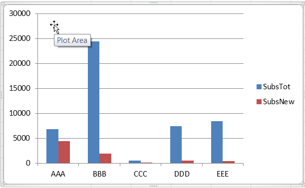
Hi Mark, thanks for this:
I want to graph the following data, After that i want to set up each bar so that when you click on it other graphs in the same dashboard change, but at this stage I'm just trying to get a simple graph to appear.
Title | SubsTot | SubsNew |
| AAA | 6859 | 4461 |
| BBB | 24415 | 1921 |
| CCC | 477 | 31 |
| DDD | 7475 | 483 |
| EEE | 8401 | 423 |
so, to end up with something like this: