Unlock a world of possibilities! Login now and discover the exclusive benefits awaiting you.
- Qlik Community
- :
- Forums
- :
- Analytics
- :
- New to Qlik Analytics
- :
- how to represent a pie chart as a line graph
Options
- Subscribe to RSS Feed
- Mark Topic as New
- Mark Topic as Read
- Float this Topic for Current User
- Bookmark
- Subscribe
- Mute
- Printer Friendly Page
Turn on suggestions
Auto-suggest helps you quickly narrow down your search results by suggesting possible matches as you type.
Showing results for
Not applicable
2016-07-28
10:31 AM
- Mark as New
- Bookmark
- Subscribe
- Mute
- Subscribe to RSS Feed
- Permalink
- Report Inappropriate Content
how to represent a pie chart as a line graph
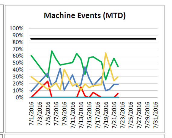
I'm new to Qlik and have a requirement to represent a pie chart output as a line graph. So for each piece of pie there would be an individual line on the line graph with all lines adding up to 100% each day.
| Date | Event | Total Minutes |
|---|---|---|
| 7/1/16 | Down | 30 |
| 7/1/16 | Ready | 100 |
| 7/1/16 | Working | 250 |
| 7/1/16 | Setup | 50 |
The pie chart would have 4 pieces that would add up to 100%. In this case the Line chart would have 4 points on 7/1 that would add up to 100%. The Line Chart should look like the following.
Any ideas?
Thanks,
Mark
248 Views
1 Reply
MVP
2016-07-28
11:29 AM
- Mark as New
- Bookmark
- Subscribe
- Mute
- Subscribe to RSS Feed
- Permalink
- Report Inappropriate Content
Try creating a line chart with two dimensions Date and Event and one expression:
=Sum([Total Minutes]) / Sum(TOTAL<Date> [Total Minutes])
187 Views
Community Browser