Unlock a world of possibilities! Login now and discover the exclusive benefits awaiting you.
- Qlik Community
- :
- Forums
- :
- Analytics
- :
- New to Qlik Analytics
- :
- Re: qlik sense responsive
- Subscribe to RSS Feed
- Mark Topic as New
- Mark Topic as Read
- Float this Topic for Current User
- Bookmark
- Subscribe
- Mute
- Printer Friendly Page
- Mark as New
- Bookmark
- Subscribe
- Mute
- Subscribe to RSS Feed
- Permalink
- Report Inappropriate Content
qlik sense responsive
Hi,
I design my visualizations on a 1920x1080 resolution, and when i change in a lower resolution, for example 1280x768, all the legends disappear. I though that Qlik sense is responsive and the visualization is adapted to any resolution? Could someone help me on that?
many thanks
ps: i am using v2.0.2 build 55
- Tags:
- qlik sense
- resolution
- « Previous Replies
-
- 1
- 2
- Next Replies »
- Mark as New
- Bookmark
- Subscribe
- Mute
- Subscribe to RSS Feed
- Permalink
- Report Inappropriate Content
Hi Chi,
this is part of the "responsive design" although this makes no sense in most cases. What does a bar chart (or other) say without any label?
- Ralf
- Mark as New
- Bookmark
- Subscribe
- Mute
- Subscribe to RSS Feed
- Permalink
- Report Inappropriate Content
Hello Chi,
Ralf is correct, in that responsive design will adjust charts and menu properties for the most optimal and viewing experience, but there is only so much real estate that can be used. However, I am using Firefox and along with the Web Developer Tool - Responsive Design View - I was able to use 3 bar charts in a 1280x720 resolution - I adjusted the legend to display in different locations - (i am using the gradient legend here) - it does display in this resolution.
To test this in Firefox - Tools->Web Developer->Responsive Design View
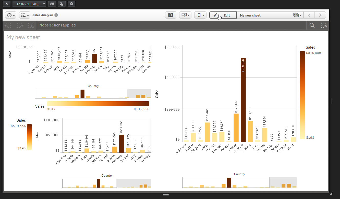
here is an example where the legend is on the right and I am coloring by dimension - note the scroll arrow that allows me to page down in the legend.

Please attach your screen shot - or sample .qvf (app) - so we can further help you.
I attached mine just in case - to make sure it works the same on your machine.
Please copy .qvf file to your C:\Users\<user profile>\Documents\Qlik\Sense\Apps and refresh Qlik Sense Desktop with F5
Please mark the appropriate replies as CORRECT / HELPFUL so our team and other members know that your question(s) has been answered to your satisfaction.
Regards,
Mike Tarallo
Qlik
Mike Tarallo
Qlik
- Mark as New
- Bookmark
- Subscribe
- Mute
- Subscribe to RSS Feed
- Permalink
- Report Inappropriate Content
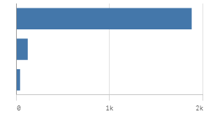
Very often we get almost meaningless charts w/o labels although there would be space for 3 to 4 characters:
- Ralf
- Mark as New
- Bookmark
- Subscribe
- Mute
- Subscribe to RSS Feed
- Permalink
- Report Inappropriate Content
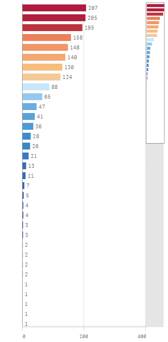
Hi Ralf you should be able to display labels even if the long values are obfuscated. Looks a similar resolution to yours.

Note you can also expand the chart to full screen if required that makes visible content restricted by the responsive design.
Finally you can always hover over the data point or click on it to provide context. It took our user community a little time to get used to it but they are overall pretty positive with the responsive layout.
- Mark as New
- Bookmark
- Subscribe
- Mute
- Subscribe to RSS Feed
- Permalink
- Report Inappropriate Content
Hi Andy,
what I meant is that the responsive design should need an overhaul to omit this kind of label-less visuals. In my case I hav a lot of charts and other UI objects and even on a small change of resolution the labels disappear for all charts. And, there is still plenty of space to show them but it doesn't. Also, it's switching to late to bring them back on resize or it prefers to show a too large ribbon instead..
A need for hovering or maximizing is a bad user experience..
- Ralf
- Mark as New
- Bookmark
- Subscribe
- Mute
- Subscribe to RSS Feed
- Permalink
- Report Inappropriate Content
Adding Patrik to the conversation to make him aware and possibly comment. plu.
Mike Tarallo
Qlik
- Mark as New
- Bookmark
- Subscribe
- Mute
- Subscribe to RSS Feed
- Permalink
- Report Inappropriate Content
Agree the chart should always be meaningful and what gets dropped should be priorities some how to ensure the chart remains usable in all viewports,
Disagree on the hover point as an equally bad experience could be a load of data point values displayed in a small window. I like how Sense spreads out and generally presents a nice visualisation to consume.
With View we have so much control over the visualisation I sometimes find it hard to step back and let/accept Sense make those decisions for me. I've often thought why's it hiding that now but I work within those constraints until new features come along.
- Mark as New
- Bookmark
- Subscribe
- Mute
- Subscribe to RSS Feed
- Permalink
- Report Inappropriate Content
I agree that some of these charts that Andy and Ralf showed can be improved. Would it be possible to get one of these apps and the screen resolutions so I can check how we evaluate the responsive use in the charts?
- Mark as New
- Bookmark
- Subscribe
- Mute
- Subscribe to RSS Feed
- Permalink
- Report Inappropriate Content
Don't get me wrong! Hover is a nice and important feature. But if it's the only way to get the context it's awkward..
- « Previous Replies
-
- 1
- 2
- Next Replies »