Unlock a world of possibilities! Login now and discover the exclusive benefits awaiting you.
- Qlik Community
- :
- All Forums
- :
- QlikView App Dev
- :
- Re: Actuals, Forecast and Difference in pivot tabl...
- Subscribe to RSS Feed
- Mark Topic as New
- Mark Topic as Read
- Float this Topic for Current User
- Bookmark
- Subscribe
- Mute
- Printer Friendly Page
- Mark as New
- Bookmark
- Subscribe
- Mute
- Subscribe to RSS Feed
- Permalink
- Report Inappropriate Content
Actuals, Forecast and Difference in pivot table
Hello all!
Currently I have a horizontal straight table like this:
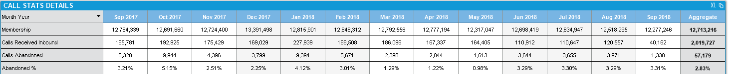
I need to create a table which is similar to the above, but it should have actuals, forecast and difference for each of the metric.
Something like this:
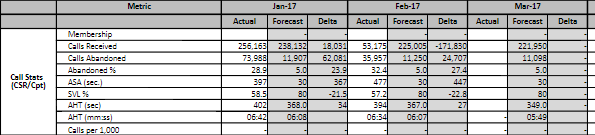
I tried creating a flag for Actuals and Forecast, but I am not able to create "Delta" for each of the metric. I have attached a sample for anyone who wants to help.
Thanks in advance,
Manas
Accepted Solutions
- Mark as New
- Bookmark
- Subscribe
- Mute
- Subscribe to RSS Feed
- Permalink
- Report Inappropriate Content
Did you try replacing flag dimension with valuelist custom dimension ?
- Mark as New
- Bookmark
- Subscribe
- Mute
- Subscribe to RSS Feed
- Permalink
- Report Inappropriate Content
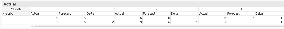
See attached for answer ...
- Mark as New
- Bookmark
- Subscribe
- Mute
- Subscribe to RSS Feed
- Permalink
- Report Inappropriate Content
Thanks Lisa, unfortunately this is not what I was looking for.
Both "Metric" and "Count" are 2 different measures. I need the Table to show like this, but also with the delta next to actual and forecast.

Consider Metric 1 to be Call Count and Metric 2 to be Membership Count. For each of these, I will need to show Actual, Forecast and Delta. Actual and Forecast is easy to show this way, but not Delta.
- Mark as New
- Bookmark
- Subscribe
- Mute
- Subscribe to RSS Feed
- Permalink
- Report Inappropriate Content
Any help, please..
- Mark as New
- Bookmark
- Subscribe
- Mute
- Subscribe to RSS Feed
- Permalink
- Report Inappropriate Content
Did you try replacing flag dimension with valuelist custom dimension ?
- Mark as New
- Bookmark
- Subscribe
- Mute
- Subscribe to RSS Feed
- Permalink
- Report Inappropriate Content
Works great! Thank you.
- Mark as New
- Bookmark
- Subscribe
- Mute
- Subscribe to RSS Feed
- Permalink
- Report Inappropriate Content
good to hear