Unlock a world of possibilities! Login now and discover the exclusive benefits awaiting you.
- Qlik Community
- :
- All Forums
- :
- QlikView App Dev
- :
- Add divider to grouped bar chart
- Subscribe to RSS Feed
- Mark Topic as New
- Mark Topic as Read
- Float this Topic for Current User
- Bookmark
- Subscribe
- Mute
- Printer Friendly Page
- Mark as New
- Bookmark
- Subscribe
- Mute
- Subscribe to RSS Feed
- Permalink
- Report Inappropriate Content
Add divider to grouped bar chart
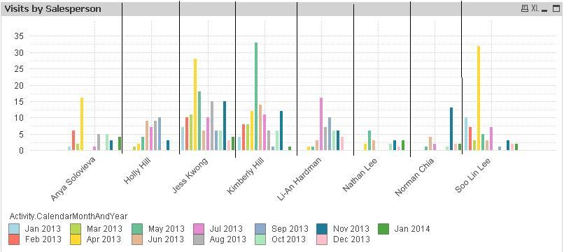
I have a slightly messy grouped bar chart and need to make it easier to read, therefore I would like to add verticle dividing lines between each Salesperson, as per the crude black lines I have drawn on.
Rather annoyingly the default gridlines seem to sit in the middle of the Salesperson's grouped bars (on July), which doesn't help as I need them between th salespeople. Any aide how i would do this?
- Tags:
- new_to_qlikview
Accepted Solutions
- Mark as New
- Bookmark
- Subscribe
- Mute
- Subscribe to RSS Feed
- Permalink
- Report Inappropriate Content
Not possible. I would instead look at increasing the distance between the groups (Chart Properties -> Presentation -> Cluster Distance).
Or - an alternative would be to show this as a Trellis graph (Chart Properties -> Dimensions -> Trellis). Doing so will create a mini-chart for each value of the first dimension.
HIC
- Mark as New
- Bookmark
- Subscribe
- Mute
- Subscribe to RSS Feed
- Permalink
- Report Inappropriate Content
great. Thanks for your help Henric
- Mark as New
- Bookmark
- Subscribe
- Mute
- Subscribe to RSS Feed
- Permalink
- Report Inappropriate Content
Hello,
I would also suggest to go for a stacked bar chart view.
Thanks
- Mark as New
- Bookmark
- Subscribe
- Mute
- Subscribe to RSS Feed
- Permalink
- Report Inappropriate Content
Isn't this quite a basic thing for Qlikview to have though? When I create a bar chart I would always want the gridlines to group together the data for each dimension title, otherwise it looks messy.
I understand on a line chart you would want it in the middle of the title but not on a bar.
Gareth
- Mark as New
- Bookmark
- Subscribe
- Mute
- Subscribe to RSS Feed
- Permalink
- Report Inappropriate Content
Looks like there is workaround:
Main idea of solution is to create under main chart (let’s call it 1st chart) background chart (2nd chart) with enabled Minor Grid. Minor grid will be situated exactly between bar groups.
Though as far as I can see it, it is impossible to switch off main grid with minor grid enabled at the same time, but we can hide it by bars of the same color as background.
Here what result will look like (you can also find attached qvw file):
Solution is quite interactive: you can make selections and dividers will adjust accordingly.
Here are specific basic steps i suggest to follow:
- Create Grouped bar chart (2 dimensions and one expression) and configure the way you need it.
- Resize plot area (CTRL+Shift) in order to disable automatic resize if X or Y axes values are changed because of applied selections.
- Copy chart to create background chart and make following adjustments:
- use simple expression like (=1, or =Year/Year if year is primary dimension (should be numeric)),
- bar distance = 0 (Chart properties->Presentation) This is required in case of even number of bars in group in order to hide main grid,
- static Max=1 (Chart properties->Axes),
- switch to continuous (to enable show minor grid check box),
- check both Show grid and Show Minor Grid check boxes,
- deselect continuous,
- Grid style – thick line and color black,
- color of font for axes (both expression and dimension axes) the same as background (e.g. white) ,
- for expression set bars color the same as background (like white()) (Chart Properties-> Expand + near Expression on Expression pane -> Background color),
- if you have scroll bar Scroll Buttons color the same as background (e.g. white) (Chart Properties -> Layout),
- set Layer to Bottom,
- give the chart distinctive object ID so you can easily open its properties via sheet properties->Objects (Chart Properties -> General).
- In main chart set background color to transparent.
- Move background chart under Main chart