Unlock a world of possibilities! Login now and discover the exclusive benefits awaiting you.
- Qlik Community
- :
- All Forums
- :
- QlikView App Dev
- :
- Bar Chart Expression Axes
Options
- Subscribe to RSS Feed
- Mark Topic as New
- Mark Topic as Read
- Float this Topic for Current User
- Bookmark
- Subscribe
- Mute
- Printer Friendly Page
Turn on suggestions
Auto-suggest helps you quickly narrow down your search results by suggesting possible matches as you type.
Showing results for
Anonymous
Not applicable
2014-11-17
09:08 AM
- Mark as New
- Bookmark
- Subscribe
- Mute
- Subscribe to RSS Feed
- Permalink
- Report Inappropriate Content
Bar Chart Expression Axes
Hello,
I have a 3 expression bar chart that I am having difficulty getting the axes to look proper. Here is a picture of the graph:
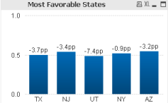
I am sorting by the states with the highest change due to their weight, showing their actual percentage ratio, and having the value of a data point be their variance from plan. I have clicked on show # as a percent for all of the expressions, and also I have set a static max at 100%. Any thoughts on how to force the axes into showing a percent, while keeping the current sort and plotted data?
237 Views
0 Replies