Unlock a world of possibilities! Login now and discover the exclusive benefits awaiting you.
- Qlik Community
- :
- All Forums
- :
- QlikView App Dev
- :
- Bar Chart with positive and negative numbers
- Subscribe to RSS Feed
- Mark Topic as New
- Mark Topic as Read
- Float this Topic for Current User
- Bookmark
- Subscribe
- Mute
- Printer Friendly Page
- Mark as New
- Bookmark
- Subscribe
- Mute
- Subscribe to RSS Feed
- Permalink
- Report Inappropriate Content
Bar Chart with positive and negative numbers
Hi all,
I want to create a bar chart with columns per month. In each month I want to show a "positive" column showing the number of customers that are active, while also showing a "negative" column with the number of customers that are notactive.
Attached xls file for your reference including the raw data. Based on that file, I'd like to have a graph showing three columns for the months of Feb/Mar/Apr. Then:
> in Feb the column should go from -1 to 1 (from -1 to 0 in red and from 0 to 1 in blue)
> in Mar the column should go from -2 to 3 (from -2 to 0 in red and from 0 to 3 in blue)
> in Mar the column should go from -3 to 5 (from -3 to 0 in red and from 0 to 5 in blue)
Thanks,
Dani
- Tags:
- new_to_qlikview
Accepted Solutions
- Mark as New
- Bookmark
- Subscribe
- Mute
- Subscribe to RSS Feed
- Permalink
- Report Inappropriate Content
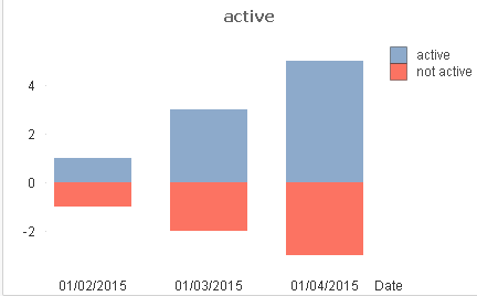
Hi Dani, with this script:
LOAD Date(Date#(Left(Month,3)&Right(Month,2), 'MMMYY')) as Date,
[Active yesno],
Customer
FROM
[.\Book1.xlsx]
(ooxml, embedded labels, table is Sheet1);
and this expressions:
Active: count({<[Active yesno]={'active'}>} Customer)
Not active: count({<[Active yesno]={'notactive'}>} Customer)*-1
And checking 'Stacked0' in style tab
returns this:
- Mark as New
- Bookmark
- Subscribe
- Mute
- Subscribe to RSS Feed
- Permalink
- Report Inappropriate Content
Hi Dani, with this script:
LOAD Date(Date#(Left(Month,3)&Right(Month,2), 'MMMYY')) as Date,
[Active yesno],
Customer
FROM
[.\Book1.xlsx]
(ooxml, embedded labels, table is Sheet1);
and this expressions:
Active: count({<[Active yesno]={'active'}>} Customer)
Not active: count({<[Active yesno]={'notactive'}>} Customer)*-1
And checking 'Stacked0' in style tab
returns this: